
When selecting paint colors, it can be helpful to pair a dark and light shade for contrast and visual interest. Two popular Benjamin Moore colors that complement each other beautifully are the crisp white Paper White OC-55 and the cool gray Classic Gray OC-23. But what exactly sets these two hues apart?
In this article, we’ll analyze Paper White and Classic Gray in depth. We’ll compare undertones, light reflectance, real life photos, and best room usages. Read on to determine which Benjamin Moore color is right for your home design needs.
Table of Contents
Key Differences Between Paper White and Classic Gray
Before diving into the details, here is an overview of the main differences between Paper White and Classic Gray:
- Color Family – Paper White is a crisp clean white, Classic Gray is a cool gray
- Undertones – Paper White has a subtly warm undertone, Classic Gray has hints of blue
- Light Reflectance – Paper White has an LRV of 74.41, Classic Gray has an LRV of 73.67
- Use – Paper White illuminates dark spaces, Classic Gray creates contrast
- Rooms – Paper White for ceilings and trim, Classic Gray for accent walls
Now let’s explore Paper White and Classic Gray more thoroughly.
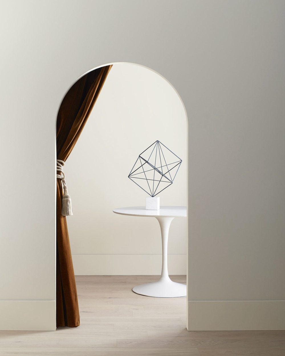
Benjamin Moore Paper White OC-55

With an exceptional light reflectance value of 74.41, Benjamin Moore Paper White lives up to its crisp, clean name. This bright white paint color excels at opening up dark spaces.
Here are some key facts about Paper White:
- LRV: 74.41
- Undertones: Subtly warm
- Finish: Flat, eggshell, pearl
- Best Spaces: Ceilings, trim, cabinets in dark rooms
- Popular Combinations: Bold colors like Classic Gray
Paper White is often described as the “whitest white” Benjamin Moore offers. It has the slightest warm undertone that prevents it from feeling clinical or stark. The result is a perfectly balanced, glowing bright white.
The outstanding 74.41 light reflectance value allows Paper White to truly excel at reflecting light. This makes it an ideal choice for illuminating darker spaces that need increased brightness.
With its well-balanced brightness and crisp clean look, Paper White works beautifully as:
- Ceilings and crown molding
- Trim, baseboards, and door frames
- Kitchen cabinets and shelving
- Bathroom walls and tile
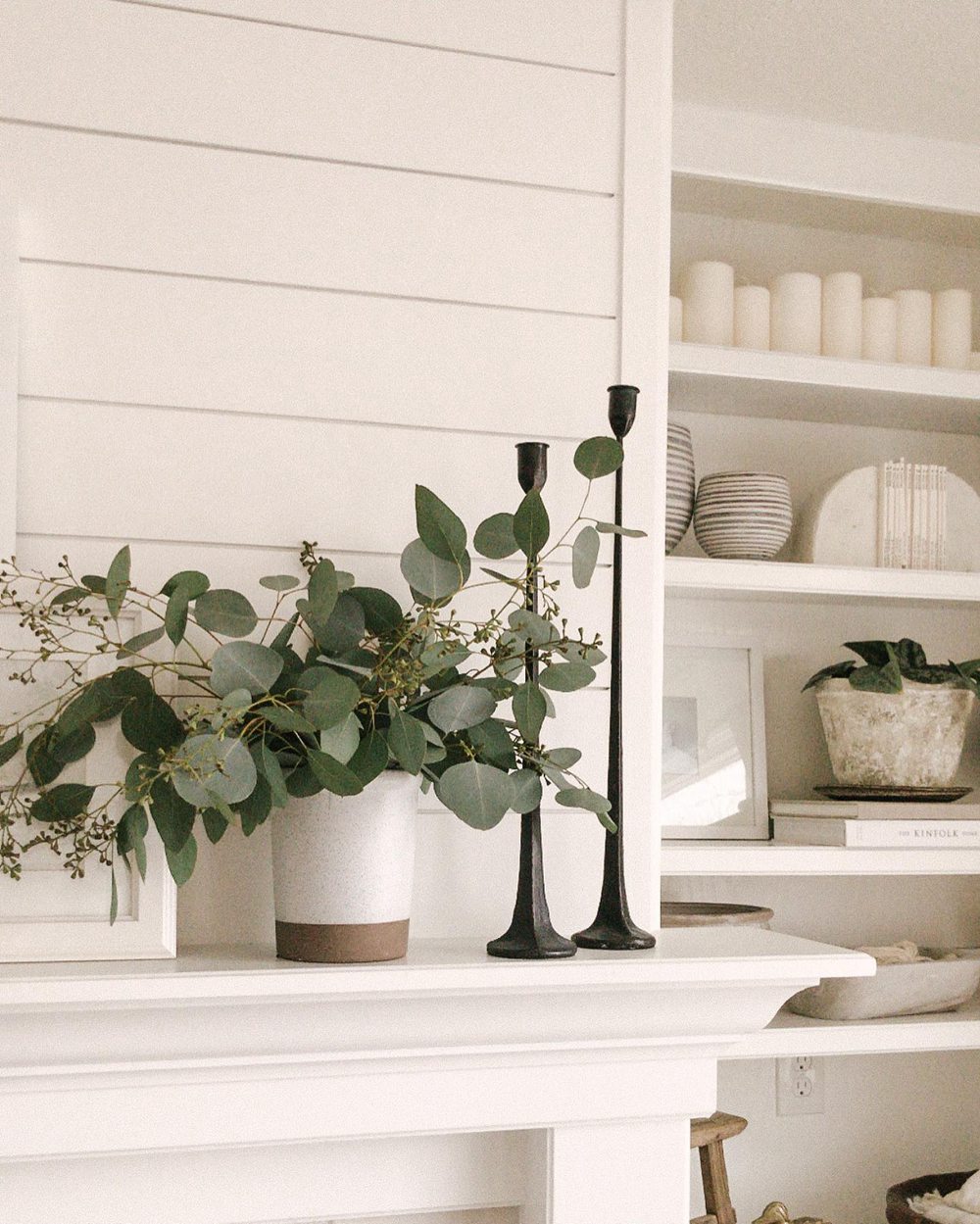
Benjamin Moore Classic Gray OC-23
With its cool blue-gray tone, Benjamin Moore Classic Gray OC-23 creates a gorgeous soothing backdrop in any home. This versatile neutral gray has widespread appeal.
Here are some key details about Classic Gray:
- LRV: 73.67
- Undertones: Cool blue tones
- Finish: Available in all paint sheens
- Rooms: Living rooms, bedrooms, offices
- Pairs Well With: Crisp whites, navy blues
Classic Gray is a chameleon-like paint color that shifts in appearance based on lighting conditions. In brighter light, it presents as a clean medium gray. In dim lighting, the subtle blue undertones come forward and deepen the hue.
The 73.67 light reflectance value provides enough illumination for most spaces without making the gray feel too dark or gloomy. Classic Gray nicely brightens up a room while still feeling soft and reserved.
With its cool essence and versatility, Classic Gray suits modern, transitional, and even traditional rooms. Use it anywhere you want a soothing gray backdrop. Ideal spaces include:
- Living room accent walls
- Bedroom and office feature walls
- Dining room walls
Comparing Paper White vs Classic Gray
Now that we’ve looked at Paper White and Classic Gray independently, let’s compare them directly:
Color Family
Paper White is a clean, bright white that reflects a lot of light. Classic Gray is a cooler-toned gray that absorbs more light.
Undertones
Paper White has the slightest warm undertone, while Classic Gray has distinctive cool blue undertones.
The subtle warmth of Paper White prevents starkness and adds comfort. The blue in Classic Gray creates a relaxing essence.
Light Reflectance
Paper White has an exceptionally high LRV of 74.41 compared to Classic Gray’s lower 73.67 LRV.
This means Paper White will make spaces feel bright and airy, whereas Classic Gray provides more moody contrast.
Rooms
Paper White excels on ceilings, trim, cabinets, and in rooms needing illumination. Classic Gray shines as an accent wall color in living areas.
Paint Finish
Both Paper White and Classic Gray come in Benjamin Moore’s full line of paint sheens from matte to high gloss.
Paper White vs Classic Gray Comparison Chart
Here is a quick overview comparing some key traits of Paper White and Classic Gray:
| Paint Color | Paper White OC-55 | Classic Gray OC-23 |
|---|---|---|
| Color Family | White | Gray |
| LRV | 74.41 | 73.67 |
| Undertones | Subtly warm | Cool blue |
| Use | Illumination | Contrast |
| Sheens | All sheens | All sheens |
Real Life Photos – Paper White vs Classic Gray
Let’s look at real life photos of spaces painted in Paper White and Classic Gray to better evaluate how they compare:
Paper White OC-55

Classic Gray OC-23
The photos demonstrate how crisp Paper White contrasts beautifully with the cooler, moody gray tone of Classic Gray. Their opposing undertones and light reflectance values create visual interest.
Should I Choose Paper White or Classic Gray?
So how do you decide whether to use Paper White or Classic Gray in your home? Here are a few tips:
Choose Paper White OC-55 if you want:
- A clean, bright white with subtle warmth
- To illuminate dark rooms and spaces
- A versatile neutral for trim, ceilings, and cabinets
- A crisp backdrop to make colors pop
Choose Classic Gray OC-23 if you want:
- A cooler-toned gray with hints of blue
- A relaxed and reserved accent wall color
- To create an elegant, moody contrast
- A soothing backdrop for living spaces
As usual, sampling the paint colors is highly recommended before fully committing. View large swatches on walls in different lighting to determine which you prefer.
While Paper White brightens, Classic Gray provides sophisticated contrast. Use both together to create the ultimate cohesive color scheme.
Best Rooms for Paper White and Classic Gray
While Paper White and Classic Gray look gorgeous together in any space, here are ideal rooms to highlight their main strengths:
Paper White OC-55
Thanks to its exceptional illumination abilities, Paper White excels in rooms with minimal natural light. Perfect spaces include:
- Dark hallways and basements
- Bathrooms and laundry rooms
- Bedrooms and offices with low light
- Kitchen cabinets and shelving
Classic Gray OC-23
With its cooler relaxed vibe, Classic Gray shines in sophisticated living spaces. Ideal rooms include:
- Living room accent walls
- Master bedroom retreats
- Den and home office feature walls
- Dining room walls
Use Paper White’s superior brightness in dark utilitarian areas. Let Classic Gray provide refined contrast in key living zones.
Decorating Ideas and Color Pairings
On their own, Paper White and Classic Gray create a stunning high contrast duo. Complement them with other paint colors and materials for gorgeous spaces:
Paper White OC-55 Ideas
- Bright white open shelving against a charcoal accent wall
- Clean white wainscoting against deep blue dining room walls
- Crisp white trim on navy blue front door
- Glossy white kitchen cabinets with a gray-blue island
Classic Gray OC-23 Ideas
- Cool gray accent wall against bright white living room
- Bedroom feature wall with teal and navy blue accents
- Dark gray dining room walls against a light wood table
- Gray kitchen island contrasting pristine white cabinetry
Pair Both With:
- Crisp whites and cool grays
- Navy blue, teal, light blue
- Warm wood flooring and finishes
- Black and white graphic prints
Together, Paper White and Classic Gray create a stylish monochromatic color scheme with elegant contrast. Adjust sheens like matte and high gloss to highlight dimension.
Paper White vs Classic Gray – Which is Better for Your Home?
So which Benjamin Moore color should you choose for your space – bright Paper White or sophisticated Classic Gray? Keep these tips in mind:
Pick Paper White OC-55 if you want:
- A clean, exceptionally bright white paint color
- To make dark dreary spaces feel light and airy
- A versatile neutral for ceilings, trim, and cabinets
- A cohesive backdrop for bold wall colors
Choose Classic Gray OC-23 if you want:
- A cooler-toned gray accent wall color
- To create a relaxed yet refined contrast
- A soothing paint color for living areas and bedrooms
- An elegant and timeless gray that suits any style
Get large in-home samples before deciding. Together, Paper White and Classic Gray provide the perfect simple yet stylish color scheme.
Frequently Asked Questions
Still trying to decide between Paper White and Classic Gray? Here are some commonly asked questions:
Is Paper White warm, cool, or neutral?
Paper White OC-55 is considered warm due to its subtle creamy undertone, though it still reads as a fairly true white. The undertone is barely detectable.
What colors go well with Classic Gray walls?
Classic Gray looks stunning alongside cool blues and greens, crisp whites, warm wood tones, and sophisticated black and white patterns.
Can you use Paper White in bathrooms?
Yes, Paper White works excellently in bathrooms. Its high 74.41 LRV brightens spaces, and the subtle warmth prevents dinginess.
Is Classic Gray suitable for bedrooms?
Yes, Classic Gray makes an elegant and soothing bedroom accent wall or feature wall color. Pair with crisp whites and navy blues.
What sheens are best for Paper White trim?
For trim and moldings, use a sheen like pearl, satin, or semi-gloss Paper White. This creates nice dimension against flat wall paint.