
When searching for the perfect sophisticated gray-blue paint color, it’s easy to get stuck comparing two similar versatile shades from Benjamin Moore. At first glance, popular choices Quiet Moments 1563 and Palladian Blue HC-144 may appear quite alike. But what really differentiates these two beautiful, muted blues?
In this guide, we’ll thoroughly compare Quiet Moments vs Palladian Blue to help you determine the best blue-gray paint color for your home. We’ll analyze undertones, light reflectance, real-life photos, room pairings and more.
Let’s dive in!
Table of Contents
Overview of Key Differences
Before getting into the details, here is a quick overview of the main differences between Quiet Moments and Palladian Blue:
- Undertones – Quiet Moments is a true blue-gray, Palladian Blue leans slightly green
- Light Reflectance – Quiet Moments LRV is 53, Palladian Blue LRV is 54
- Use – Both suit modern and traditional spaces
- Rooms – Quiet Moments excels in living rooms, Palladian Blue shines in dining rooms
- Availability – Both come in any finish
Now let’s explore Quiet Moments and Palladian Blue more thoroughly.
Benjamin Moore Quiet Moments 1563
With its weathered blue-gray appearance, Benjamin Moore Quiet Moments 1563 creates an elegant, soothing backdrop well-suited for varied rooms and styles. This versatile neutral works across both modern and traditional spaces.
Here are some key details about Quiet Moments:
- LRV: 60.73
- Undertones: Blue-gray
- Finishes: Available in any sheen
- Rooms: Living rooms, bedrooms, offices, dining rooms
- Pairs Well With: Crisp whites, warm wood tones, black accents
Quiet Moments is a hazy slate blue-gray with no strong undertones. In certain lights it can take on a more blue or gray look. This muted neutral has universal appeal.
The 60.73 light reflectance value prevents Quiet Moments from feeling too cold or stark. Quiet Moments strikes an ideal balance between airy and saturated.
This versatile neutral complements both cool and warm accents nicely. Popular Quiet Moments color pairings include:
- Benjamin Moore Chantilly Lace
- Black iron finishes
- Golden oak wood tones
- Crisp white trim and mouldings
- Sherwin Williams Pure White
While suitable anywhere at home, Quiet Moments truly excels in these spaces:
- Living Rooms – Calming backdrop for furniture
- Bedrooms – Restful and tranquil
- Offices – Focused atmosphere
- Dining Rooms – Sophisticated for hosting
Quiet Moments’ gray-blue tones create a relaxed elegance perfect as an all-over wall color. Use it to gently unify varied architectural details.
Benjamin Moore Palladian Blue HC-144
With its soft sky blue appearance, Benjamin Moore Palladian Blue HC-144 creates a gentle, welcoming backdrop suitable for varied spaces. This versatile, traditional blue works well across styles.
Here are some key details about Palladian Blue:
- LRV: 60.4
- Undertones: Blue with hints of green
- Finishes: Available in any sheen
- Rooms: Living rooms, dining rooms, bedrooms, bathrooms
- Pairs Well With: Warm woods, white, beige, gray
Palladian Blue is a pale robin’s egg blue with faint sage undertones. In certain lights it can take on a brighter sky blue or slate blue look. This soft blue has timeless appeal.
The 60.4 light reflectance value prevents Palladian Blue from feeling too bold or bright. Palladian Blue strikes an ideal balance between muted and saturated.
This versatile blue complements both cool and warm accents nicely. Popular Palladian Blue color pairings include:
- Benjamin Moore White Dove
- Sherwin Williams Pure White
- Oak wood tones
- Black wrought iron
- Off white trim and mouldings
While suitable anywhere in the home, Palladian Blue truly excels in these spaces:
- Living Rooms – Tranquil backdrop
- Dining Rooms – Elegant for hosting
- Bedrooms – Restful and airy
- Bathrooms – Spa-like feel
Palladian Blue’s soft aqua tones create a relaxed sophistication perfect as an all-over wall color. Use it to unify varied architectural characteristics.
Comparing Quiet Moments vs Palladian Blue
Now that we’ve looked at Quiet Moments and Palladian Blue individually, let’s directly compare them:
Light Reflectance
Quiet Moments and Palladian Blue have very similar LRVs of 60.73 and 60.4. They will appear nearly identical in lightness.
Undertones
Here’s the main difference – Quiet Moments is a true blue-gray while Palladian Blue leans slightly green.
Use & Rooms
Both work across modern and traditional spaces, though Quiet Moments feels more transitional for living rooms and Palladian Blue more elegant for dining rooms.
Availability
Quiet Moments and Palladian Blue come in any sheen from matte to high gloss.
Style
Quiet Moments is more versatile across styles, while Palladian Blue trends traditional.
| Paint Color | Quiet Moments 1563 | Palladian Blue HC-144 |
|---|---|---|
| LRV | 60.73 | 60.4 |
| Undertones | Blue-gray | Blue with green hints |
| Use | Transitional neutral | Traditional blue |
| Finish | Any sheen | Any sheen |
| Rooms | Living rooms, offices | Dining rooms, bedrooms |
| Style | Modern, traditional | Mainly traditional |
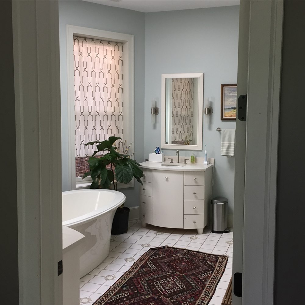
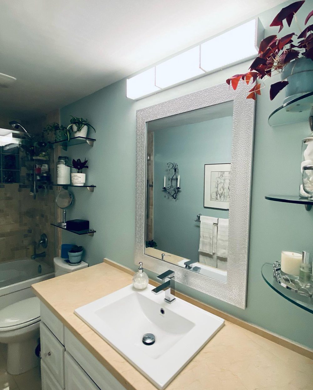
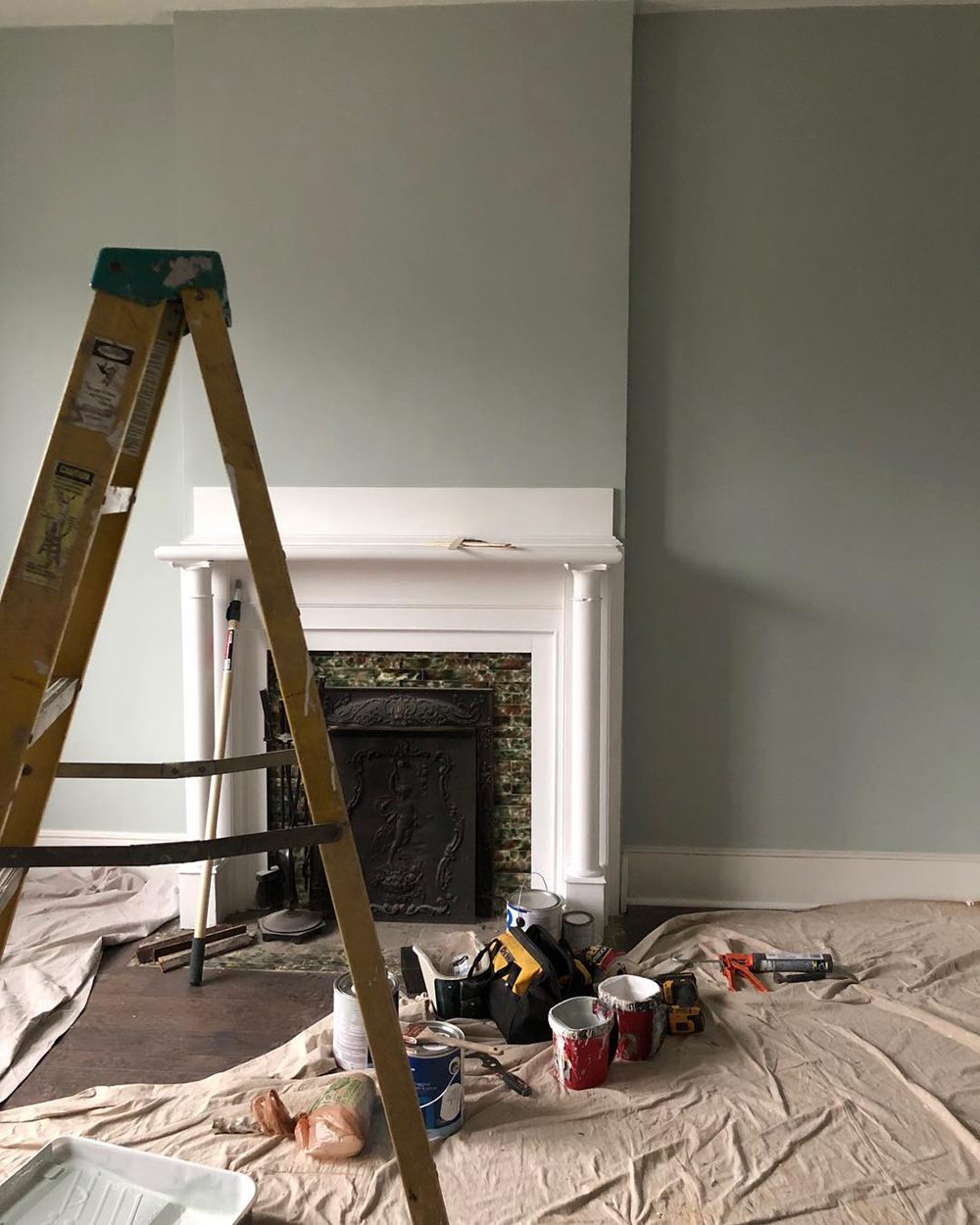
Real Life Photos: Quiet Moments vs Palladian Blue
Let’s look at real life photos to better visualize the differences between Quiet Moments and Palladian Blue:
Benjamin Moore Quiet Moments
Benjamin Moore Palladian Blue
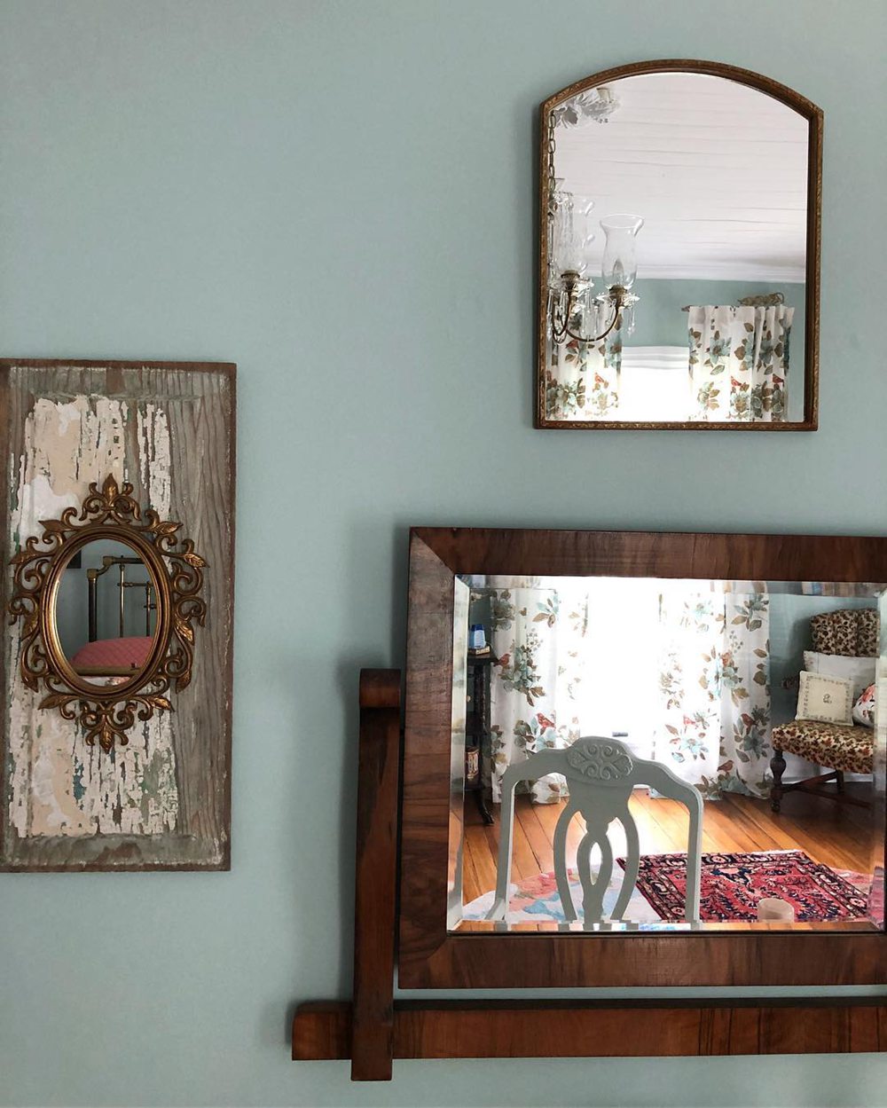
While the two may seem similar at first glance, upon closer inspection you can observe Quiet Moments’ subtle gray vs the green hints in Palladian Blue. Lighting affects their look.
Should I Choose Quiet Moments or Palladian Blue?
So how do you decide between Benjamin Moore’s Quiet Moments or Palladian Blue for your home? Here are a few tips:
Consider Quiet Moments 1563 if you want:
- A weathered blue-gray with neutral flexibility
- A versatile backdrop across modern and traditional
- A relaxing oasis for living rooms and bedrooms
- Understated transitional sophistication
Consider Palladian Blue HC-144 if you want:
- A soft robin’s egg blue with green hints
- A classic traditional aesthetic
- A statement dining room or elegant bathroom
- A bright, uplifting pop of color
Get color swatches for both Quiet Moments and Palladian Blue. Paint large patches on your walls to view at all times of day. This gives you the best sense of how the undertones come across in different lighting.
Pair the swatches with decor you already own to envision how they’ll look. Both are beautiful, sophisticated blues that suit varied spaces with elegance and style.
Ideal Room Pairings
Here are some rooms that are especially well suited to Quiet Moments and Palladian Blue paint colors:
Benjamin Moore Quiet Moments
- Living Rooms
- Bedrooms
- Offices
- Kitchens
- Bathrooms
Benjamin Moore Palladian Blue
- Dining Rooms
- Bathrooms
- Bedrooms
- Kitchens
- Living Rooms
While both blues work well throughout the home, the above applications make optimal use of their unique strengths.
Decorating Ideas and Color Pairings
On their own, Quiet Moments and Palladian Blue make bold statements. Complement them with other colors and materials for complete spaces:
Quiet Moments 1563 Pairs Well With:
- Crisp whites like Benjamin Moore Chantilly Lace
- Warm wood tones like golden oak
- Black iron accents and finishes
- Neutral beiges and tans
Palladian Blue HC-144 Pairs Well With:
- Bright whites like Sherwin Williams Pure White
- Warm oak wood tones
- Black wrought iron
- Off white trim and mouldings
Crisp whites, natural woods, and black metals beautifully accent both the blue-gray and green-blue undertones.
Quiet Moments vs Palladian Blue – Which is Better?
So which blue paint color is the better choice for your home – Quiet Moments or Palladian Blue?
Consider Quiet Moments 1563 if you want:
- A weathered blue-gray with neutral flexibility
- A versatile backdrop across modern and traditional
- A relaxing oasis for living rooms and bedrooms
- Understated transitional sophistication
Consider Palladian Blue HC-144 if you want:
- A soft robin’s egg blue with green hints
- A classic traditional aesthetic
- A statement dining room or elegant bathroom
- A bright, uplifting pop of color
Both are stunning, sophisticated blues perfect for nearly any space. Quiet Moments is more versatile and modern. Palladian Blue offers traditional character.
Get color samples before deciding. Whether you choose Benjamin Moore’s Quiet Moments or Palladian Blue, you’ll love how beautifully it graces your home.
Frequently Asked Questions
Still trying to decide between Quiet Moments vs Palladian Blue? Here are answers to some common questions:
What are the main differences between Quiet Moments and Palladian Blue?
The main differences are undertones and versatility. Quiet Moments is a true blue-gray that works across styles. Palladian Blue has green undertones and fits traditional aesthetics best.
Does Quiet Moments work well in a bedroom?
Yes, Quiet Moment’s soothing gray-blue hue would work wonderfully in a restful bedroom paired with crisp white trim. Its versatility also suits modern, traditional, or transitional bedrooms.
Can you use Palladian Blue in a kitchen?
Definitely, Palladian Blue would look gorgeous in a kitchen, especially a traditional style kitchen with oak cabinets. The soft green-blue color is uplifting yet still muted enough for an everyday space.
Is Quiet Moments suitable for southern exposure?
Yes, Quiet Moments’ light 60.73 LRV and subtle gray undertone are perfect for keeping a south facing room feeling airy and bright. The gray nicely balances intense sunlight.
What finish does Palladian Blue come in?
Palladian Blue is extremely versatile and comes in any sheen from matte flat to high gloss enamel to suit your preference. A soft eggshell or satin finish would match its traditional style well.