

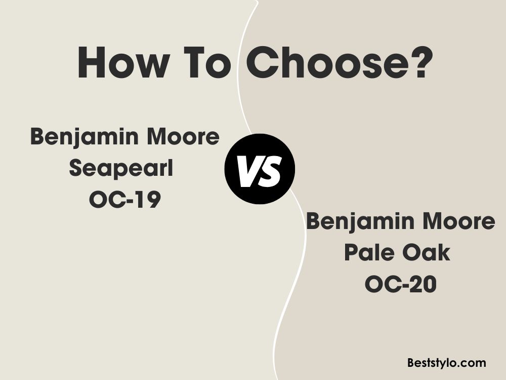
When selecting a light, warm neutral paint color, it can be difficult to discern subtle differences between similar shades. Two beautiful off-white beiges from Benjamin Moore are Sea Pearl OC-19 and Pale Oak OC-20. But what exactly sets these two apart?
In this article, we’ll thoroughly analyze Sea Pearl and Pale Oak. We’ll compare undertones, light reflectance, real life photos, and best room usages. Read on to determine which neutral paint color is the right fit for your home’s interior design.
Table of Contents
Key Differences Between Sea Pearl and Pale Oak
Before diving into the details, here is an overview of the main differences between Sea Pearl and Pale Oak:
- Undertones – Sea Pearl has green-gray, Pale Oak has yellow-brown
- Light Reflectance – Sea Pearl has an LRV of 76.43, Pale Oak has an LRV of 68.64
- Use – Sea Pearl suits modern coastal spaces, Pale Oak fits traditional homes
- Rooms – Sea Pearl shines in airy rooms, Pale Oak excels in cozy spaces
- Availability – Pale Oak comes in fewer finishes
Now let’s explore Sea Pearl and Pale Oak more thoroughly.
Benjamin Moore Sea Pearl OC-19
With its pale green-gray appearance, Sea Pearl OC-19 by Benjamin Moore creates a gorgeous soothing backdrop in coastal design. This versatile off-white has broad appeal.
Here are some key details about Sea Pearl:
- LRV: 76.43
- Undertones: Subtle green-gray
- Finish: Available in all paint sheens
- Rooms: Whole home color, especially airy rooms
- Pairs Well With: Blues, greens, wood tones
Sea Pearl is a light green-gray beige with barely detectable cool undertones. This chameleon-like paint color subtly shifts in appearance based on lighting conditions and surroundings.
In bright spaces, soft gray-green comes forward for an ethereal misty look. In dim lighting, subtle warmth is more noticeable for a light beige effect. The overall impression is a color that gently straddles the line between cool and warm.
With a 76.43 light reflectance value, Sea Pearl provides enough illumination to keep rooms feeling open and breezy. The green-gray influence prevents it from feeling too warm.
The versatility of Sea Pearl is one of its greatest strengths. This tranquil color effortlessly complements both cool and warm accents. Especially popular combinations include:
- Benjamin Moore Raindrop
- Benjamin Moore October Mist
- Benjamin Moore Revere Pewter
- Benjamin Moore Gray Owl
Use Sea Pearl to create serene, livable spaces. This soothing backdrop helps rooms feel refined yet relaxed. It works in any area but excels in these rooms:
- Airy living rooms
- Bright bedrooms
- Kitchens
- Bathrooms
- Hallways
Benjamin Moore Pale Oak OC-20
Pale Oak OC-20 is a gorgeous, natural-looking light brown paint color by Benjamin Moore. This beautiful beige has broad appeal across styles from modern to traditional.
Here are some key facts about Pale Oak:
- LRV: 68.64
- Undertones: Yellow-brown
- Finish: Flat, eggshell, pearl
- Rooms: Living rooms, bedrooms, dining rooms
- Pairs Well With: Grays, blues, greens, browns
True to its name, Pale Oak has distinct yellow-brown undertones reminiscent of natural oak wood. This gives the paint color a very inviting and warm appearance.
Despite the oak-inspired base color, Pale Oak reads as quite light and refined. With a 68.64 light reflectance value, this soft neutral helps rooms feel bright and cheerful.
The warm oak undertones pair wonderfully with organic textures and natural materials like wood furniture and stone accents. Pale Oak helps spaces feel grounded and cozy. Use it alongside other warm neutrals like:
- Benjamin Moore Edgecomb Gray
- Benjamin Moore Palo Duro Canyon
- Benjamin Moore Roasted Chestnut
- Benjamin Moore Hale Navy
This versatile beige looks gorgeous across styles from rustic farmhouse to urban loft. While suitable for any room, it really excels in these spaces:
- Living rooms
- Bedrooms
- Dining rooms
- Kitchens
- Offices
Comparing Sea Pearl vs Pale Oak
Now that we’ve looked at Sea Pearl and Pale Oak independently, let’s compare them directly:
Light Reflectance
Sea Pearl has an LRV of 76.43 compared to Pale Oak’s slightly lower 68.64 LRV. This means Sea Pearl reflects a bit more light. However, they are quite close in illumination abilities.
Undertones
Here is where the main difference lies. Sea Pearl has barely detectable cool green-gray undertones. Pale Oak has very warm yellow-brown oak undertones.
Sea Pearl’s hint of green-gray adds an ethereal coastal sensibility. Pale Oak’s oak-inspired warmth provides a cozy traditional feel.
Rooms
Due to its subtle coolness, Sea Pearl excels alongside airy open concept spaces full of natural light.
Pale Oak’s distinctive warmth makes it ideal for cozier living areas like bedrooms, dining rooms, and lounges.
Availability
Sea Pearl comes in all paint sheens from flat to high-gloss enamel. Pale Oak only comes in flat, eggshell, and pearl finishes.
Sea Pearl vs Pale Oak Comparison Chart
Here is an overview of how Sea Pearl and Pale Oak compare:
| Paint Color | Sea Pearl OC-19 | Pale Oak OC-20 |
|---|---|---|
| LRV | 76.43 | 68.64 |
| Undertones | Subtle green-gray | Yellow brown |
| Use | Bright airy rooms | Cozy living spaces |
| Sheens | All sheens | 3 sheens |
| Style | Coastal, modern | Traditional, transitional |
Real Life Photos – Sea Pearl vs Pale Oak
Let’s look at real life spaces painted in Sea Pearl and Pale Oak to better see how they compare in actual environments.
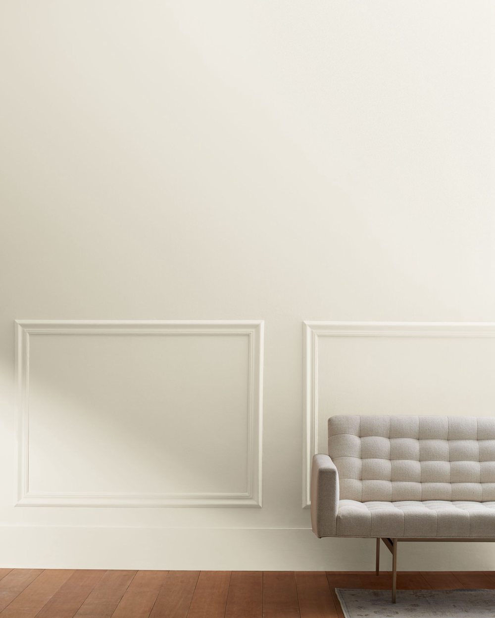
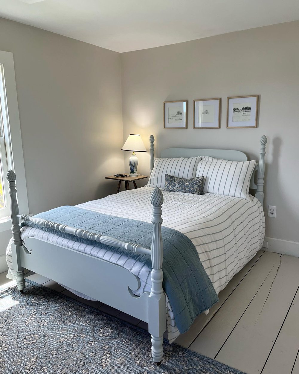
Sea Pearl OC-19
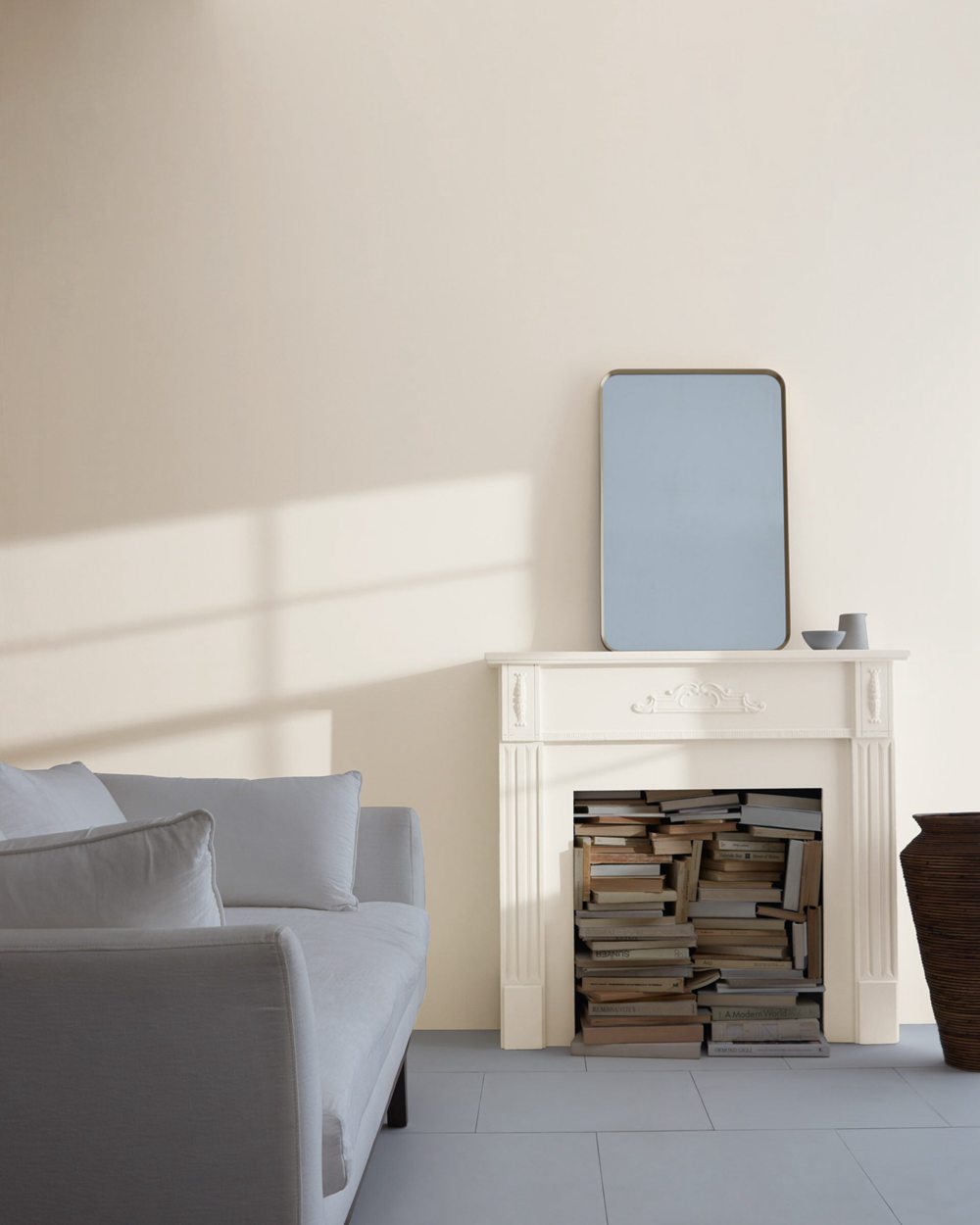
Pale Oak OC-20
The photos demonstrate how Sea Pearl typically appears to be a cooler and more gray-toned neutral compared to the warmer, more oak-beige Pale Oak. However, depending on lighting they can look quite similar.
Should I Choose Sea Pearl or Pale Oak?
So how do you decide between Sea Pearl vs Pale Oak for your home? Here are some factors that can guide your decision:
Consider Sea Pearl OC-19 if you want:
- A light off-white with subtle hints of green-gray
- A versatile color suitable for coastal styles
- A soothing but airy neutral
- A comfortable backdrop for brighter rooms
Consider Pale Oak OC-20 if you want:
- A light beige-brown with distinct oak undertones
- A welcoming traditional paint color
- A cozy feel for living spaces
- To complement wood furnishings and finishes
Always get paint samples before committing to a full paint job. View large swatches on your walls in different lighting at different times of day. This will give you the best sense of which neutral you prefer before finalizing a choice.
While Sea Pearl suits laidback coastal interiors, Pale Oak’s cozy warmth gives it an advantage in traditionally styled homes seeking a soft welcoming backdrop.
Ideal Room Pairings
While Sea Pearl and Pale Oak work well throughout homes, here are some rooms that their specific characteristics are ideally suited to:
Sea Pearl OC-19
This soothing off-white excels in brighter, sunlit rooms. Perfect Sea Pearl spaces include:
- Airy living rooms with natural light
- Bright bedrooms and nurseries
- Kitchens and breakfast nooks
- Bathrooms and laundry rooms
- Hallways and staircases
Pale Oak OC-20
This welcoming neutral excels in cozier living spaces. Ideal Pale Oak rooms:
- Living rooms, dens, family rooms
- Bedrooms and nurseries
- Dining rooms
- Offices, libraries, studies
- Foyers, entryways
Use Sea Pearl to enhance bright open interior spaces. Let Pale Oak provide a soft welcoming feel in more enclosed living areas.
Decorating Ideas and Color Pairings
On their own, Sea Pearl and Pale Oak create peaceful backdrops. Paired with other colors and textures, you can design truly stunning living spaces:
Sea Pearl OC-19 Ideas
- Light green-gray kitchen with weathered wood island
- Off-white shiplap accent wall in a sunroom
- Airy neutral bedroom with woven jute rug
- White open shelves and trim against gray-blue walls
Pale Oak OC-20 Ideas
- Warm beige dining room with antique wood table
- Cozy living room with oak-white walls and brick fireplace
- Rustic kitchen with exposed wood beams on ceiling
- Neutral paneled doors in an entryway against navy walls
Color Pairings for Both
- Light blues, grays, greens, antique wood
- Natural materials like jute, linen, wood
- Black and white photography prints
- Metallic finishes like aged bronze
Keep walls in a neutral off-white like Sea Pearl or Pale Oak to let accent colors shine. Easily change accents seasonally for a fresh updated look.
Sea Pearl vs Pale Oak – Which is Best For You?
So what’s better for your home – airy Benjamin Moore Sea Pearl or cozy Pale Oak? The right choice depends on your goals:
Pick Sea Pearl OC-19 if you want:
- A light off-white with hints of soothing gray-green
- A versatile paint color suitable for coastal styles
- A comforting but bright neutral for well-lit rooms
- An adaptable backdrop that feels laidback
Choose Pale Oak OC-20 if you want:
- A light beige-brown with distinctive oak undertones
- A softly welcoming paint color for traditional spaces
- A cozy feel for more enclosed living areas
- A neutral that pairs beautifully with wood tones
Get large in-home samples before deciding. While Pale Oak excels in traditionally styled homes, breezy Sea Pearl provides a gorgeous neutral for coastal casual interiors.
Choose the light neutral paint color that best complements your existing lighting, furnishings, and interior design aesthetic.
Frequently Asked Questions
Still trying to choose between Sea Pearl and Pale Oak? Here are some commonly asked questions:
Does Sea Pearl have warm or cool undertones?
Sea Pearl OC-19 is a subtle cool-toned off-white with barely detectable hints of green-gray that give it a misty coastal sensibility.
What undertone does Pale Oak have?
Pale Oak OC-20 is a warm paint color with distinctive yellow-brown undertones reminiscent of natural oak wood. This lends a welcoming traditional feel.
Can you use Sea Pearl on ceilings?
Yes, Sea Pearl can work nicely on ceilings thanks to its 76.43 light reflectance value. The subtle cool green-gray tint prevents any yellowing.
What rooms should I use Pale Oak in?
Pale Oak looks beautiful in cozy living spaces like living rooms, bedrooms, dens, dining rooms, and offices where its oak-inspired warmth shines.
Which neutral would pair best with blue-gray walls?
Sea Pearl’s slight green-gray undertone would complement light blue-gray walls well for a soothing, coastal inspired look.