
When searching for the perfect soothing green paint color, it’s easy to get stuck comparing two similar shades. Benjamin Moore favorites Tranquility AF-490 and Quiet Moments 1563 are beautiful green tones that appear very alike at first glance. But what really differentiates these gorgeous colors?
In this guide, we’ll analyze Tranquility vs Quiet Moments in-depth to help you determine the ideal green paint color for your home. We’ll look at undertones, light reflectance, real-life photos, room pairings and more.
Let’s dive in!
Table of Contents
Key Differences Between Tranquility and Quiet Moments
Before getting into the details, here is an overview of the main differences between Benjamin Moore Tranquility and Quiet Moments:
- Undertones – Tranquility is a blue-green, Quiet Moments is a yellow-green
- Light Reflectance – Tranquility has an LRV of 53.31, Quiet Moments has an LRV of 60.73
- Use – Tranquility suits modern and transitional styles, Quiet Moments fits traditional decor
- Rooms – Tranquility excels in living rooms, Quiet Moments shines in bedrooms
- Availability – Both come in all paint sheens
Now let’s explore Tranquility and Quiet Moments more thoroughly.
Benjamin Moore Tranquility AF-490
With its calming gray-green hue, Benjamin Moore Tranquility AF-490 creates a soothing backdrop suitable for both contemporary and traditional spaces. This versatile color has wide appeal.
Here are some details about Tranquility:
- LRV: 53.31
- Undertones: Blue-green
- Finish: Available in all paint sheens
- Rooms: Living rooms, offices, dens, bedrooms
- Pairs Well With: Whites, grays, wood tones
Tranquility is a relaxed medium-light teal-gray green without strong cool or warm undertones. In certain lights it can read as a weathered blue-green or muted green-gray. The soft natural color has broad appeal across styles.
The 53.31 light reflectance value prevents the color from feeling too bold or dark. Tranquility strikes a harmonious balance suitable for most rooms.
This versatile green complements both cool and warm accents nicely. Popular color pairings include:
- Benjamin Moore White Dove
- Sherwin-Williams Repose Gray
- Benjamin Moore Revere Pewter
- Aged wood finishes
- Crisp white trims
While suitable anywhere at home, Tranquility truly excels in these spaces:
- Living Rooms
- Bedrooms
- Offices
- Dens
- Libraries
Tranquility’s soothing vibe helps create a relaxed, welcoming feel perfect as an all-over home color. Use it to evoke tranquility and harmony.
Benjamin Moore Quiet Moments 1563
With its warm jade green color, Benjamin Moore Quiet Moments 1563 adds a natural touch of color while still feeling subtle and inviting. This versatile, organic green works across styles.
Here are some details about Quiet Moments:
- LRV: 60.73
- Undertones: Yellow-green
- Finish: Available in all sheens
- Rooms: Bedrooms, living rooms, dens, offices
- Pairs Well With: Neutrals, blues, metallics
Quiet Moments is a soft muted chartreuse green with distinct warm yellow undertones. In certain lights it can shift toward sage green or muted lime. The gentle color is uplifting yet soothing.
The 60.73 light reflectance value keeps the color lively without being too bold or intense. Quiet Moments strikes a harmonious balance suitable for most spaces.
This friendly green pairs nicely with both cool and warm accents. Popular color combinations include:
- Benjamin Moore Horizon
- Sherwin-Williams Pure White
- Benjamin Moore Hale Navy
- Brushed gold and brass metals
- Crisp white wainscoting
While workable anywhere at home, Quiet Moments truly excels in these rooms:
- Bedrooms
- Living Rooms
- Dens
- Offices
- Libraries
Quiet Moments’ natural, organic vibe helps create a relaxing, welcoming feel. Use it to evoke the calming essence of nature.
Comparing Tranquility vs Quiet Moments
Now that we’ve looked at Tranquility and Quiet Moments individually, let’s directly compare them:
Light Reflectance
Tranquility has an LRV of 53.31 compared to Quiet Moments slightly lighter 60.73 LRV. However, both colors are fairly close in overall brightness.
Undertones
Here’s where the main difference lies. Tranquility is a cool blue-green, while Quiet Moments is distinctly warm with yellow undertones.
Use & Rooms
Tranquility’s cool versatility allows whole home use. Quiet Moments’ warmth excels in cozy living rooms and bedrooms.
Availability
Both Tranquility and Quiet Moments come in any sheen from flat matte to high gloss semi-gloss.
Tranquility vs Quiet Moments Comparison Chart
| Paint Color | Tranquility AF-490 | Quiet Moments 1563 |
|---|---|---|
| LRV | 53.31 | 60.73 |
| Undertones | Blue-green | Yellow-green |
| Use | Whole home color | Bedrooms, living rooms |
| Finishes | All sheens | All sheens |
| Style | Modern, transitional | Traditional, organic |
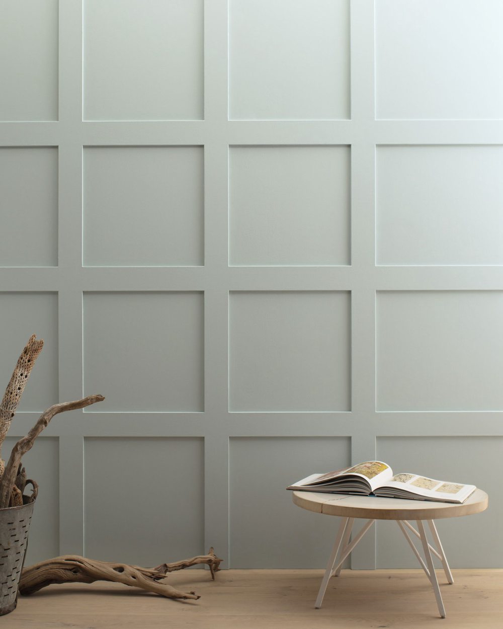
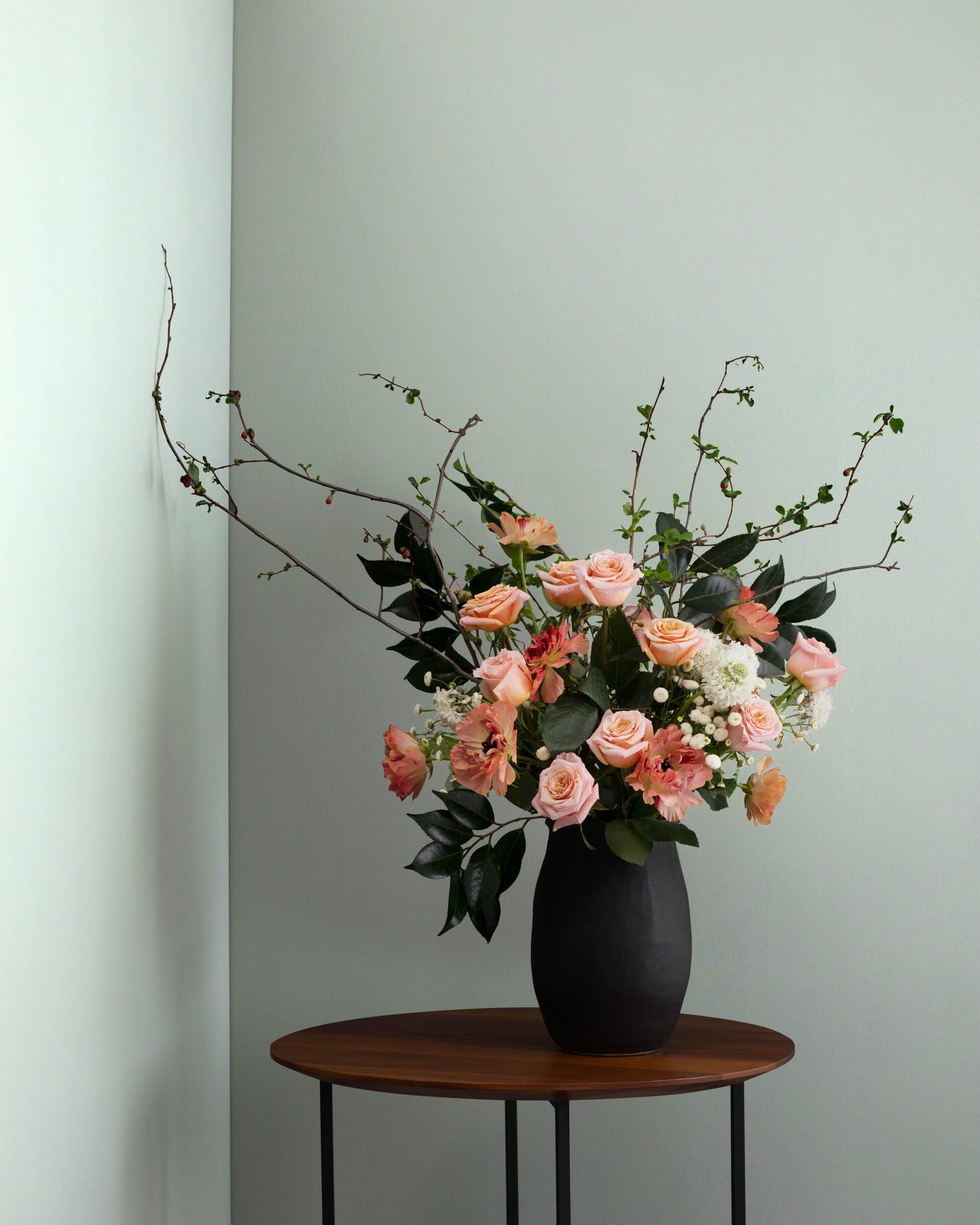
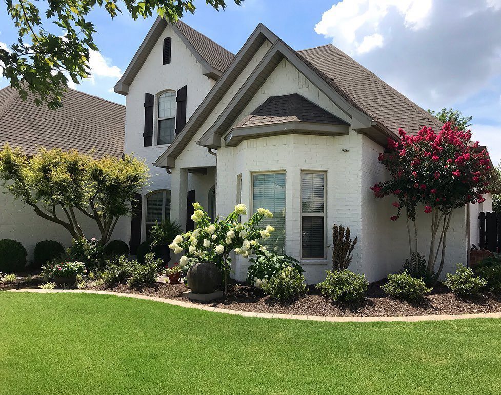
Real-Life Photos: Tranquility vs Quiet Moments
Let’s look at real-life photos to better visualize the differences between Tranquility and Quiet Moments:
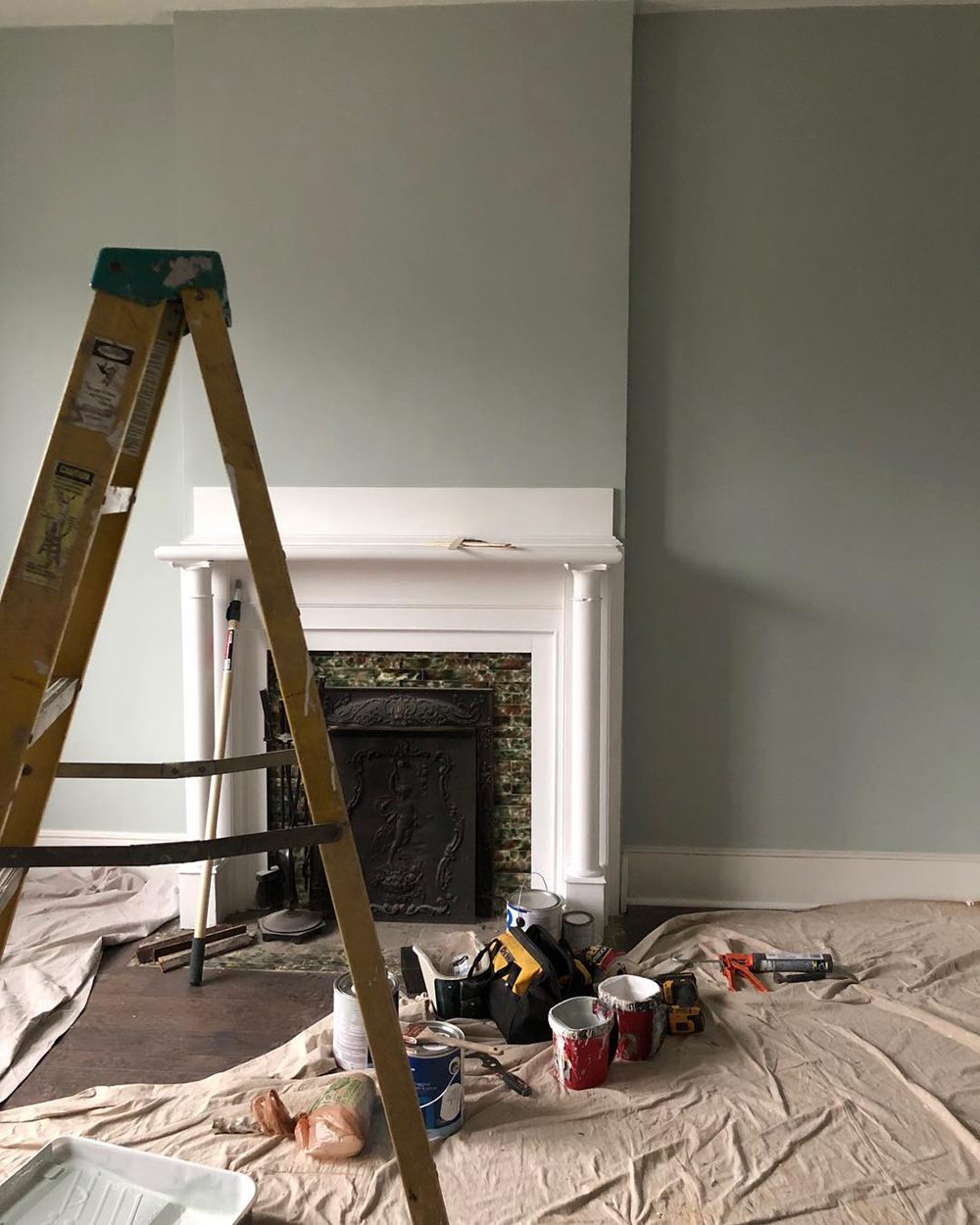
Benjamin Moore Tranquility
Benjamin Moore Quiet Moments
While they may overlap in some spaces, Tranquility generally appears cooler in tone compared to the yellow-green warmth of Quiet Moments. Lighting affects their look.
Should I Choose Tranquility or Quiet Moments?
So how do you decide between Benjamin Moore Tranquility or Quiet Moments for your home? Here are a few tips:
Choose Tranquility AF-490 if you want:
- A cooler, more grayish green
- A versatile color suitable for whole home use
- A relaxing shade that still feels invigorating
- A paint color that works with varied styles
Choose Quiet Moments 1563 if you want:
- A warmer, yellow-based green
- An inviting feel perfect for cozy living spaces
- To accentuate traditional, organic decor
- A soothing natural ambiance
Get samples of both Tranquility and Quiet Moments. Paint large sections on your walls viewing during different times of day. This gives you the best sense of how the colors look in your particular lighting.
You can also pair them with existing furniture and accents. Either soothing green you choose will create a relaxing oasis.
Ideal Room Pairings
Here are some rooms that are especially well-suited to Tranquility and Quiet Moments paint colors:
Benjamin Moore Tranquility
- Living Rooms
- Offices
- Dens
- Bedrooms
- Libraries
Benjamin Moore Quiet Moments
- Bedrooms
- Living Rooms
- Dens
- Offices
- Libraries
While both greens work well throughout the home, the above applications tend to make optimal use of their distinctive strengths.
Decorating Ideas and Color Pairings
Complement Tranquility and Quiet Moments with other colors and materials to create beautiful, peaceful spaces:
Tranquility AF-490 Pairings
- Benjamin Moore White Dove
- Sherwin-Williams Repose Gray
- Benjamin Moore Revere Pewter
- Aged wood finishes
- Crisp white trims
Quiet Moments 1563 Pairings
- Benjamin Moore Horizon
- Sherwin-Williams Pure White
- Benjamin Moore Hale Navy
- Brushed brass or gold accents
- Crisp white wainscoting
Tranquility vs Quiet Moments – Which is Better?
So which green paint color is better for your home – Tranquility or Quiet Moments?
Consider Tranquility AF-490 if you want:
- A cooler, more grayish green
- A versatile color suitable for any room
- A soothing but invigorating ambiance
- A paint color that works across design styles
Consider Quiet Moments 1563 if you want:
- A warmer, soft yellow-green
- A welcoming natural feel perfect for bedrooms
- To accentuate traditional organic decor
- A calming essence reminiscent of nature
While Tranquility is likely the more versatile option, Quiet Moments provides beautiful warm character to living spaces.
Get samples before deciding. Either peaceful green you choose will create a relaxing oasis.
Frequently Asked Questions
Still trying to decide between Tranquility or Quiet Moments? Here are answers to some common questions:
What are the main differences between Tranquility and Quiet Moments?
The main differences are their undertones and versatility. Tranquility is a cooler gray-green that works anywhere. Quiet Moments is a warm yellow-green perfect for living rooms.
Can you use Quiet Moments in a bathroom?
Quiet Moments may be too bold and yellow-toned for a soothing bathroom. But it could work nicely paired with tranquil blues.
Does Tranquility come in a matte finish?
Yes, Tranquility is extremely versatile and comes in any sheen from flat matte to high gloss semi-gloss to suit diverse aesthetic needs.
Is Quiet Moments suited for northern exposure?
At 60.73 LRV, Quiet Moments provides enough brightness for a north facing room without appearing dreary or dismal.
What colors pair well with Tranquility?
Cool grays, fresh whites, black and wood tones, and accent shades of blue, green, or indigo pair beautifully with Tranquility’s blue-green hue.