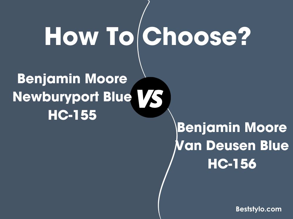
When selecting a rich, sophisticated blue paint color, two top options from Benjamin Moore are Van Deusen Blue HC-156 and Newburyport Blue HC-155. At first glance, these two navy blues may appear very similar. But looking closer, there are noticeable differences between Van Deusen Blue and Newburyport Blue that impact the overall aesthetic.
In this in-depth guide, we’ll compare Benjamin Moore Van Deusen Blue vs Newburyport Blue paint colors. We’ll examine undertones, LRV levels, real-world photos, and ideal room applications. By the end, you’ll understand how Van Deusen Blue and Newburyport Blue differ and which deep blue is the perfect choice for your space.
Table of Contents
Key Differences Between Van Deusen Blue and Newburyport Blue
Before diving into all the details, here is a brief overview of how Benjamin Moore Van Deusen Blue and Newburyport Blue differ:
- Undertones: Van Deusen Blue is a green-blue, Newburyport Blue is a purple-blue.
- LRV: Van Deusen Blue has a higher LRV of 11.97, Newburyport Blue is darker at 10.31 LRV.
- Use: Van Deusen Blue works well whole-room, Newburyport Blue best accenting.
- Rooms: Van Deusen Blue excels in bedrooms, Newburyport Blue shines in studies.
Now let’s explore Benjamin Moore Van Deusen Blue vs Newburyport Blue more closely!
Benjamin Moore Van Deusen Blue HC-156
Van Deusen Blue HC-156 is a rich green-leaning navy paint color with an earthy, natural vibe. Its versatility makes it a popular deep blue choice.
Here are some details about Van Deusen Blue:
- LRV: 11.97
- Undertones: Green-blue
- Sheen: Available in all finishes
- Rooms: Bedrooms, living rooms, offices, libraries
- Pairs Well With: Tans, yellows, grays, whites
Van Deusen Blue is a jewel-toned navy with strong green undertones. The earthy greenness gives it an authentic, laidback feel.
With an LRV of 11.97, Van Deusen Blue reflects a decent amount of light for a rich navy shade to avoid feeling too somber or dark. The hint of green maintains an inviting, genuine vibe.
This flexible green-blue complements a variety of color schemes. Pleasing combinations include:
- Benjamin Moore White Dove
- Benjamin Moore Revere Pewter
- Benjamin Moore October Mist
- Benjamin Moore Coventry Gray
While suitable anywhere in a home, this relaxed green-blue excels when used as the main color in bedrooms, offices, living rooms, and studies.
Benjamin Moore Newburyport Blue HC-155
Newburyport Blue HC-155 is a regal purple-leaning navy paint color with widespread popularity. Its richness allows it to suit formal spaces.
Here are some key details about Newburyport Blue:
- LRV: 10.31
- Undertones: Purple-blue
- Sheen: Available in all finishes
- Rooms: Studies, dining rooms, bathrooms, accents
- Pairs Well With: Golds, grays, creams, whites
Newburyport Blue is a very deep navy that borders on inky purple. The strong purple undertones give it a formal, sophisticated edge.
With an LRV of 10.31, Newburyport Blue reflects less light than Van Deusen Blue, appearing richer and darker. The prominence of purple makes it feel luxe and elegant.
Some pleasing color combinations with Newburyport Blue include:
- Benjamin Moore Chantilly Lace
- Benjamin Moore Revere Pewter
- Benjamin Moore Gray Owl
- Benjamin Moore Linen White
While suitable anywhere when used judiciously, this elegant purple-blue excels when strategically placed in studies, dining rooms, bathrooms, and as an accent.
Directly Comparing Van Deusen Blue vs Newburyport Blue
Now that we’ve explored Van Deusen Blue HC-156 and Newburyport Blue HC-155 separately, let’s directly compare the two Benjamin Moore paint colors:
Light Reflectance Value (LRV)
Van Deusen Blue has an LRV of 11.97, while Newburyport Blue has an LRV of 10.31. This means Van Deusen Blue reflects more light, appearing slightly lighter and brighter. However, both rich blues avoid feeling too dark or gloomy.
Undertones
Here is the main difference. Van Deusen Blue is a green-leaning navy, while Newburyport Blue is more purple-toned.
Van Deusen Blue’s earthy greenness provides a relaxed, approachable vibe. Newburyport Blue’s regal purple gives it a formal, sophisticated mood.
Best Room Applications
Thanks to its flexibility, Van Deusen Blue works well in most whole rooms, especially bedrooms and offices. Newburyport Blue excels as an accent color due to its dramatic bold richness.
Paint Finishes
Both Van Deusen Blue and Newburyport Blue come in any sheen from matte to high-gloss. They can provide classic polished elegance or a muted modern look.
Van Deusen Blue vs Newburyport Blue Comparison Chart
Here is an overview of their major differences:
| Paint Color | Van Deusen Blue HC-156 | Newburyport Blue HC-155 |
|---|---|---|
| LRV | 11.97 | 10.31 |
| Undertones | Green-blue | Purple-blue |
| Use | Whole-room color | Accent color |
| Sheens | All finishes | All finishes |
Real Rooms Painted in Van Deusen Blue and Newburyport Blue
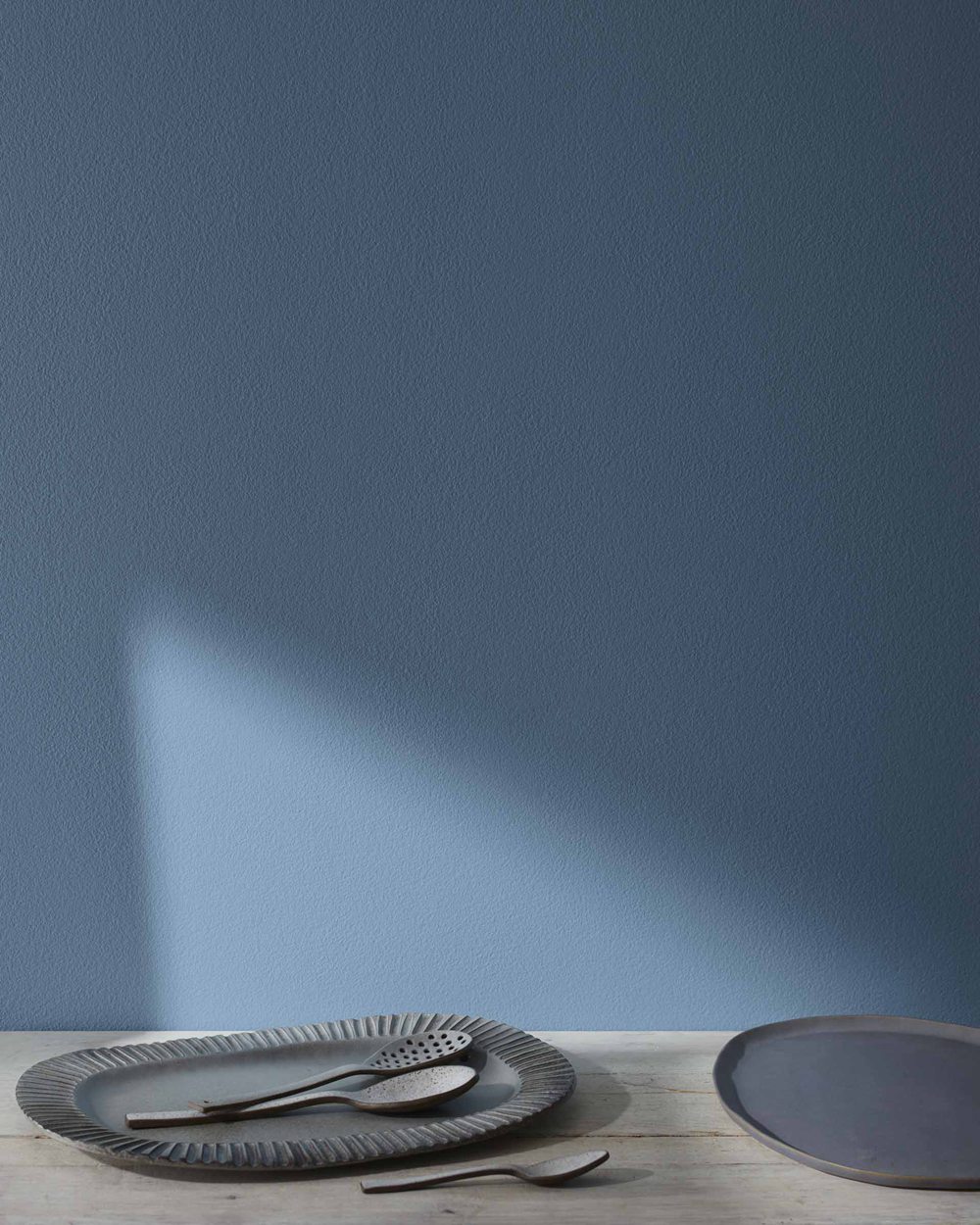
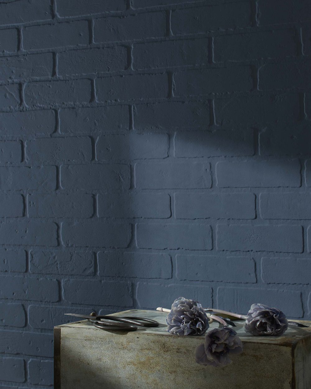
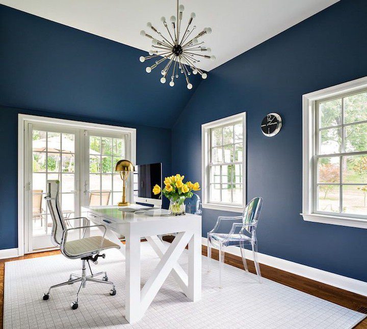
To better visualize Van Deusen Blue vs Newburyport Blue, let’s look at real-world rooms painted in the two colors:
Van Deusen Blue HC-156
Newburyport Blue HC-155

The images demonstrate the noticeable difference in undertones. Van Deusen Blue appears green-tinted, while Newburyport Blue is more purple. But their comparable richness can make them seem similar at first glance.
Should You Choose Van Deusen Blue or Newburyport Blue?
So which sophisticated navy blue is the better choice for your space – flexible Van Deusen Blue or dramatic Newburyport Blue? Here are some tips for deciding:
Pick Van Deusen Blue HC-156 if you want:
- A green-leaning navy with an earthy vibe
- A versatile color suitable for whole rooms
- Laidback sophistication for bedrooms and offices
- A genuine, inviting mood without strong contrast
Choose Newburyport Blue HC-155 if you want:
- A purple-toned navy with a dramatic flair
- Striking contrast for accents and focal walls
- A regal, polished look in formal spaces
- Bold elegance with a touch of luxurious depth
If still uncertain between the two, get samples and paint large swatches on your walls. View throughout different lighting before deciding.
Either rich navy you choose will provide beauty and visual interest. But their unique undertones mean one likely better suits your particular style and goals.
Ideal Room Applications
Here are some rooms that tend to suit Van Deusen Blue HC-156 and Newburyport Blue HC-155 best:
Van Deusen Blue HC-156
- Bedrooms
- Living Rooms
- Offices
- Family Rooms
- Libraries/Studies
Newburyport Blue HC-155
- Studies
- Foyers
- Dining Rooms
- Bathrooms
- Accent Walls
Both can work well when used thoughtfully in any room. But the above applications maximize each navy paint color’s individual strengths.
Design Ideas and Color Pairings
On their own, Van Deusen Blue and Newburyport Blue create striking backdrops. Paired with other colors and materials, they make truly gorgeous interiors:
Van Deusen Blue Color Pairings
- Benjamin Moore Chantilly Lace (trim/ceiling)
- Benjamin Moore Revere Pewter (furniture)
- Benjamin Moore Gray Owl (accent wall)
- Medium wood flooring
Newburyport Blue Color Pairings
- Benjamin Moore Linen White (trim/molding)
- Benjamin Moore White Dove (furniture)
- Benjamin Moore Kendall Charcoal (accent wall)
- Brass light fixtures
Van Deusen Blue vs Newburyport Blue – Which is Best for You?
When choosing between Van Deusen Blue and Newburyport Blue, keep your own style preferences and goals in mind:
Pick Van Deusen Blue HC-156 if you want:
- A versatile green-blue suitable for whole rooms
- An earthy, laidback navy with inviting warmth
- A soothing oasis for bedrooms and offices
- Casual sophistication without strong contrast
Choose Newburyport Blue HC-155 if you want:
- A purple-blue navy for dramatic accent walls
- A bolder, darker alternative to lighter blues
- Stunning elegance in formal dining rooms and studies
- Luxe, polished richness with a bold edge
While they share similarities, the undertone differences likely make one better suit your space. Get samples before deciding on Van Deusen Blue or Newburyport Blue.
Frequently Asked Questions
Still trying to choose between earthy Van Deusen Blue vs regal Newburyport Blue? Here are answers to some common questions:
Does Newburyport Blue work well in bedrooms? It can, but may feel too bold and dark as a main bedroom wall color. Consider using Newburyport Blue judiciously on an accent wall instead.
What colors complement Van Deusen Blue walls? Van Deusen Blue pairs nicely with light greens, warm grays, tans, and off-whites. Crisp white trim prevents the navy from feeling too heavy.
Which blue paint color is darker? Newburyport Blue has a lower LRV of 10.31 compared to Van Deusen Blue’s 11.97 LRV. This makes Newburyport Blue noticeably richer and darker.
Can you use Van Deusen Blue in a bathroom? Definitely. Paired with white tile, Van Deusen Blue provides a relaxing spa-like ambience in bathrooms. Its green undertone gives a natural feel.
Is Newburyport Blue suitable for kitchen cabinets? Yes, Newburyport Blue looks gorgeous against bright white countertops! The dramatic purple undertone creates striking contrast for a bold look.
Conclusion
When comparing Benjamin Moore’s Van Deusen Blue HC-156 and Newburyport Blue HC-155 paint colors, the main differences come down to undertones and aesthetics:
- Van Deusen Blue is a laidback green-blue fitting for whole rooms, providing an earthy, welcoming vibe.
- Newburyport Blue is a regal purple-blue that excels as an accent, adding striking elegance and bold contrast.
While quite similar at first glance, the undertone variations help make one likely better suit your particular space and style. Carefully consider your needs when deciding between flexible Van Deusen Blue and dramatic Newburyport Blue. Getting samples of each navy blue will ensure you select the perfect sophisticated shade!


