
When searching for the perfect neutral paint color, it’s easy to get stuck comparing two similar versatile shades from Sherwin Williams. Popular choices Mindful Gray SW 7016 and Repose Gray SW 7015 appear very alike at first glance. But what really differentiates these two beautiful, subtle neutrals?
In this in-depth guide, we’ll analyze Mindful Gray vs Repose Gray to help you determine the ideal neutral paint for your home. We’ll look at undertones, light reflectance, real-life photos, room pairings and more.
Table of Contents
Key Differences Between Mindful Gray and Repose Gray
Before getting into the details, here is an overview of the main differences between Sherwin Williams’ Mindful Gray and Repose Gray:
- Undertones – Mindful Gray is a cool gray, Repose Gray is a warm gray
- Light Reflectance – Repose Gray has an LRV of 58, Mindful Gray has an LRV of 48
- Use – Mindful Gray suits modern styles, Repose Gray fits traditional decor
- Rooms – Mindful Gray excels in offices, Repose Gray shines in bedrooms
- Availability – Both come in all sheens
Now let’s explore Mindful Gray and Repose Gray more thoroughly.
Sherwin Williams Mindful Gray SW 7016
With its subtle cool gray appearance, Sherwin Williams Mindful Gray SW 7016 creates an understated backdrop well-suited for contemporary styles. This versatile neutral works across modern spaces.
Here are some details about Mindful Gray:
- LRV: 48
- Undertones: Cool gray
- Finish: Available in all sheens
- Rooms: Offices, kitchens, bathrooms, accent walls
- Pairs Well With: Blues, bold colors, black and white
Mindful Gray is a quiet, dusty blue-gray with green undertones. In all lighting it maintains its understated neutral gray appearance.
The 48 light reflectance value provides ideal soft illumination without being too dark. Mindful Gray gives an open, breathable feel.
This adaptable neutral complements a wide variety of colors from bold to muted. Popular Mindful Gray color pairings include:
- Sherwin Williams Rainwashed
- Black and white patterns
- Brushed nickel accents
- Navy blue and teal accents
While suitable anywhere at home, Mindful Gray truly excels in these sleek, modern spaces:
- Offices
- Kitchens
- Bathrooms
- Accent walls
- Entryways
Mindful Gray’s versatility helps create a relaxing yet fresh backdrop, perfect for accentuating contemporary styles.
Sherwin Williams Repose Gray SW 7015
With its warm gray appearance, Sherwin Williams Repose Gray SW 7015 creates an understated backdrop well-suited for accentuating traditional decor. This versatile neutral works in both formal and casual spaces.
Here are some details about Repose Gray:
- LRV: 58
- Undertones: Warm gray
- Finish: Available in all sheens
- Rooms: Bedrooms, living rooms, dining rooms, offices
- Pairs Well With: Blues, blacks, wood tones
Repose Gray is a relaxed, soft gray with faint beige undertones. In certain lights it can read as a weathered putty. The welcoming neutral has traditional appeal.
The 58 light reflectance value prevents the shade from feeling too dark or drab. Repose Gray strikes a cozy yet bright balance suitable for most rooms.
This versatile neutral complements both cool and warm accents nicely. Popular Repose Gray color pairings include:
- Sherwin Williams Pure White
- Sherwin Williams Tricorn Black
- Black accent pieces
- Walnut wood finishes
- White trim
While suitable anywhere at home, Repose Gray truly excels in these spaces:
- Bedrooms
- Living Rooms
- Dining Rooms
- Offices
- Libraries
Repose Gray’s warmth helps create a welcoming, traditional feel perfect as an all-over home color. Use it to allow bold colors to stand out.
Comparing Mindful Gray vs Repose Gray
Now that we’ve examined Mindful Gray and Repose Gray independently, let’s directly compare them:
Light Reflectance
Repose Gray and Mindful Gray have quite different LRVs of 58 and 48 respectively. Repose Gray will appear noticeably brighter.
Undertones
Here’s where the main difference lies. Mindful Gray is a cool gray, while Repose Gray is a warm, beige-influenced neutral.
Use & Rooms
Mindful Gray’s coolness excels in modern offices and kitchens. Repose Gray’s warmth is perfect for cozy bedrooms.
Availability
Both Mindful Gray and Repose Gray come in any sheen from matte to high gloss.
| Paint Color | Mindful Gray SW 7016 | Repose Gray SW 7015 |
|---|---|---|
| LRV | 48 | 58 |
| Undertones | Cool gray | Warm gray |
| Use | Modern spaces | Traditional rooms |
| Finishes | All sheens | All sheens |
| Style | Contemporary | Traditional |
Real-Life Photos: Mindful Gray vs Repose Gray
Let’s look at real-life photos to better visualize the differences between Mindful Gray and Repose Gray:
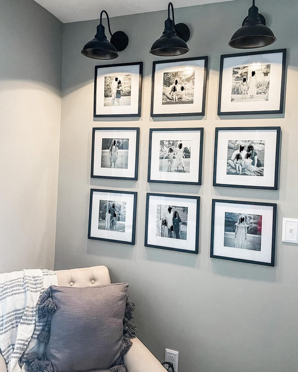
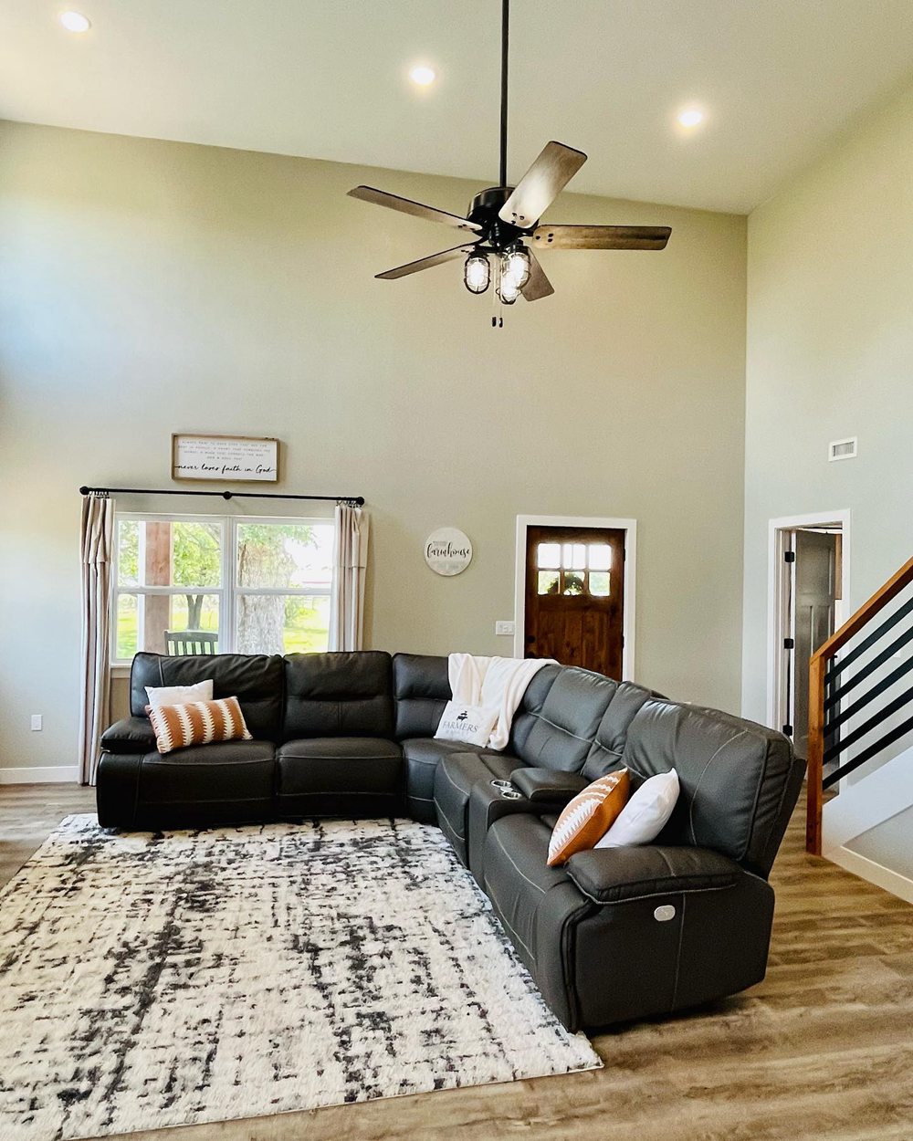
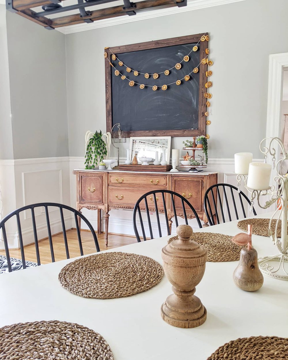
Sherwin Williams Mindful Gray
Sherwin Williams Repose Gray
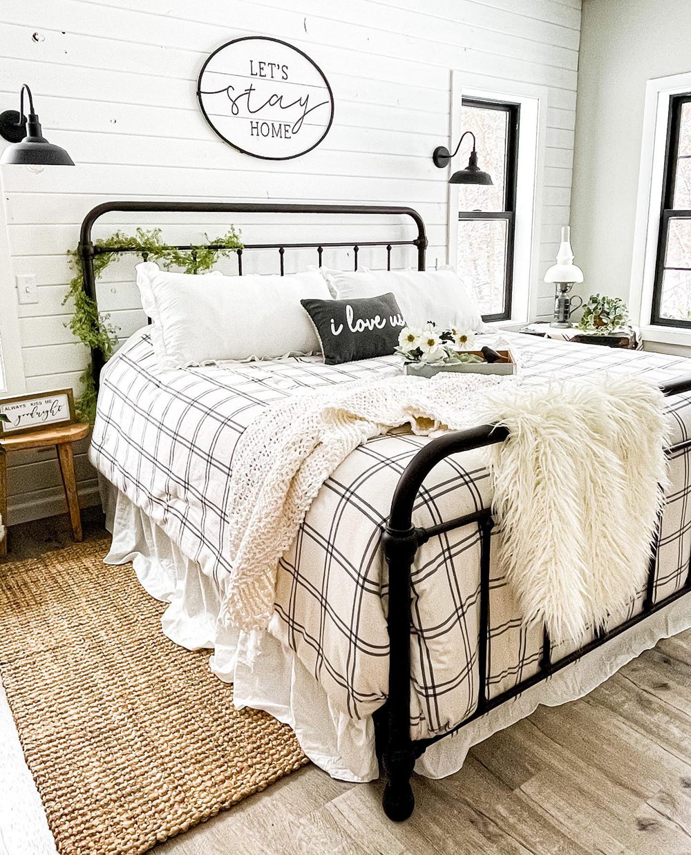
While they can overlap, Mindful Gray generally appears crisper and cooler than the warm tone of Repose Gray. But lighting affects their look.
Should I Choose Mindful Gray or Repose Gray?
So how do you decide between Sherwin Williams’ Mindful Gray or Repose Gray for your home? Here are some tips:
Choose Mindful Gray SW 7016 if you want:
- A cool, crisp gray
- A versatile color suitable for modern spaces
- An airy feel for offices and kitchens
- To allow bold accent colors to pop
Choose Repose Gray SW 7015 if you want:
- A warm, beige-influenced gray
- A cozy yet sophisticated neutral for bedrooms
- A versatile color that works with traditional decor
- A soft, welcoming backdrop
Get samples of both Mindful Gray and Repose Gray. Paint large sections on your walls viewing at different times of day. This gives you the best sense of how the undertones read in your environment.
You can also pair them with decor you already have to visualize the look. Both offer beautiful neutral tones that suit varied styles.
Ideal Room Pairings
Here are some rooms that are especially well-suited to Mindful Gray and Repose Gray paint colors:
Sherwin Williams Mindful Gray
- Offices
- Kitchens
- Bathrooms
- Accent walls
- Entryways
Sherwin Williams Repose Gray
- Bedrooms
- Living Rooms
- Dining Rooms
- Offices
- Libraries
While both neutrals work well throughout the home, the above applications make optimal use of their unique strengths.
Decorating Ideas and Color Pairings
On their own, Mindful Gray and Repose Gray create peaceful backdrops. Complement them with other colors and materials for gorgeous spaces:
Mindful Gray SW 7016 Pairings
- Sherwin Williams Rainwashed
- Black and white patterns
- Brushed nickel accents
- Navy blue and teal accents
Repose Gray SW 7015 Pairings
- Sherwin Williams Pure White
- Sherwin Williams Tricorn Black
- Black accent pieces
- Walnut wood finishes
- White trim
Mindful Gray vs Repose Gray – Which is Better?
So which neutral paint color is better for your home – Mindful Gray or Repose Gray?
Consider Mindful Gray SW 7016 if you want:
- A cool, crisp gray
- A versatile color suitable for modern spaces
- An airy feel for offices and kitchens
- To allow bold accent colors to pop
Consider Repose Gray SW 7015 if you want:
- A warm, beige-influenced gray
- A cozy yet sophisticated neutral for bedrooms
- A versatile color that works with traditional decor
- A soft, welcoming backdrop
While Mindful Gray offers modern crispness, Repose Gray provides subtle warm character.
Get samples before deciding. Either beautiful Sherwin Williams neutral you choose will suit your home perfectly.
Frequently Asked Questions
Still trying to decide between Mindful Gray or Repose Gray? Here are answers to some common questions:
What are the main differences between Mindful Gray and Repose Gray?
The main differences are their undertones. Mindful Gray is a cool crisp gray while Repose Gray is a warm, cozy beige-gray.
What colors complement Mindful Gray?
Mindful Gray looks beautiful paired with deep blues, blacks, whites, and brushed nickel accents for nice contrast.
Can you use Repose Gray in a bathroom?
Yes, Repose Gray’s warmth would complement white tile and black accents nicely in a bathroom.
Is Mindful Gray suitable for low light rooms?
Mindful Gray’s lower 48 LRV may not be ideal for dark spaces – consider Repose Gray’s 58 LRV instead.
Does Repose Gray come in eggshell finish?
Yes, Repose Gray is extremely versatile and comes in any sheen from flat matte to eggshell.