

When searching for the perfect soothing green-blue paint color, it’s easy to get stuck comparing two similar versatile shades from the same brand. At first glance, popular Sherwin Williams options Opaline SW 6189 and Sea Salt SW 6204 may appear nearly identical. But what really differentiates these two beautiful, muted greens?
In this guide, we’ll thoroughly compare Opaline vs Sea Salt to help you determine the ideal soothing green-blue paint for your home. We’ll analyze undertones, light reflectance, real-life photos, room pairings and more.
Let’s dive in!
Table of Contents
Overview of Key Differences
Before getting into the details, here is a quick overview of the main differences between Opaline and Sea Salt:
- Undertones – Opaline is a green-blue, Sea Salt leans blue
- Light Reflectance – Opaline LRV is 73, Sea Salt LRV is 63
- Use – Both suit modern, traditional and coastal styles
- Rooms – Opaline shines in bedrooms, Sea Salt excels in baths
- Availability – Both come in any sheen
Now let’s explore Opaline and Sea Salt more thoroughly.
Sherwin Williams Opaline SW 6189
With its muted, earthy green-blue appearance, Opaline SW 6189 creates a relaxing, welcoming backdrop well-suited for varied spaces. This versatile color complements any style beautifully.
Here are some details about Opaline:
- LRV: 73
- Undertones: Green-blue
- Finishes: Available in all sheens
- Rooms: Bedrooms, living rooms, dining rooms, nurseries
- Pairs Well With: Warm woods, white, black
Opaline is a weathered aqua green with subtle sage undertones. In certain lights it can read as a faded teal or slate blue. This soothing color has widespread appeal.
The 73 light reflectance value prevents Opaline from feeling too bold or bright. Opaline strikes a cheerful yet laidback balance suitable for most rooms.
This versatile green-blue complements both cool and warm accents nicely. Popular Opaline color pairings include:
- Sherwin Williams Pure White
- Natural wood tones
- Black iron lighting fixtures
- Creamy off-white trim
While suitable anywhere at home, Opaline truly excels in these restful spaces:
- Bedrooms – Calm and relaxing
- Living Rooms – Casual backdrop
- Dining Rooms – Soothing ambiance
- Nurseries – Playful yet peaceful
Opaline’s muted aqua tones help create a relaxing, welcoming feel perfect as an all-over home color. Use it to gently unify varied architectural details.
Sherwin Williams Sea Salt SW 6204
With its muted, airy green-blue appearance, Sea Salt SW 6204 creates an approachable, laidback backdrop suited for varied spaces. This versatile color works across many styles.
Here are some details about Sea Salt:
- LRV: 63
- Undertones: Blue-green
- Finishes: Any sheen
- Rooms: Bathrooms, bedrooms, kitchens, laundry rooms
- Pairs Well With: Warm woods, white, gray
Sea Salt is a weathered peacock blue with dominant sage green undertones. In certain lights it can take on a deeper sea glass tone. This soothing color has widespread appeal.
The 63 light reflectance value prevents Sea Salt from feeling too saturated or bold. Sea Salt strikes a cheerful yet casual balance suitable for most rooms.
This versatile green-blue complements both cool and warm accents nicely. Popular Sea Salt color pairings include:
- Sherwin Williams Pure White
- Warm wood tones
- Creamy off-white trim
- Gray linens and textiles
While suitable anywhere at home, Sea Salt truly excels in these restful spaces:
- Bathrooms – Spa-like ambiance
- Bedrooms – Calm and relaxing
- Kitchens – Fresh and laidback
- Laundry Rooms – Casual and inviting
Sea Salt’s muted aqua-green tones create a relaxing, coastal feel perfect as an all-over home color. Use it to gently unify varied architectural characteristics.
Comparing Opaline vs Sea Salt
Now that we’ve looked at Opaline and Sea Salt independently, let’s directly compare them:
Light Reflectance
Opaline and Sea Salt have similar LRVs of 73 and 63. Sea Salt will read just slightly lighter.
Undertones
Here’s the biggest difference – Opaline leans green while Sea Salt has dominant blue undertones.
Use & Rooms
Both suit most styles and spaces, though Opaline shines in bedrooms and Sea Salt excels in bathrooms.
Availability
Opaline and Sea Salt come in any sheen from matte to high gloss.
Style
Opaline trends more traditional, while Sea Salt has a casual laidback feel.
| Paint Color | Opaline SW 6189 | Sea Salt SW 6204 |
|---|---|---|
| LRV | 73 | 63 |
| Undertones | Green-blue | Blue-green |
| Use | Versatile wall color | Versatile wall color |
| Finish | Any sheen | Any sheen |
| Style | Traditional | Casual |
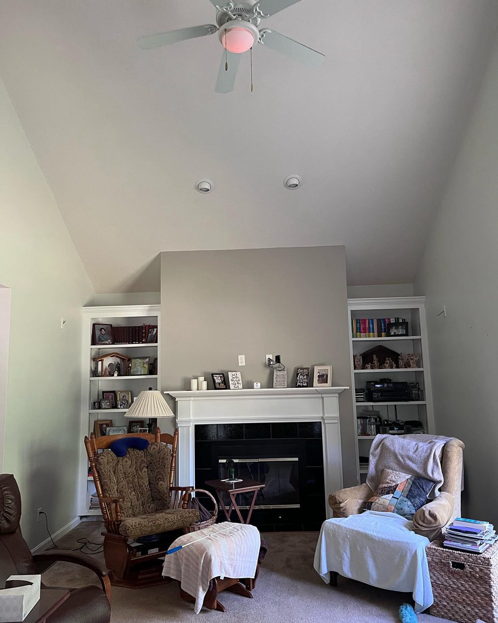
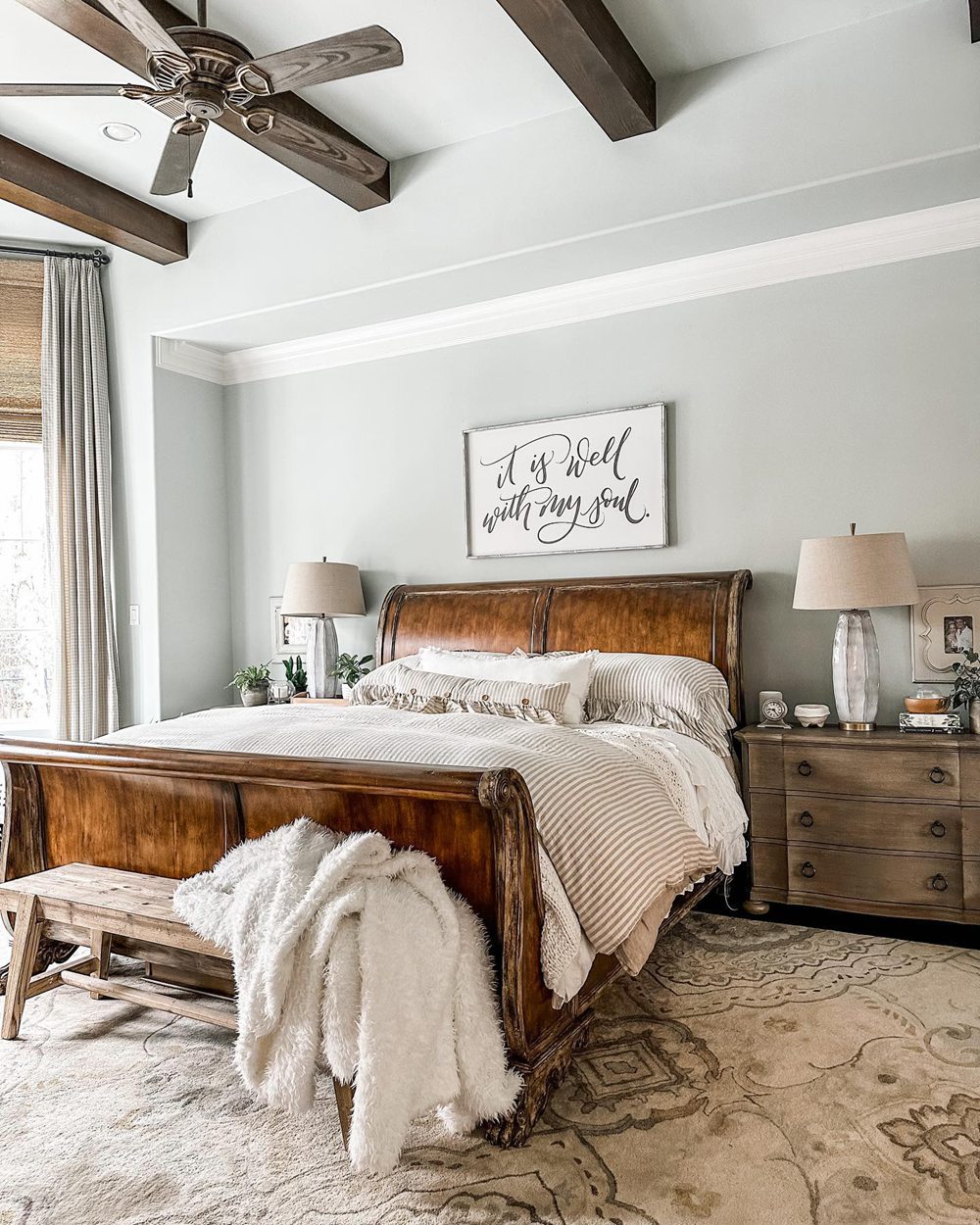
Real-Life Photos: Opaline vs Sea Salt
Let’s look at real-life photos to better visualize the differences between Opaline and Sea Salt:
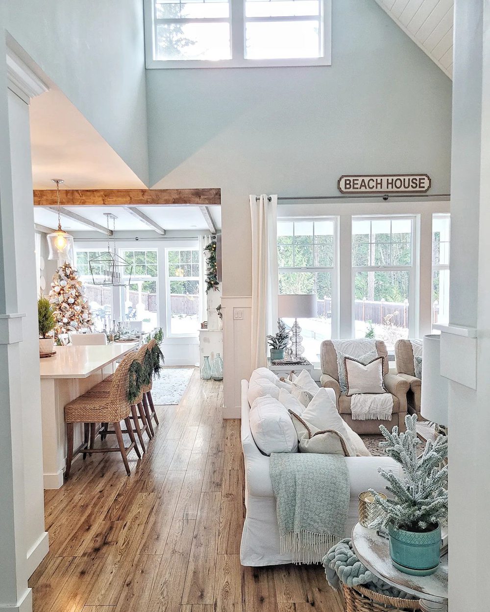
Sherwin Williams Opaline
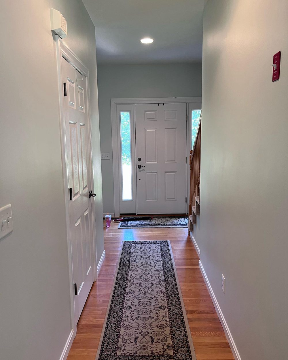
Sherwin Williams Sea Salt
While they appear similar at first, upon closer inspection you can see Opaline’s greener tones vs the blue in Sea Salt. Lighting plays a role in how they look.
Should I Choose Opaline or Sea Salt?
So how do you decide between Sherwin Williams’ Opaline or Sea Salt for your home? Here are a few tips:
Consider Opaline SW 6189 if you want:
- A muted sage green-blue
- A traditional, soothing ambiance
- A relaxing oasis for bedrooms
- An earthy organic look
Consider Sea Salt SW 6204 if you want:
- A weathered peacock blue-green
- A casual, laidback feel
- A coastal vibe for bathrooms
- A light airy atmosphere
Get samples of both Opaline and Sea Salt. Paint large patches on your walls to view throughout the day and night. The undertones can shift under different lighting conditions.
Also, hold decor items you plan to use next to the samples to envision how they’ll look together. Both colors complement most schemes beautifully.
Ideal Room Pairings
Here are some rooms especially well-suited to Opaline and Sea Salt paint colors:
Sherwin Williams Opaline
- Bedrooms
- Living Rooms
- Dining Rooms
- Nurseries
- Offices
Sherwin Williams Sea Salt
- Bathrooms
- Kitchens
- Laundry Rooms
- Bedrooms
- Entryways
While both work well throughout the home, the above applications take advantage of their slightly different undertones.
Decorating Ideas and Color Pairings
On their own, Opaline and Sea Salt make bold statements. Accent with these colors:
Opaline SW 6189 Pairs Well With:
- Sherwin Williams Pure White
- Black iron lighting fixtures
- Warm wood tones
- Creamy off-white trim
Sea Salt SW 6204 Pairs Well With:
- Sherwin Williams Pure White
- Warm wood tones
- Creamy off-white trim
- Gray linens and textiles
Whites, warm woods, black metals and neutral textiles beautifully complement both the green and blue undertones.
Opaline vs Sea Salt – Which is Better?
So which soothing green-blue paint color is better for your home – Opaline or Sea Salt?
Consider Opaline SW 6189 if you want:
- A muted sage green-blue
- A traditional, soothing ambiance
- A relaxing oasis for bedrooms
- An earthy organic look
Consider Sea Salt SW 6204 if you want:
- A weathered peacock blue-green
- A casual, laidback feel
- A coastal vibe for bathrooms
- A light airy atmosphere
Both are beautiful, soothing colors perfect for creating a relaxing retreat. Opaline has traditional character. Sea Salt feels laidback and coastal.
Get samples before deciding – lighting affects how their undertones come across. Either will beautifully enhance your home with tranquility and style!
Frequently Asked Questions
Still trying to decide between Opaline vs Sea Salt? Here are answers to some common questions:
What’s the main difference between Opaline and Sea Salt?
The main difference is Opaline leans more green, while Sea Salt has dominant blue undertones. Opaline is more traditional and Sea Salt more casual.
Which color would work better in a north facing room?
Sea Salt would add vibrancy to a north facing space without appearing too cold. Its greener undertone warms up the cooler light.
Can you use Opaline in a kitchen?
Absolutely! Opaline would give a kitchen a traditional, earthy feel. The sage green undertones are organic and inviting.
Is Sea Salt suitable for modern farmhouse styles?
Yes, Sea Salt’s casual coastal vibe would work nicely in a modern farmhouse. Its soft blue-green color pairs beautifully with traditional and contemporary elements.
What finish does Opaline come in?
Opaline is extremely versatile and comes in any finish from matte to high gloss enamel to match your style.