
When searching for the perfect blue paint color, the number of options can seem endless. Two popular shades that often get compared are Sherwin-Williams Sea Salt SW 6204 and Benjamin Moore Palladian Blue HC-144. But what really sets these beautiful blues apart?
In this in-depth guide, we’ll analyze Sea Salt vs Palladian Blue to help you find the right blue paint for your home. We’ll look at undertones, light reflectance, real-life photos, room pairings, and more.
Let’s dive in!
Table of Contents
Key Differences Between Sea Salt and Palladian Blue
Before getting into the details, here is an overview of the main differences between Sherwin-Williams Sea Salt and Benjamin Moore Palladian Blue:
- Undertones – Sea Salt is a green-blue, Palladian Blue is a purple-blue
- Light Reflectance – Sea Salt has an LRV of 63, Palladian Blue has an LRV of 60.4
- Use – Sea Salt suits relaxed coastal spaces, Palladian Blue has traditional elegance
- Rooms – Sea Salt shines in casual rooms, Palladian Blue excels in formal areas
- Availability – Palladian Blue comes in fewer finish options
Now let’s explore Sea Salt and Palladian Blue more thoroughly.
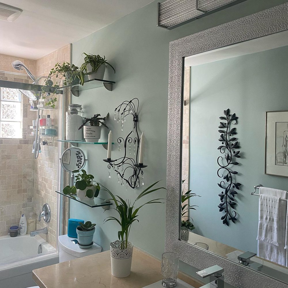
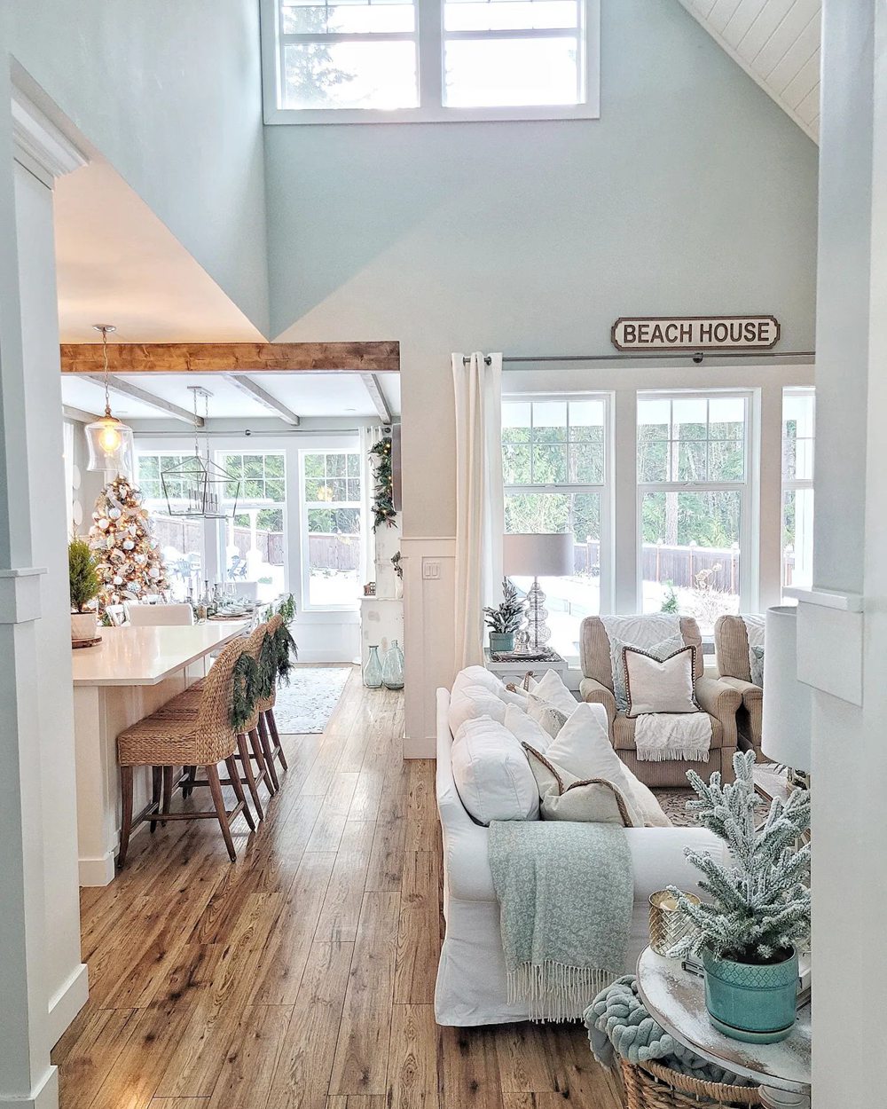
Sherwin-Williams Sea Salt SW 6204
With its soothing green-blue color, Sherwin-Williams Sea Salt SW 6204 creates a relaxed backdrop reminiscent of the beach. This versatile color works well across styles from casual to formal spaces.
Here are some details about Sea Salt:
- LRV: 63
- Undertones: Blue-green
- Finish: Available in all sheens
- Rooms: Casual spaces like bedrooms, baths, kids’ rooms
- Pairs Well With: Neutrals, whites, natural woods
Sea Salt is a muted medium-light blue-green with subtle cool undertones. In certain lights it can take on a soothing gray-blue or pale teal appearance. The green influence gives it a refreshing relaxed look.
The 63 light reflectance value keeps the color lively without being too bold. Sea Salt provides a good balance suitable for many rooms.
This versatile blue pairs beautifully with neutral and natural accents. Popular combinations include:
- Benjamin Moore White Dove
- Sherwin-Williams Repose Gray
- Natural wood finishes
- White trim and accents
- Green foliage
While workable in any space, Sea Salt looks especially inviting in these rooms:
- Bedrooms
- Kids’ Rooms
- Bathrooms
- Kitchens
- Casual Dining Rooms
Use its relaxing blue-green backdrop to create a casual coastal feel. Sea Salt keeps spaces feeling calm and peaceful.
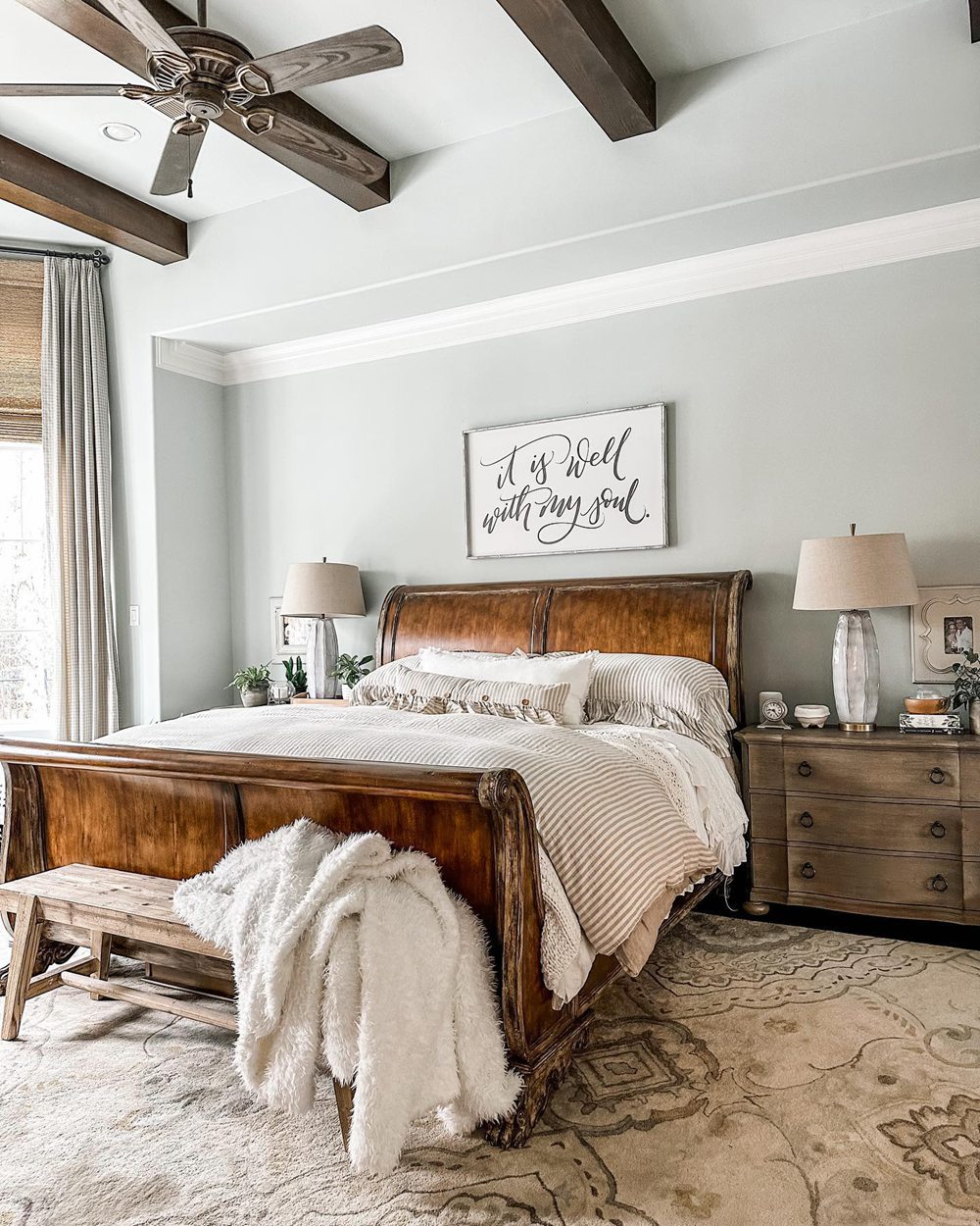
Benjamin Moore Palladian Blue HC-144
With its rich purple-blue hue, Benjamin Moore Palladian Blue HC-144 provides an elegant backdrop suitable for formal spaces. This timeless classic has traditional appeal.
Here are some details about Palladian Blue:
- LRV: 60.4
- Undertones: Violet-blue
- Finish: Eggshell, pearl, satin
- Rooms: Dining rooms, libraries, studies, powder rooms
- Pairs Well With: Whites, grays, gold accents
Palladian Blue is a medium-dark violet blue inspired by the iconic architecture of Italian Renaissance architect Andrea Palladio. In certain lights, it can take on a denim blue or periwinkle appearance. The blue-violet undertones give it an upscale elegant look.
Despite the dark base color, Palladian Blue’s 60.4 LRV keeps it from feeling too bold or intense. The rich chroma creates a dramatic but livable backdrop.
This versatile blue complements both warm and cool accents. Popular pairings include:
- Benjamin Moore Chantilly Lace
- Sherwin-Williams Repose Gray
- Benjamin Moore Wrought Iron
- Metallic gold and brass
- Crisp white trim
While usable in any room, Palladian Blue excels in these formal spaces:
- Dining Rooms
- Libraries
- Studies
- Foyers
- Powder Rooms
Its rich violet-blue tone helps create an upscale, elegant feel. Use Palladian Blue to add drama and sophistication.
Comparing Sea Salt vs Palladian Blue
Now that we’ve looked at Sea Salt and Palladian Blue separately, let’s directly compare them:
Light Reflectance
Sea Salt has an LRV of 63 compared to Palladian Blue’s 60.4 LRV. This makes Sea Salt noticeably lighter. Palladian Blue will feel darker and moodier.
Undertones
The main difference lies in undertones. Sea Salt is a tranquil green-blue. Palladian Blue is a dramatic violet-blue.
Use & Rooms
Sea Salt’s casual vibe suits relaxed spaces like bedrooms and baths. Palladian Blue’s elegance excels in formal dining rooms and studies.
Availability
Sea Salt comes in all paint sheens. Palladian Blue has fewer options, in eggshell, pearl, and satin finishes.
Sea Salt vs Palladian Blue Comparison Chart
| Paint Color | Sea Salt SW 6204 | Palladian Blue HC-144 |
|---|---|---|
| LRV | 63 | 60.4 |
| Undertones | Green-blue | Violet-blue |
| Use | Casual rooms | Formal rooms |
| Finishes | All sheens | Eggshell, pearl, satin |
| Style | Coastal, casual | Traditional, elegant |
Real-Life Photos: Sea Salt vs Palladian Blue
To better visualize the differences between Sea Salt and Palladian Blue, let’s look at real-life photos of the paint colors:
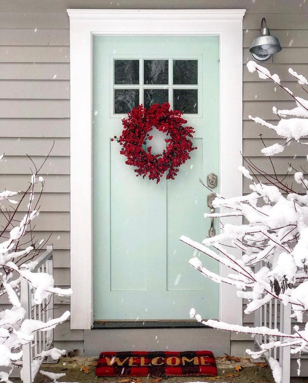
Sherwin-Williams Sea Salt
Benjamin Moore Palladian Blue
While the colors can appear similar in some lighting, Sea Salt reads as brighter and more casual compared to the deeper elegance of Palladian Blue.
Should I Choose Sea Salt or Palladian Blue?
So how do you decide between Sherwin-Williams Sea Salt or Benjamin Moore Palladian Blue for your home? Here are a few tips:
Choose Sea Salt SW 6204 if you want:
- A relaxing medium blue-green shade
- A casual color suitable for bedrooms and baths
- A versatile color that works in coastal or modern spaces
- Good light reflectance for a lively feel
Choose Palladian Blue HC-144 if you want:
- A rich dramatic violet-blue
- An elegant color perfect for formal dining rooms
- To accentuate traditional or transitional decor
- A moodier backdrop with some depth
When uncertain, get samples of both paint colors. Paint large sections on your walls and view at different times/lighting. This gives you the best sense of how they’ll look.
You can also visualize them alongside your existing decor. Both offer beautiful blue tones that complement most color schemes.
Ideal Room Pairings
Here are some rooms that work especially well with Sea Salt and Palladian Blue:
Sherwin-Williams Sea Salt
- Bedrooms
- Kids’ Rooms
- Bathrooms
- Kitchens
- Casual Dining Rooms
Benjamin Moore Palladian Blue
- Formal Dining Rooms
- Foyers
- Libraries
- Studies
- Powder Rooms
While both can work well in any space, the above rooms tend to make optimal use of their unique strengths and vibes.
Decorating Ideas and Color Pairings
On their own, Sea Salt and Palladian Blue create gorgeous backdrops. Complement them with other colors and materials for stunning spaces:
Sea Salt SW 6204 Pairings
- Benjamin Moore White Dove
- Natural wood finishes
- Rattan and woven textures
- White trim and ceilings
- Green foliage and accents
Palladian Blue HC-144 Pairings
- Sherwin-Williams Repose Gray
- Benjamin Moore Chantilly Lace
- Brass light fixtures
- White molding and wainscoting
- Benjamin Moore Wrought Iron
Sea Salt vs Palladian Blue: Which is Better?
So which blue paint color is better, Sea Salt or Palladian Blue?
Consider Sea Salt SW 6204 if you want:
- A tranquil medium blue-green for casual spaces
- Relaxed coastal or modern vibes
- Good light reflectance and livability
- A color suitable for kids’ and guest rooms
Consider Palladian Blue HC-144 if you want:
- A rich luxurious purple-blue
- Elegant drama perfect for formal dining rooms
- To accentuate upscale traditional decor
- A moody blue with some depth
While Sea Salt may be more casual and livable, Palladian Blue provides gorgeous elegance and charm.
Get color swatches before deciding. Either beautiful blue you choose will create a stunning backdrop for years.
Frequently Asked Questions
Still trying to choose between Sea Salt or Palladian Blue? Here are answers to some common questions:
What are the main differences between Sea Salt and Palladian Blue?
The main differences are their undertones and suitability for casual vs. formal spaces. Sea Salt is a tranquil green-blue. Palladian Blue is a dramatic purple-blue.
What colors pair well with Sea Salt?
Light neutrals like white, soft greens, and natural wood tones pair nicely with Sea Salt. It also complements other blues and greens beautifully.
What rooms does Palladian Blue work best in?
Palladian Blue looks stunning in elegant formal spaces like dining rooms, foyers, libraries, and powder rooms. Its drama and depth excel in these more sophisticated rooms.
Is Sea Salt considered a warm or cool paint color?
Sea Salt is considered a cool paint color due to its subtle blue-green undertones. It has a relaxing, tranquil vibe.
Can you use Palladian Blue in a north-facing room?
Palladian Blue’s 60.4 LRV means it’s dark enough for a north-facing room, but not so dark it feels dreary or gloomy. The rich color stays vibrant.