When searching for the perfect neutral paint color, two top choices are Benjamin Moore Revere Pewter HC-172 and Sherwin Williams Accessible Beige SW 7036. Both offer beautiful, versatile neutrals that work well across various design aesthetics. But what’s the difference between Revere Pewter and Accessible Beige? And how do you select the best one for your home?
In this guide, we’ll analyze Revere Pewter vs Accessible Beige in depth. We’ll look at undertones, light reflectance values (LRV), real-life photos, and ideal room applications for each color. Let’s dive in to determine whether the greenish Revere Pewter or beige Accessible Beige is the best neutral paint color for your home’s interior.
Table of Contents
Key Differences Between Revere Pewter and Accessible Beige
Before diving into specifics, here is an overview of the main differences between BM Revere Pewter HC-172 and SW Accessible Beige SW 7036:
- Undertones – Revere Pewter has green undertones, Accessible Beige has brown undertones
- LRV – Revere Pewter has an LRV of 55.05, Accessible Beige has an LRV of 58
- Use – Revere Pewter complements traditional styles, Accessible Beige contemporary décor
- Rooms – Revere Pewter excels in cozy spaces, Accessible Beige open concepts
Now let’s explore Revere Pewter and Accessible Beige more closely.
Benjamin Moore Revere Pewter HC-172
A beloved neutral paint color, Revere Pewter HC-172 by Benjamin Moore is a warm medium-light gray with green undertones. This versatile color works well across many design styles.
Here are some details about Revere Pewter:
- LRV: 55.05
- Undertones: Green-gray
- Finish: Available in all sheens
- Rooms: Living rooms, bedrooms, offices
- Color Pairings: Tans, yellows, blues
Featuring soft green-gray undertones, Revere Pewter has an organic, inviting look. In some lights it appears a true medium gray, while in others it takes on a subtle sage green cast. This makes Revere Pewter highly versatile.
At 55.05 light reflectance, Revere Pewter reflects a moderate amount of light. This gives enough illumination without being too stark. The green-gray tone gives Revere Pewter a natural, relaxed feel.
Use Revere Pewter HC-172 to create a gorgeous, welcoming backdrop. Its versatility allows it to coordinate beautifully with color schemes featuring tans, greens, yellows, and blues. It looks especially pleasing in these rooms:
- Living Rooms
- Bedrooms
- Offices
- Entryways
- Kitchens
Some colors that pair particularly well with Revere Pewter include:
- Benjamin Moore Simply White
- Benjamin Moore Edgecomb Gray
- Benjamin Moore Golden Straw
- Benjamin Moore Hale Navy
Sherwin Williams Accessible Beige SW 7036
A beloved neutral paint color, Accessible Beige SW 7036 by Sherwin Williams is a versatile beige with warm cream-brown undertones. This welcoming color works across many design aesthetics.
Here are some details about Accessible Beige:
- LRV: 58
- Undertones: Cream-brown
- Finish: Available in all sheens
- Rooms: Whole home color, especially living spaces
- Color Pairings: Tans, blues, grays
Featuring distinct cream-brown undertones, Accessible Beige has an approachable, inviting appearance. Depending on lighting, it can read as a true light brown or take on a slightly creamy ivory look. This makes it highly versatile.
With a 58 light reflectance value, Accessible Beige reflects ample illumination to keep rooms feeling brightly lit. The warm undertone gives this gorgeous neutral an uplifting feel.
Use Accessible Beige SW 7036 to create a welcoming, cohesive backdrop suitable for diverse design styles. This flexible beige looks especially pleasing in these rooms:
- Living Rooms
- Bedrooms
- Bathrooms
- Kitchens
- Dining Rooms
Some colors that pair beautifully with Accessible Beige include:
- Sherwin Williams Pure White
- Sherwin Williams Repose Gray
- Sherwin Williams Peppercorn
- Sherwin Williams Naval
Comparing Revere Pewter vs Accessible Beige
Now that we’ve looked at Revere Pewter and Accessible Beige individually, let’s compare them directly:
Light Reflectance
Revere Pewter and Accessible Beige have very similar light reflectance values, with Revere Pewter at 55.05 and Accessible Beige slightly higher at 58.
Undertones
The main difference lies in undertones. Revere Pewter has soft green-gray, while Accessible Beige has warm cream-brown.
Use
Revere Pewter’s traditional green-gray fits best with farmhouse and cottage styles. Accessible Beige’s warmth complements contemporary, modern spaces.
Rooms
Revere Pewter’s coziness excels in smaller bedrooms and offices. Accessible Beige’s brightness shines best in airy open concept kitchens and living areas.
Paint Finish
Both Revere Pewter and Accessible Beige come in any sheen from matte to high-gloss.
Pairings
Revere Pewter pairs well with off-whites, yellows, blues and wood tones. Accessible Beige coordinates beautifully with tans, grays, and brass metallics.
Revere Pewter vs Accessible Beige Comparison Chart
Here is an overview comparison of key differences between BM Revere Pewter HC-172 and SW Accessible Beige SW 7036:
| Paint Color | Revere Pewter HC-172 | Accessible Beige SW 7036 |
|---|---|---|
| LRV | 55.05 | 58 |
| Undertones | Green gray | Cream brown |
| Use | Traditional, farmhouse | Modern, contemporary |
| Rooms | Small cozy rooms | Bright open concepts |
| Sheens | All finishes | All finishes |
| Pairings | Off-whites, yellows, blues, woods | Tans, grays, brass metallics |
Real Life Photos: Revere Pewter vs Accessible Beige
To give a sense of how Revere Pewter and Accessible Beige compare in real spaces, let’s look at real life photos of the paint colors:
Revere Pewter HC-172
Accessible Beige SW 7036

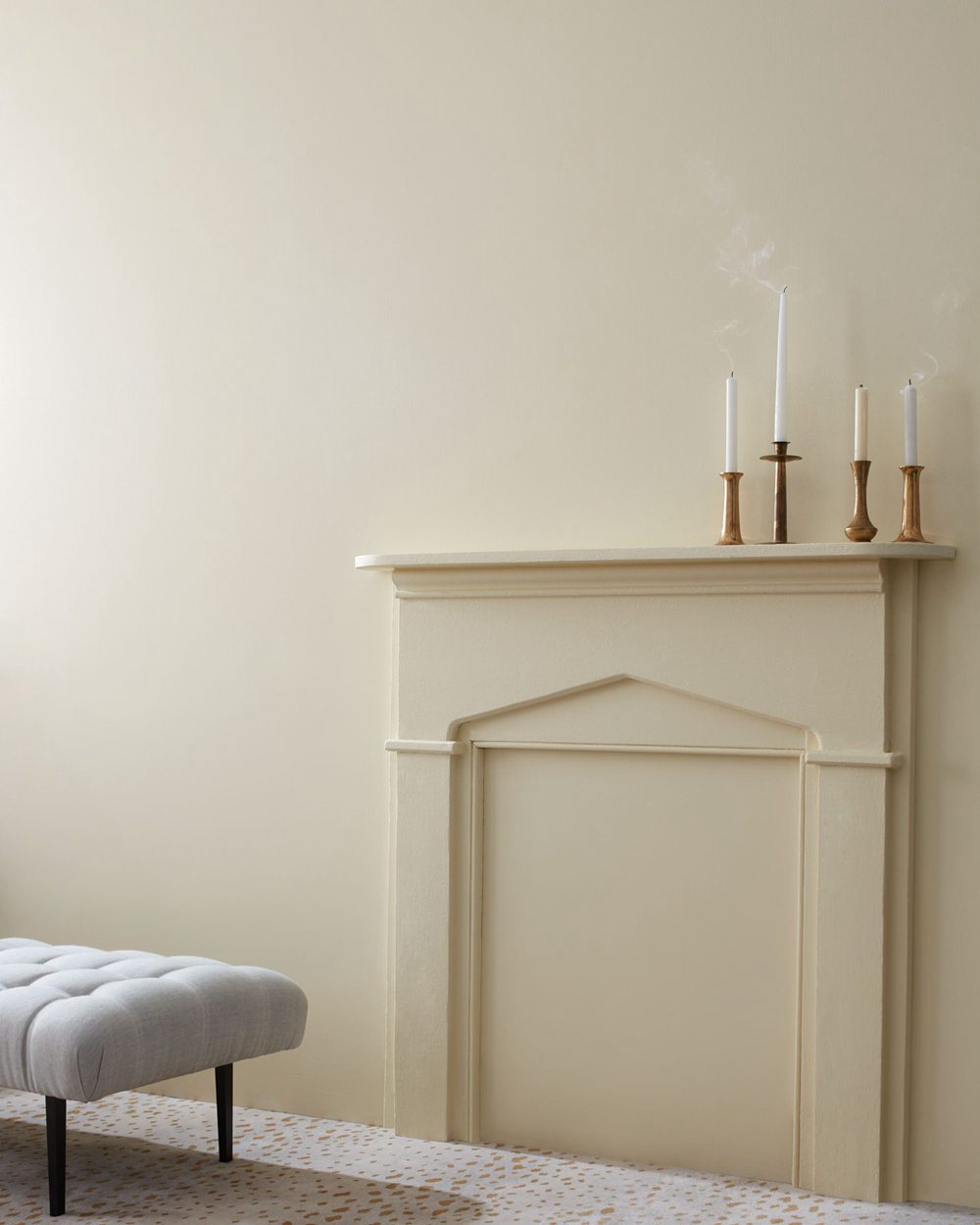
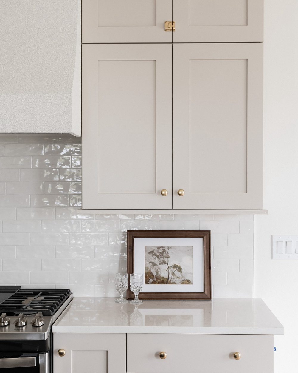
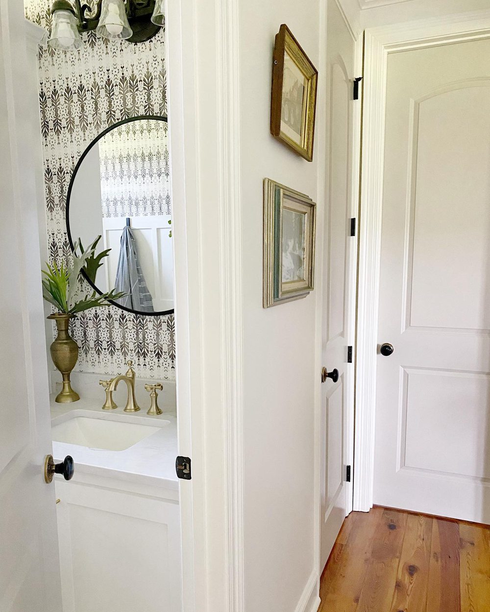
In real world spaces, Revere Pewter generally appears deeper and greener compared to the lighter beige Accessible Beige. But different lighting can impact their look. Overall, Revere Pewter feels more traditional while Accessible Beige has a contemporary vibe.
Should I Choose Revere Pewter or Accessible Beige?
So how do you decide between Benjamin Moore Revere Pewter or Sherwin Williams Accessible Beige for your home? Here are some tips:
Consider Revere Pewter HC-172 if you want:
- A greenish-gray for cozy, intimate spaces
- A relaxed, natural ambiance
- To complement traditional color palettes
- A “greige” with more color than very light tones
Consider Accessible Beige SW 7036 if you want:
- A light beige with warm cream-brown undertones
- An uplifting, bright neutral for open concepts
- A versatile foundation for modern styles
- A more lively alternative to basic beiges
To choose, get large paint samples and view in your actual space, at different times/lighting. See how the undertones come across and complement your décor.
While both are beautiful neutrals, Revere Pewter fits best in traditional cozier rooms and Accessible Beige bright open floor plans.
Best Rooms for Revere Pewter and Accessible Beige
Here are rooms that tend to be especially well suited to BM Revere Pewter HC-172 and SW Accessible Beige SW 7036:
Revere Pewter HC-172
- Bedrooms
- Offices
- Living Rooms
- Dining Rooms
- Libraries
Accessible Beige SW 7036
- Living Rooms
- Kitchens
- Bathrooms
- Open Floor Plans
- Hallways
Of course both can work anywhere, but the above applications maximize Revere Pewter’s coziness and Accessible Beige’s brightness.
Design Ideas Using Revere Pewter and Accessible Beige
On their own, Revere Pewter and Accessible Beige create simple backdrops. Use other paint colors, textures and decor to complete your room designs:
Revere Pewter Color Pairings
- Benjamin Moore Chantilly Lace (trim/ceiling)
- Benjamin Moore Gray Owl (accent wall)
- Medium wood floor stain
- Navy blue and white textiles
Accessible Beige Color Pairings
- Sherwin Williams Pure White (trim/ceiling)
- Polished chrome fixtures
- Grayish blue accent pillows
- Hardwood floor stain
Revere Pewter vs Accessible Beige: Which is Better for Your Home?
Is cozy Revere Pewter or bright Accessible Beige the better neutral paint color for your space? It depends on your style and goals:
Consider Revere Pewter if you want:
- A greenish-gray for intimate spaces
- To complement traditional color palettes
- A “greige” with more interest than plain beiges
- A warm, relaxing ambiance
Consider Accessible Beige if you want:
- A light beige with warm cream-brown undertones
- An uplifting, bright neutral for open concepts
- A lively alternative to basic beiges
- A cohesive backdrop for modern styles
Revere Pewter excels in cozier bedrooms, offices and traditional homes. Accessible Beige shines in airy living rooms and contemporary open floor plans.
Be sure to get large in-home paint samples before deciding. Both offer gorgeous neutral versatility – choose the one that fulfills your goals!
Frequently Asked Questions (FAQ)
Here are answers to some commonly asked questions about BM Revere Pewter HC-172 and SW Accessible Beige SW 7036:
What are the main differences between Revere Pewter and Accessible Beige?
The main differences are their undertones and lightness. Revere Pewter is a deeper green-gray while Accessible Beige is a lighter beige.
Does Revere Pewter have any purple or blue in it?
No, Revere Pewter does not have strong purple or blue undertones. It reads as primarily a green-influenced gray rather than a complex neutral.
What colors complement Accessible Beige?
Colors like light tans, grays, blues, and brass metals pair beautifully with Accessible Beige. Its cream-brown undertone provides a cohesive, welcoming backdrop.
Is Revere Pewter suitable for bathrooms?
Yes, Revere Pewter’s 55.05 LRV prevents bathrooms from feeling too dark. And its green-gray tone provides an organic, tranquil feel.
Can you use Accessible Beige in a kitchen?
Definitely. Accessible Beige’s 58 LRV prevents kitchens feeling dark while still providing warmth. Its versatility pairs with most cabinetry finishes.


