

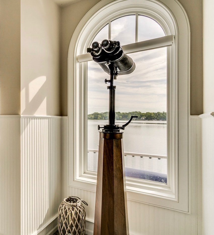
Dark wood floors can be absolutely beautiful. Their rich, warm tones add character and elegance to any room. However, finding the right paint color to pair with dark wood floors can be tricky. You want to choose a color that complements the floors without clashing or making the space feel too dark and heavy.
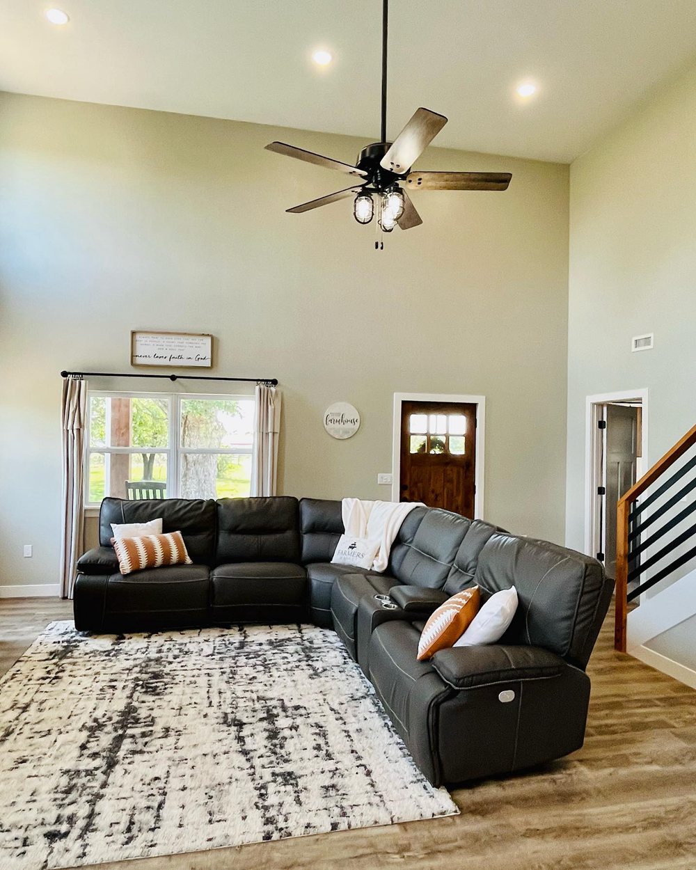
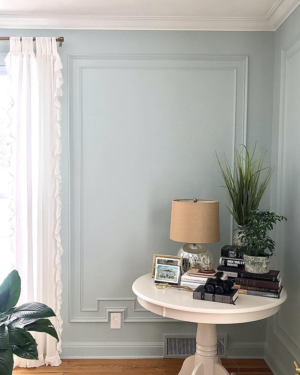
When selecting paint colors for rooms with dark wood floors, you’ll want to consider undertones. Cool paint colors like grays, blues and greens work well with warm-toned floors, while warm paint colors like tans, yellows and reds complement cool-toned gray or espresso floors. You’ll also want to pay attention to contrast. Oftentimes, lighter paint colors help dark wood floors stand out while preventing a cave-like feeling. Additionally, you’ll want to think about the size of the space. Small rooms can handle deeper, bolder paint colors while larger rooms look best with lighter, airier hues.
To help you select the perfect paint color for your dark wood floors, here are some of the best options to consider:
Table of Contents
Best Cool Paint Colors for Warm Wood Tones
For rich walnut, mahogany or cherry floors, cool paint colors in the gray, blue or green color families are your best bet. Here are some gorgeous options from Sherwin Williams and Benjamin Moore:
Cool Grays
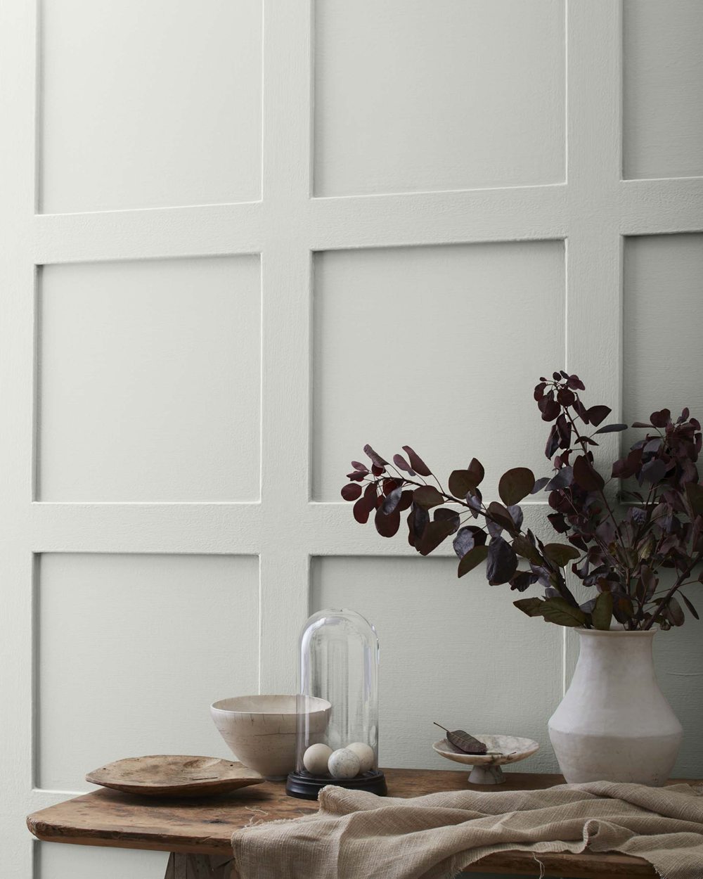
Sherwin Williams Repose Gray – This popular, pale gray has slight purple undertones that echo the lavender-brown hues found in many dark woods. It’s a fail-safe option for achieving a relaxed, neutral palette.
Benjamin Moore Gray Owl – For a true greige, this understated gray with subtle taupe notes pairs nicely with reddish woods like merlot or walnut without clashing. It’s ideal for spaces like living rooms and bedrooms.
Benjamin Moore Palladian Blue – Despite the name, this crisp, airy gray reads as a true neutral and provides a breath of fresh air against warm wood tones. Use it in entryways, kitchens or baths.

Sherwin Williams Mindful Gray – With its calming violet-gray tint, this breezy shade complements but doesn’t compete with walnut or mahogany floors. Use it in meditative spaces like bedrooms or reading nooks.
Lovely Blues
Benjamin Moore Covington Blue – This welcoming, powdery blue has just enough gray to accent reddish brown floors without feeling too cold. It’s an uplifting but soothing hue.

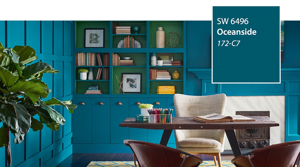
Sherwin Williams Oceanside – Capture the essence of coastal living with this relaxed teal-blue. Its mineral tones align with darker wood grains to create natural harmony. Use in laid-back spaces like dining rooms.
Sherwin Williams Rainwashed – Evoking gentle rains, this pale watery blue with sage hints is soothing and natural next to deep woodgrain. Let it wash over bedrooms or offices.
Gorgeous Greens
Sherwin Williams Aloe – As relaxing as its namesake plant, this restorative, muted green pairs nicely with woodsy brown hues. It cultivates tranquility in living spaces.
Benjamin Moore Grey Cashmere – A refined, dusty sage hue with gray undertones, it provides a sophisticated but natural backdrop for darker floors. Ideal for living and lounge areas.
Best Warm Paint Colors for Cool Wood Tones
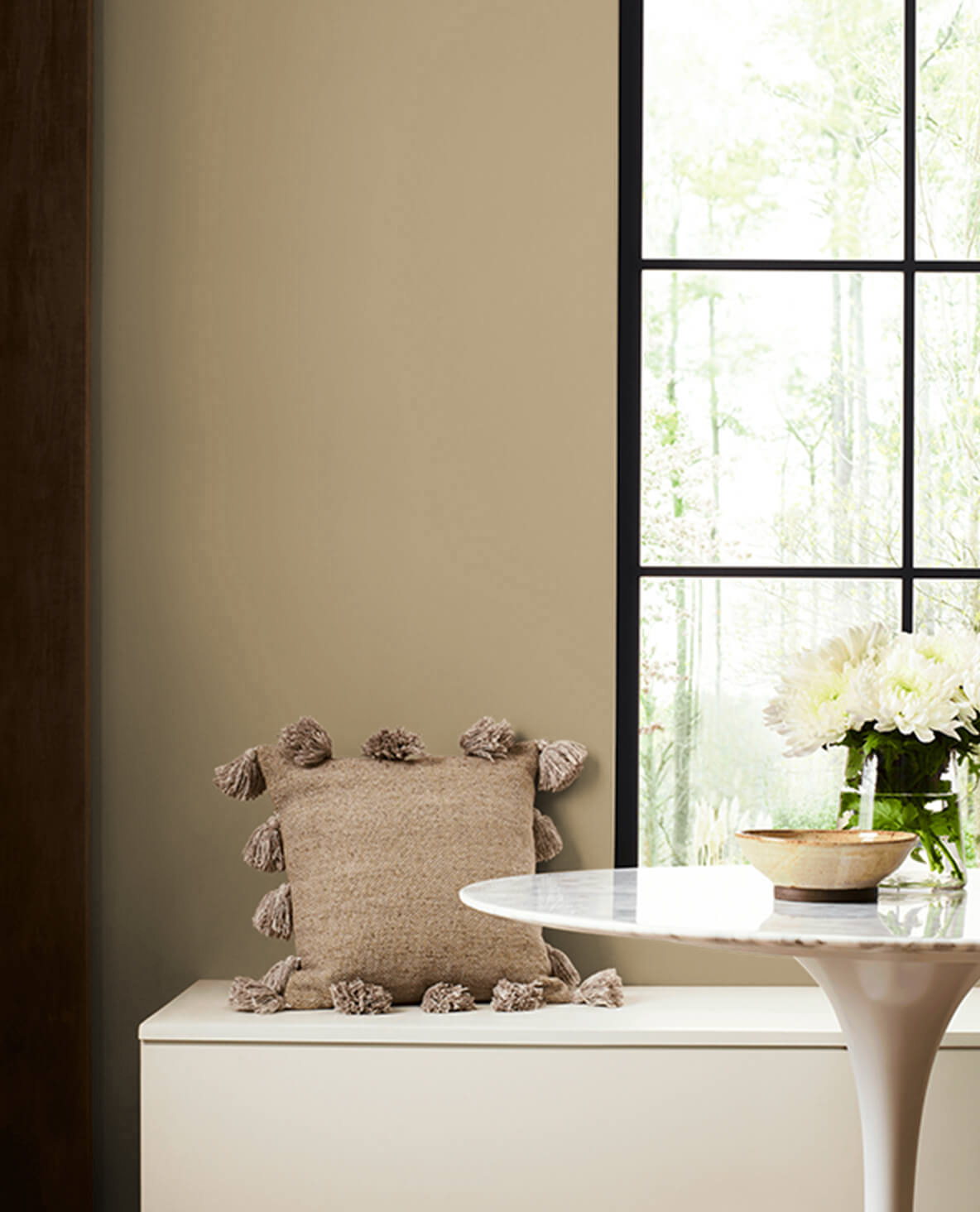
For oak, maple, ebony or gray-toned floors, warmer paint colors like tans, yellows, reds and oranges make ideal complements. Consider these stunning shades from Sherwin Williams and Benjamin Moore:
Toasty Tans
Sherwin Williams Accessible Beige – This bestselling neutral beige has a toasty warmth that flatters grayish wood floors. Use it to create a welcoming backdrop in living spaces and bedrooms.
Benjamin Moore Manchester Tan – Without veering orange, this earthy, clay-based tan adds coziness to ebony or cool-toned floors. It’s perfect for dens, dining rooms and more.
Sherwin Williams Repose Gray – Bring the American Southwest home with this earthy, desert-inspired hue. Its sand-colored warmth looks natural next to gray wood grains.
Cheery Yellows
Sherwin Williams Copen Blue – Bright but not overbearing, this refreshing sky blue perks up weathered gray floors. It cultivates energy in kitchens, offices and kids’ rooms.
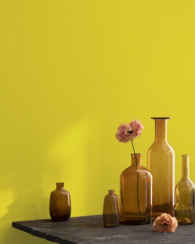
Benjamin Moore Lemon Meringue – This zesty, lemony yellow strikes a joyful balance – energetic but not neon. Its sunshine warmth flatters cool-toned woods.

Sherwin Williams Roycroft Suede – Sophisticated but cheerful, this warm golden tone lends a refined glow to gray-brown floors. Use in elegant dining rooms and living spaces.
Benjamin Moore Citron – Vibrant but soft, this daffodil yellow cheers up dark espresso floors. It’s playful but still livable in family rooms, kitchens and more.
Rich Reds/Pinks
Sherwin Williams Rosy Outlook – This radiant pink-beige hybrid warms up any space with cool-toned floors. Without being sugary, it emanates rosy optimism.
Benjamin Moore Caliente – Spicy but refined, this energizing reddish-orange infusion adds heat and richness to maple or ash floors. Use it to warm up foyers, dining rooms and offices.
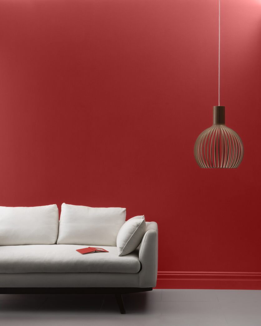
Sherwin Williams Redend Point – Sophisticated wine tones offer depth and drama against oak or ebony floors. Embrace luxury with this bold, elegant hue.
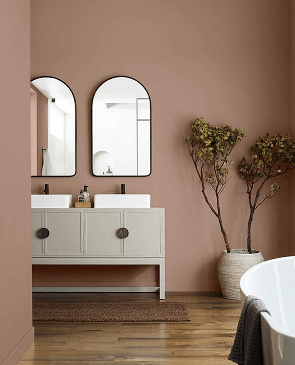
Benjamin Moore Indian Summer – Invigorating but earthy, this terra-cotta red pairs perfectly with gray grains for a grounded, natural look. Use in family rooms, dens and more.
Choosing Paint Colors Based on Room Size
Beyond coordinating with your floors’ undertones, it’s important to consider the size of each individual room when choosing paint colors. Here are some general guidelines:
For small rooms: Light, airy paint colors will make the space feel open and expansive. Stick to soft neutrals, pastels, and lighter shades of blue, green or yellow. Avoid darker, bold colors.
For medium rooms: You have more flexibility with bolder colors here. Try out stronger blues, greens, reds or tans – just opt for softer tones instead of deeply saturated hues.
For large rooms: Have fun with deeper, richer colors here. Darker neutrals, navy blues, emerald greens and wine reds all look stunning in big areas. Don’t be afraid of drama!
Paint Finish Recommendations
In addition to choosing the right hue, it’s important to use the appropriate paint finish for rooms with wood floors. Here are some top tips:
- For high-traffic areas like hallways, entryways and kids’ rooms, opt for an eggshell or satin finish. They’re easy to clean and hide scuffs.
- In formal dining rooms and living spaces, consider a satin or semi-gloss finish. They have a subtle sheen that makes trim really pop.
- For bedrooms and adult spaces, a matte or flat finish works well. They offer a velvety appearance and help hide imperfect walls.
- In bathrooms and laundry rooms that see moisture, use high-gloss paint. It creates a wipeable, water-resistant finish.
- For accent walls or trim, high-gloss enamel paint provides a durable, ultra-vibrant shine.
No matter what finish you choose, always properly prep and prime walls beforehand to ensure great coverage and adhesion.
Coordinating Wall Colors with Dark Wood Floors
Choosing the perfect wall color to coordinate with dark wood floors requires some technique.
Consider the primary light direction in the room and select wall colors that perfectly reflect that lighting. Slightly deeper tones can be used on walls with direct light, while walls with indirect light or backlighting need slightly lighter colors.
Factor in room size and light absorbency as well. Larger rooms can accommodate deeper, more light-absorbent hues. Smaller rooms require brighter tones, as dark colors can make them feel even smaller and darker.
Use the three-color rule by selecting three complementary colors – a main color, secondary color and accent color. The main color takes up the most surface area, typically the walls. Secondary colors are used for ancillary items like curtains and art. Accent colors are the pops of color in smaller doses.
Dual color schemes that use two different hues to define separate wall areas create nice visual depth, like darker main walls and lighter secondary walls.
Set up gradient transitions between the two wall colors to blur the lines and make the color layers flow naturally.
Pairing White Furniture with Dark Wood Floors
White furniture and dark wood floors form a striking contrast that creates contemporary style. Crisp white balances out the heaviness of the floors to prevent a gloomy feel. Dark grounds make white furniture silhouettes pop with sleek elegance.
Soft bridge colors like beige, gray, and pale sage transition between the white and dark to avoid visual shock. White furniture in velvet or with wood accents adds warmth and dimensionality. Area rugs define spaces while providing softness underfoot. Greenery and florals liven up the interplay between the two colors.
Best Paint Colors for Bedrooms with Dark Wood Floors
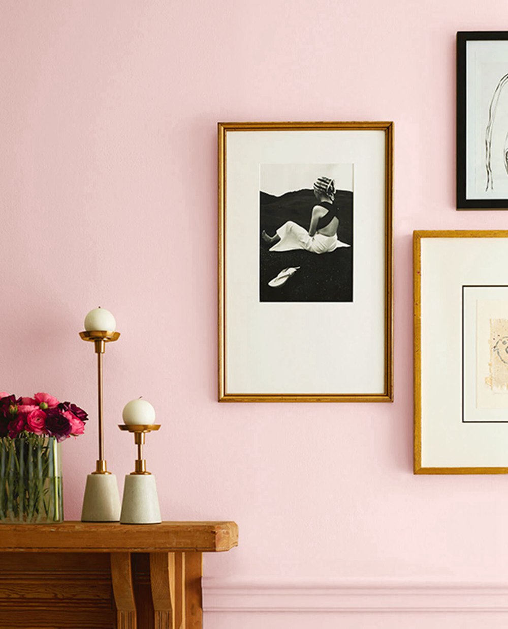
Dark wood creates a refined, grounded look in bedrooms, one of the most private and relaxing spaces. Warm whites feel fresh and breezy, perfect for pared-down styles. Soft blues and greens inspire tranquil spa feelings. Sophisticated grays provide a comforting neutral. Romantic mauves and blushes create a dream-like ambience. Natural fiber textures and earthy terracotta accents provide organic harmony. Strategic lamp lighting completes the cozy atmosphere.
Incorporating Dark Wood Floors in White Rooms
Stark white interiors feel clean and airy but can verge on sterile and devoid of warmth. Dark wood floors in moderation add welcoming texture and depth. Limit dark floors to anchor furniture arrangements, avoiding heaviness. Punch up dark pieces with lively wallpaper. Rugs soften the visual contrast while adding softness underfoot. Deep-hued curtains frame windows beautifully while controlling light. Metallic black accents like lamps and picture frames provide interest. Plants blend the disparate colors together for a harmonious balance.
Frequently Asked Questions
What are the best paint colors to make dark wood floors pop?
Lighter, airy paint colors help make dark wood floors really stand out. Soft grays, light blues, warm tans, and pale greens are perfect choices. Stay away from darker or bolder colors that might blend in too much with the floors.
Should you match or contrast wood floors with paint?
It depends on the look you’re going for, but matching undertones usually looks best. Cool-toned paints complement warm wood tones, while warm paint colors pair nicely with cooler floor finishes. Contrasting undertones can work in some cases, but take care not clash.
How do you choose a wall color for dark wood trim?
Look at undertones. Warm paint colors like certain tans, yellows, reds and golds make dark wood trim pop. Cool grays and blues can work too depending on the floor color. Lighten your selected paint color by 10-20% so the trim stands out.
Should kitchen cabinets match dark wood floors?
Not necessarily – it really comes down to personal preference. Matching cabinetry can look cohesive and blended, while contrasting cabinetry makes each element stand out more. For contrast, use a lighter wood tone or painted finish opposite very dark floors.
What sheen is best for dark wood floors?
A gloss or semi-gloss sheen enhances wood grain and richness. Satin is middle of the road – provides some sheen but isn’t too shiny. For a more matte look, go with an eggshell finish instead. Avoid flat, as it can show imperfections.