With so many gorgeous whites and off-whites on the market, it can be difficult to pick the perfect one for your home. Two of the most popular are Benjamin Moore’s White Dove OC-17 and Sherwin-Williams’ Alabaster SW 7008. But what really sets these beautiful, neutral paint colors apart?
In this guide, we’ll analyze White Dove and Alabaster in depth, comparing undertones, finishes, light reflectance, real photos, and ideal room uses. Read on to determine if White Dove or Alabaster is the best soft white for your interior design.
Table of Contents
Key Differences Between White Dove and Alabaster
Before diving into details, here is an overview of the main differences between White Dove and Alabaster:
- Undertones – White Dove has subtle warm pink, Alabaster has cool yellow-gray
- Light Reflectance – White Dove has an LRV of 83.16, Alabaster has an LRV of 82
- Look – White Dove is softer and warmer, Alabaster is crisper and cooler
- Use – White Dove suits traditional spaces, Alabaster better for modern rooms
- Rooms – White Dove recommended for bedrooms, Alabaster ideal for kitchens
Now let’s explore White Dove and Alabaster paint colors more closely.
Benjamin Moore White Dove OC-17
A beloved classic, White Dove OC-17 is the quintessential warm white. This versatile neutral provides a clean, welcoming backdrop.
Here are some key facts about White Dove:
- LRV: 83.16
- Undertones: Subtle pink beige
- Sheen: Available in all sheens
- Rooms: Whole home, especially bedrooms and living rooms
- Pairings: Grays, blues, greens, yellows
White Dove lives up to its name with a crisp white appearance coupled with the softest warm beige-pink undertone. In certain lighting, the pinkish tint emerges lending a gentle radiance.
With an 83.16 light reflectance value, White Dove supplies sufficient brightness for most spaces without feeling stark. The barely perceptible warmth prevents a sterile feel.
This versatile favorite complements both cool and warm palettes equally. Especially popular combinations include:
- Benjamin Moore Revere Pewter
- Benjamin Moore Coastal Fog
- Benjamin Moore Gray Owl
- Benjamin Moore Chili Pepper Red
Use White Dove to infuse spaces with quiet warmth and refinement. This elegant neutral backdrop works across styles from modern to farmhouse. It’s recommended for:
- Bedrooms
- Living rooms
- Dining rooms
- Offices
- Entryways
Sherwin-Williams Alabaster SW 7008
With its clean, bright white appearance, Alabaster SW 7008 immediately brightens up any space. This versatile neutral provides an airy backdrop.
Here are some key details about Sherwin-Williams’ Alabaster paint color:
- LRV: 82
- Undertones: Subtle cool green-gray
- Sheen: Flat, eggshell, satin, semi-gloss
- Rooms: Whole home, especially kitchens and baths
- Pairings: Grays, blues, greens
Alabaster is a gorgeous crisp white with the faintest whisper of green-gray. In certain lighting, it can read as an extremely subtle cool tone. Overall it remains very close to a true white.
With an 82 light reflectance value, Alabaster maximizes brightness. This makes it ideal for any space needing ample illumination. The barely perceptible coolness prevents it from feeling sterile.
Alabaster’s clean, fresh color immediately awakens rooms with its renewed look. This versatile neutral coordinates beautifully with both cool and warm accents. Especially popular combinations include:
- Sherwin-Williams Agreeable Gray
- Sherwin-Williams Oceanside
- Sherwin-Williams Naval
- Sherwin-Williams Peppercorn
Use Alabaster to create serene, airy spaces with an open, minimalist feel. This relaxed backdrop helps rooms feel uncluttered and tranquil. It works in any area but really excels in these:
- Kitchens
- Bathrooms
- Ceilings
- Trim/moldings
- Small spaces
Comparing White Dove and Alabaster
Now that we’ve looked at White Dove and Alabaster individually, let’s directly compare the two paint colors:
Light Reflectance
With LRVs of 83.16 and 82 respectively, Alabaster reflects a bit more light than White Dove. However, both offer sufficient brightness for most spaces.
Undertones
Here is where the main difference lies. White Dove has the subtlest hint of warm beige-pink. Alabaster has faint cool green-gray undertones.
White Dove’s barely perceptible pinkness gives it a soft, welcoming look. Alabaster’s coolness provides a brighter, crisper appearance.
Uses
Thanks to its slightly higher reflectance and crispness, Alabaster works well throughout homes for a cohesive brightness.
White Dove’s subtle warmth makes it ideal for living areas where a welcoming vibe is preferred. Its tone remains flexible across spaces though.
Aesthetic
White Dove’s faint pinkness gives it an elegant, transitional look perfect for traditional decors.
Alabaster’s barely-there coolness lends a brighter, more contemporary vibe suited to modern spaces.
White Dove vs Alabaster Comparison Chart
Here is an overview of some key differences between White Dove and Alabaster:
| Paint Color | White Dove OC-17 | Alabaster SW 7008 |
|---|---|---|
| LRV | 83.16 | 82 |
| Undertones | Pink beige | Green-gray |
| Use | Bedrooms, living rooms | Kitchens, baths, trim |
| Aesthetic | Traditional, transitional | Modern, contemporary |
| Sheen | All sheens | All sheens |
Real Room Photos – White Dove vs Alabaster
To better visualize the variations between White Dove and Alabaster, let’s look at real room photos showcasing the paint colors:
White Dove
A beloved classic, White Dove OC-17 is the quintessential warm white. This versatile neutral provides a clean, welcoming backdrop.
Here are some key facts about White Dove:
- LRV: 83.16
- Undertones: Subtle pink beige
- Sheen: Available in all sheens
- Rooms: Whole home, especially bedrooms and living rooms
- Pairings: Grays, blues, greens, yellows
White Dove lives up to its name with a crisp white appearance coupled with the softest warm beige-pink undertone. In certain lighting, the pinkish tint emerges lending a gentle radiance.
With an 83.16 light reflectance value, White Dove supplies sufficient brightness for most spaces without feeling stark. The barely perceptible warmth prevents a sterile feel.
This versatile favorite complements both cool and warm palettes equally. Especially popular combinations include:
- Benjamin Moore Revere Pewter
- Benjamin Moore Coastal Fog
- Benjamin Moore Gray Owl
- Benjamin Moore Chili Pepper Red
Use White Dove to infuse spaces with quiet warmth and refinement. This elegant neutral backdrop works across styles from modern to farmhouse. It’s recommended for:
- Bedrooms
- Living rooms
- Dining rooms
- Offices
- Entryways
Alabaster
With its clean, bright white appearance, Alabaster SW 7008 immediately brightens up any space. This versatile neutral provides an airy backdrop.
Here are some key details about Sherwin-Williams’ Alabaster paint color:
- LRV: 82
- Undertones: Subtle cool green-gray
- Sheen: Flat, eggshell, satin, semi-gloss
- Rooms: Whole home, especially kitchens and baths
- Pairings: Grays, blues, greens
Alabaster is a gorgeous crisp white with the faintest whisper of green-gray. In certain lighting, it can read as an extremely subtle cool tone. Overall it remains very close to a true white.
With an 82 light reflectance value, Alabaster maximizes brightness. This makes it ideal for any space needing ample illumination. The barely perceptible coolness prevents it from feeling sterile.
Alabaster’s clean, fresh color immediately awakens rooms with its renewed look. This versatile neutral coordinates beautifully with both cool and warm accents. Especially popular combinations include:
- Sherwin-Williams Agreeable Gray
- Sherwin-Williams Oceanside
- Sherwin-Williams Naval
- Sherwin-Williams Peppercorn
Use Alabaster to create serene, airy spaces with an open, minimalist feel. This relaxed backdrop helps rooms feel uncluttered and tranquil. It works in any area but really excels in these:
- Kitchens
- Bathrooms
- Ceilings
- Trim/moldings
- Small spaces
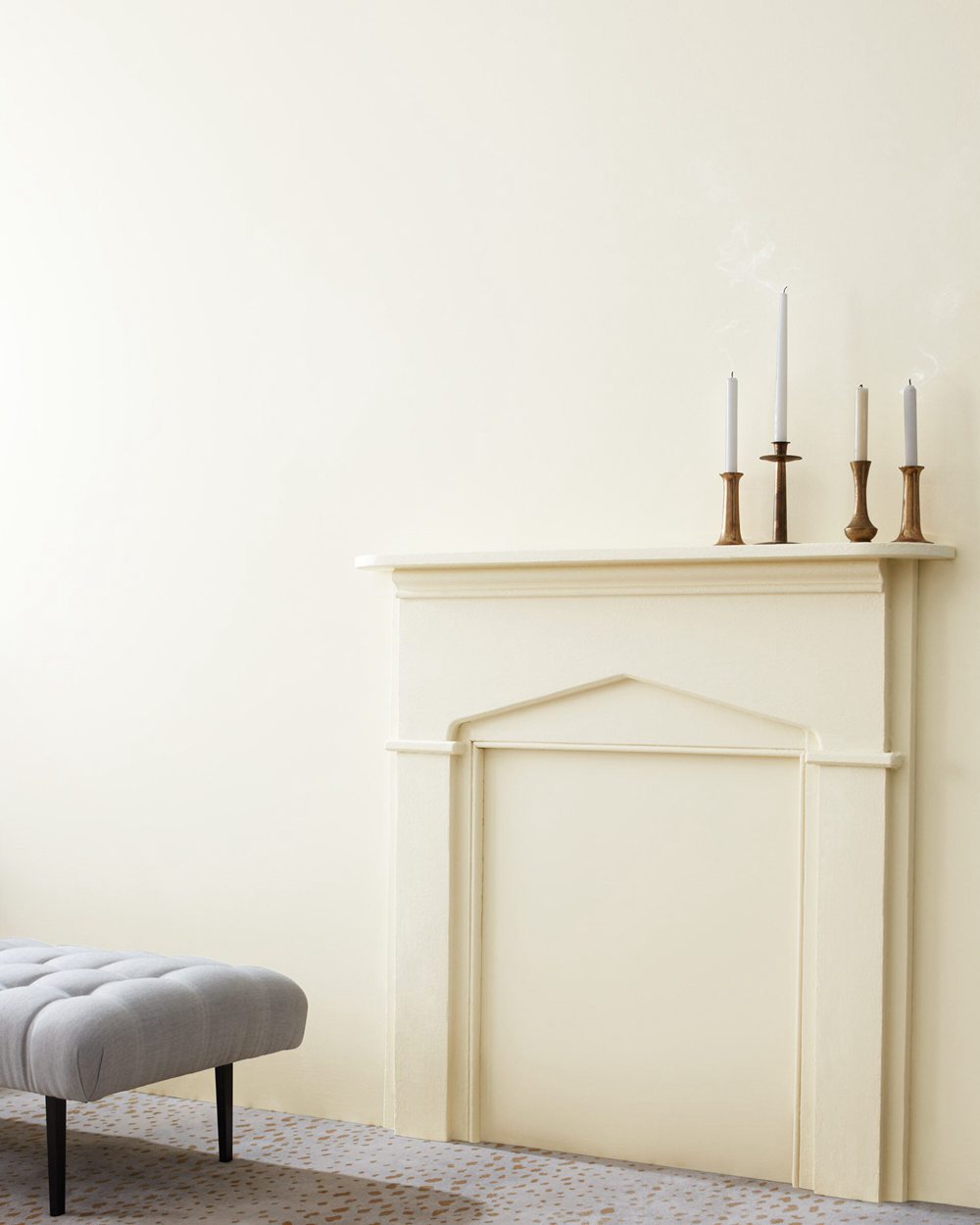
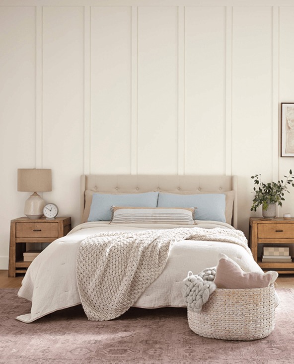
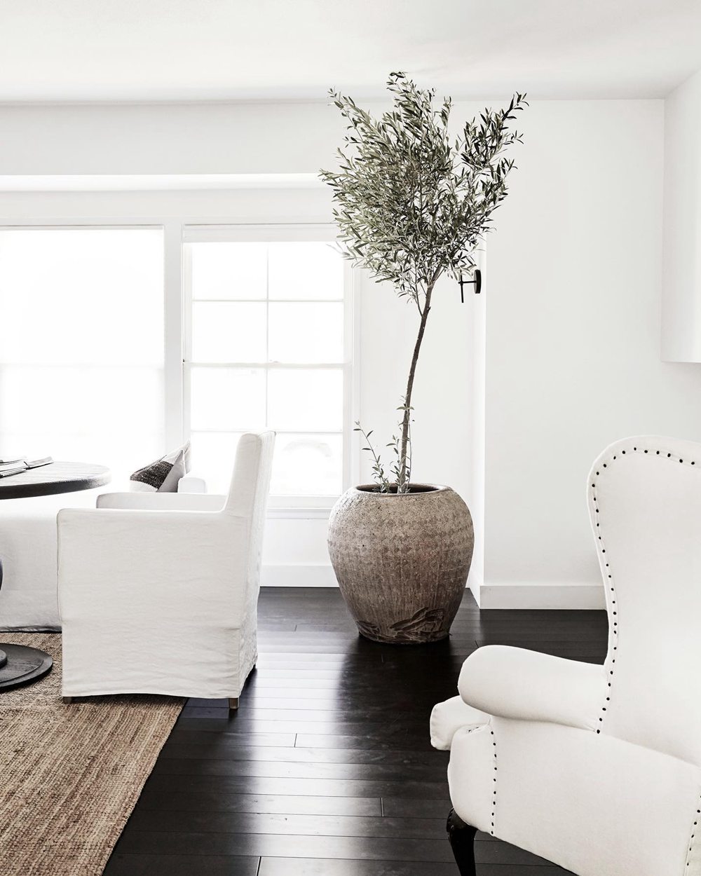
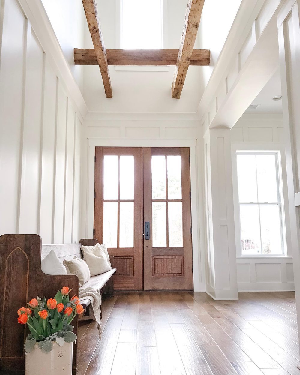
In the photos, White Dove comes across as softer and warmer, while Alabaster appears crisper and brighter. But lighting affects their look – they can seem quite similar in some conditions.
Should I Choose White Dove or Alabaster?
So how do you decide between White Dove vs Alabaster for your home? Here are a few tips:
Choose White Dove if you want:
- A white with subtle warm pink undertones
- A welcoming backdrop for bedrooms and living areas
- A soft, flexible neutral across styles
- Understated elegance and warmth
Choose Alabaster if you want:
- A clean, bright white with barely cool undertones
- Crisp, airy feel for kitchens and baths
- A versatile foundational color
- A modern, minimalist look
It’s best to get samples of both paint colors. Paint large sections on your walls and view at different times of day. This will give you the clearest sense of which hue you prefer in your unique lighting environment.
While quite different, both White Dove and Alabaster are beautiful classics. Choose the one best aligned with your goals and style vision.
Ideal Room Combinations
Here are some rooms that are particularly well-suited to White Dove and Alabaster:
White Dove OC-17
- Bedrooms
- Living rooms
- Dining rooms
- Offices
- Hallways
Alabaster SW 7008
- Kitchens
- Bathrooms
- Ceilings
- Doors/trim
- Small spaces
With their soft hues and sufficient light reflectance, White Dove and Alabaster work well throughout homes. But the above applications tend to perfectly complement each shade’s individual strengths.
Decorating Ideas and Color Pairings
On their own, White Dove and Alabaster create clean and elegant backdrops. Complement them with colors and textures for beautifully designed rooms:
White Dove Color Pairings
- Benjamin Moore Revere Pewter
- Benjamin Moore October Mist
- Benjamin Moore Edgecomb Gray
- Benjamin Moore Black Forest Green
- Wood furniture, wool, velvet
Alabaster Color Pairings
- Sherwin-Williams Repose Gray
- Sherwin-Williams Oceanside
- Sherwin-Williams Naval
- Sherwin-Williams Peppercorn
- Marble, metal, glass
White Dove vs Alabaster: Which is Best for Your Home?
So which neutral white is better for you, White Dove or Alabaster? Consider your goals and style:
Choose White Dove if you want:
- A white with subtle warm pink undertones
- A soft, welcoming backdrop for bedrooms/living rooms
- Flexibility to complement any color scheme
- Elegant warmth across styles
Choose Alabaster if you want:
- A crisp, bright white with faint coolness
- Airy, contemporary feel for kitchens and baths
- A true white for a minimalist look
- Modern, versatile cohesion throughout home
White Dove provides refined, flexible warmth. Alabaster delivers contemporary cool brightness.
Test them in your lighting before deciding. Either will create a beautiful, functional foundation.
Frequently Asked Questions
Still trying to decide between White Dove and Alabaster? Here are answers to some commonly asked questions:
Which white reflects more light, White Dove or Alabaster?
Alabaster has a slightly higher LRV of 82 than White Dove at 83.16 light reflectance. But both offer sufficient illumination.
What undertone does Alabaster have?
Alabaster has the faintest whisper of cool green-gray undertones. In most lights it appears as a true, crisp white.
Is White Dove warm or cool?
White Dove is a warm undertone white, with very subtle hints of pink beige. Its warmth is extremely understated.
Can you use Alabaster on ceilings?
Yes, Alabaster’s 82 LRV makes it an excellent ceiling white. It reflects light well to prevent ceilings looking dark.
What colors go well with White Dove?
White Dove pairs beautifully with both cool and warm hues like Revere Pewter, Edgecomb Gray, Hale Navy and Chili Pepper Red.


