

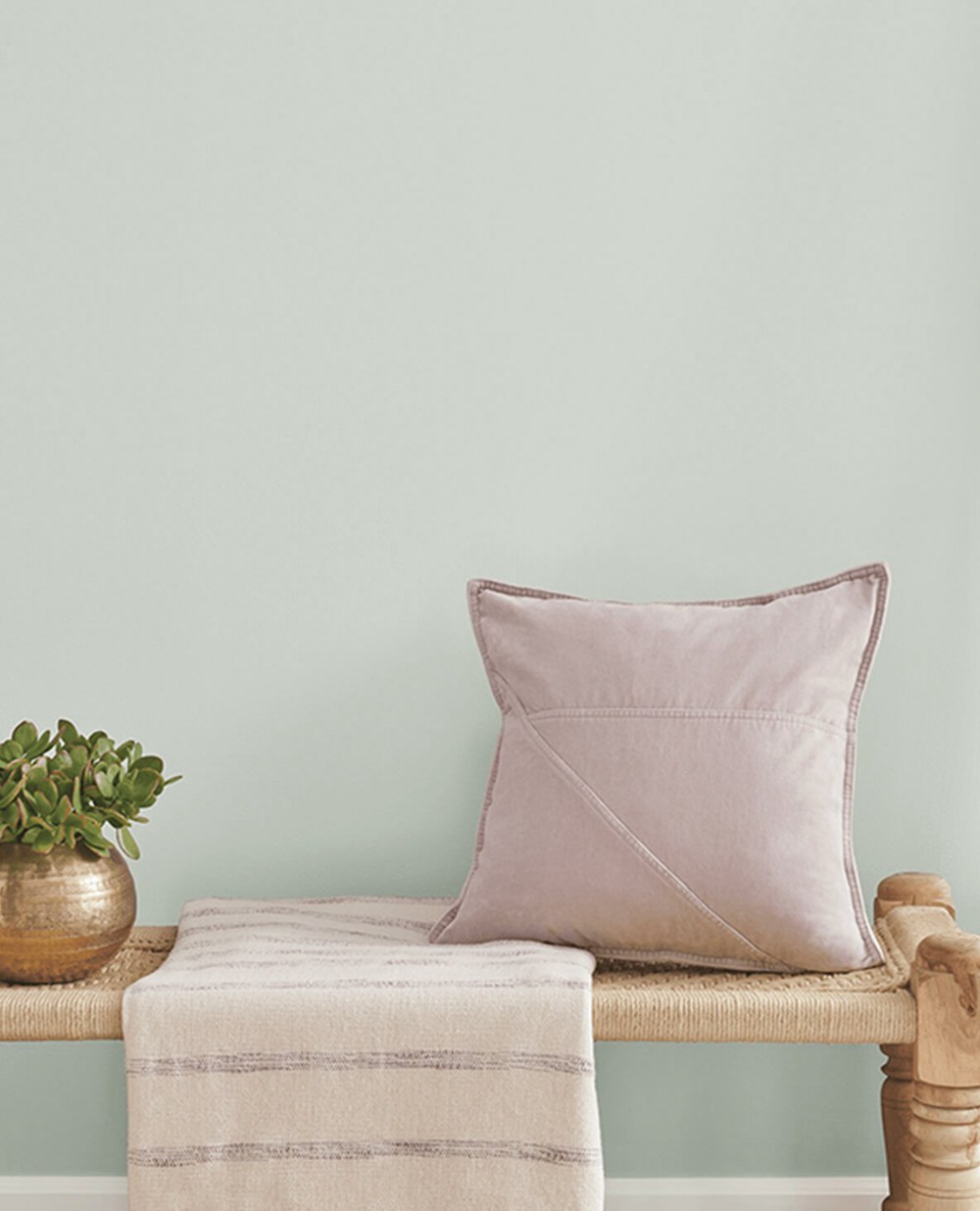
Neutral blue paint colors straddle the line between cool gray and bold blue. With undertones of beige, green and purple, these muted shades add subtle depth without overwhelming. If you love blue but find pure blues too intense, neutral blue is the perfect in-between.
Below are 20 beautiful neutral blue paint colors ranging from soft and hazy to crisp and saturated.
Table of Contents
What Are Neutral Blue Paint Colors?
Neutral blue paint encompasses a range of blue-grays from very pale to mid-tone. They have lower color saturation, giving them a softer, more subtle look than true blues.
There are a few main types of neutral blue paint:
- Blue-grays – Blends of blue and gray, some with green or purple undertones. The gray grounds the blue, making it more neutral.
- Periwinkle blues – Light blue with hints of lavender or violet. The lavender softens the vibrancy of the blue.
- Powder blues – Very pale blue tinted with white/gray. The white mutest the blue dramatically.
Now let’s explore 20 gorgeous neutral blue paint colors to use in your home.
20 Best Neutral Blue Paint Colors
1. Benjamin Moore Wythe Blue
A gorgeous green-tinted blue inspired by sea glass. Crisp yet perfectly neutral. Use it in beachy rooms or to add an uplifting touch of color.
2. Sherwin-Williams Online
A muted slate blue with subtle sage undertones. A perfect accent color that won’t overwhelm. Try it on trims, doors or accent walls.
3. Behr Jazz Blue
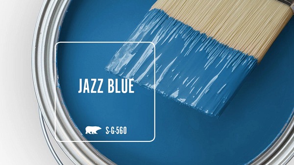
A muted teal blue that energizes without overwhelming. Jazz Blue is vibrant but still highly adaptable. Use it anywhere you want a punch of color.
4. Benjamin Moore Gray Cashmere
A soft blue-gray evocative of luxurious cashmere. Its cozy warmth is beautiful in bedrooms, living rooms and studies.
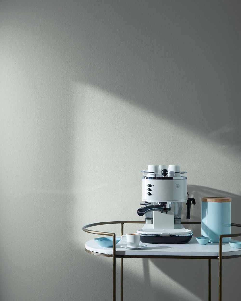
5. Sherwin-Williams Sea Salt
A gorgeous blue-gray reminiscent of the ocean. Its inherent relaxation makes it ideal for destressing bedrooms, baths or offices.
6. Benjamin Moore Harbor Haze
A hazy, atmospheric blue-gray perfect for coastal cottages. It captures the essence of misty shorelines. Use it everywhere for a beachy retreat.
7. Sherwin-Williams Raindrop
A soothing, subtle blue-gray that reads as a neutral. Raindrops provides tranquility without overwhelming a space. Use it as a lighter neutral alternative to gray.
8.Benjamin Moore Blue Danube
A dusty blue with green undertones. Blue Danube energizes while still maintaining versatility. Much livelier than a neutral gray but less dramatic than a primary blue.
9. Benjamin Moore Palladian Blue
A rich, dramatic blue with strong gray undertones. Its striking sophistication makes it stunning in more formal dining rooms, libraries, and parlors.
10. Benjamin Moore Hale Navy
A darker navy blue that pairs perfectly with crisp whites. Its classic nautical vibe works in coastal, cottage, and traditional spaces.
11. Sherwin-Williams Rainwashed
A relaxing slate blue-gray reminiscent of rainy skies. Its soothing tranquility makes it ideal for self-care spaces like spas, yoga rooms and bedrooms.
12. Behr Aegean Blue
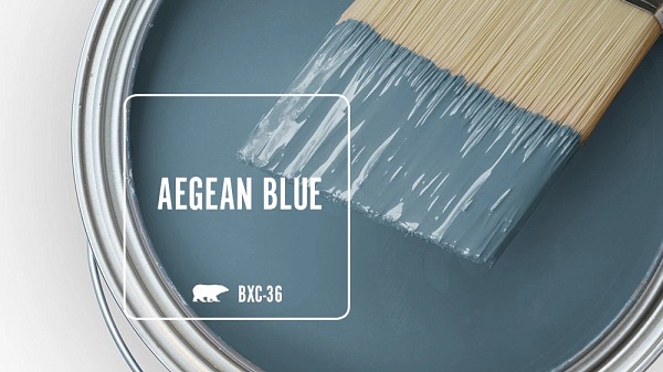
A breezy turquoise blue ideal for beachy, tropical spaces. Much bolder than a blue-gray but still relatively neutral compared to primary blues.
13. Benjamin Moore Iron Mountain
A saturated dark gray-blue that reads as a neutral. Its smoky richness adds striking drama without overwhelming. Use in modern living rooms, dining rooms and offices.
14. Behr Blue Vortex
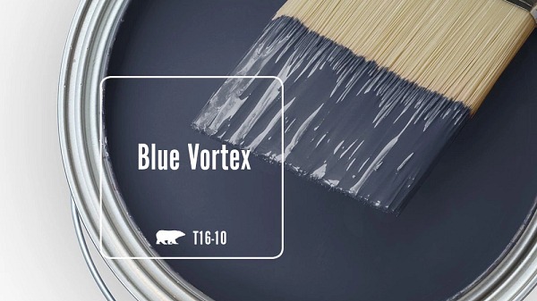
A dynamic, energizing royal blue for adding spice to any space. While vibrant, it’s muted enough to use almost anywhere you want to liven things up.
15. Benjamin Moore White Heron
A gorgeous crisp blue white. As ethereal as a cloud yet still grounded by its subtle blue tones. Endlessly versatile.
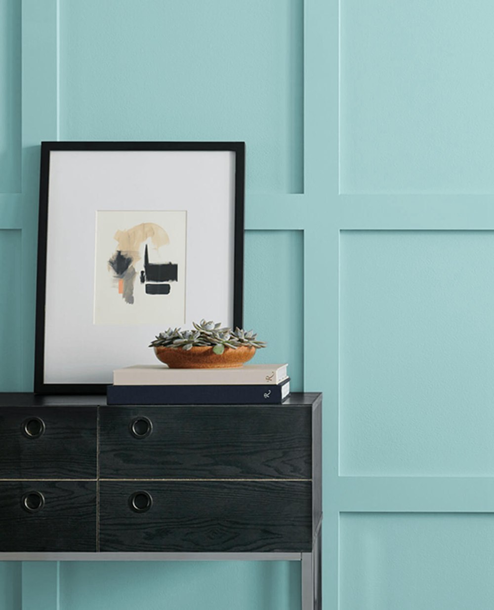
16. Sherwin-Williams Tradewind

A tropical, ocean-inspired teal aqua. Its laidback energy makes it perfect for beachy casual spaces. Use it throughout a coastal cottage.
17. Behr Clear Vista
A bright azure blue that energizes the spirit. While playful, it’s adaptable enough for use beyond kids’ rooms. Uplifting in any space needing joy.
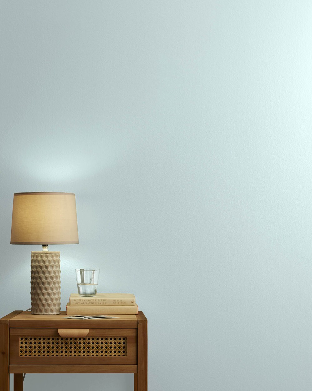
18. Benjamin Moore Baby’s Breath
The palest blue, almost white. Its barely-there blue tint gives it an airy, dreamy quality without overwhelming. Perfect for a nursery.
19. Sherwin-Williams Nebulous Blue
A soft periwinkle blue with hints of violet. Its inherent femininity makes it ideal for girls’ rooms. Also lovely in bedrooms.
20. Behr Hopeful Dream
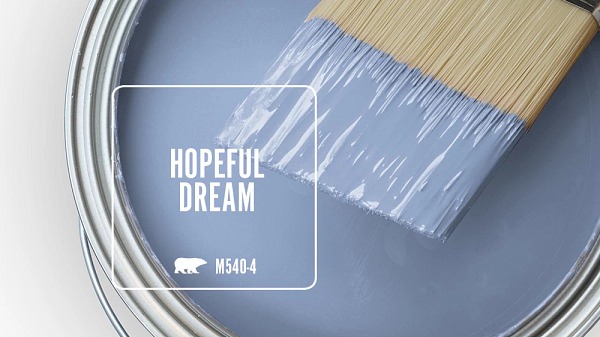
A relaxing sky blue-gray. Its misty tranquility makes it ideal for destressing bedrooms, baths, and offices. The perfect hue for self-care.
Benefits of Neutral Blue Paint
Compared to bold primary blues, neutral blues offer advantages:
Calming
While still uplifting, neutral blues are more relaxing than primary blues. Their muted tones don’t overwhelm or overstimulate. You can enjoy their colors without feeling drowned in vibrancy.
Versatile
With undertones like gray, green and brown, neutral blues complement more color schemes and furnishings. Unlike primary blues, they aren’t so bold that they clash with existing elements like wood tones or warm accents. Their adaptability makes them easier to work into varied decors.
Sophisticated
Neutral blues feel refined and elegant. Their complexity adds visual depth and dimension without the drama of dark colors. Their muteness reads as tailored and cultured.
Neutral Backdrop
Despite the blue tones, most neutral blues work well as neutral wall backdrops in place of beige or gray. Especially pale periwinkles and powder blues blend right in.
Adaptable
Depending on the light and surroundings, neutral blues can read as blue, green or gray. They chameleon-like adapt to their environment, picking up undertones from nearby colors. Their versatility makes them easy to integrate with changing trends.
Best Rooms for Neutral Blue Paint
Here are rooms that benefit beautifully from neutral blue paint colors:
1. Bedrooms
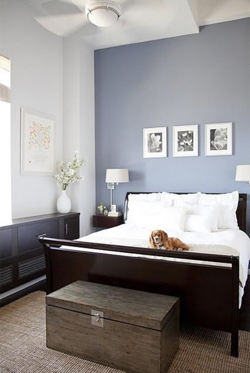
Calming, sophisticated neutral blues promote relaxation in bedrooms. Try airy periwinkle blues or denser blue-grays on accent walls or behind the headboard. Their tranquility facilitates healthy sleep.
2. Bathrooms
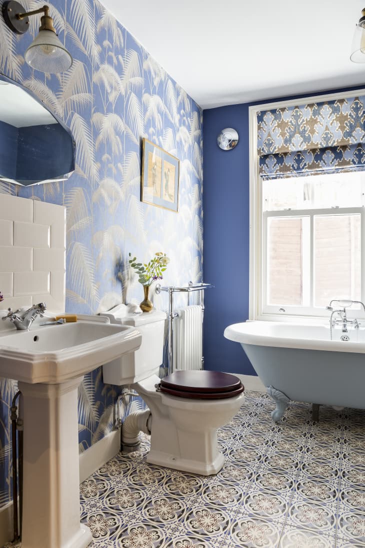
Use serene powder blues on bathroom walls or cabinetry to create a spa-like oasis. Neutral blues make bathrooms feel more like relaxing retreats.
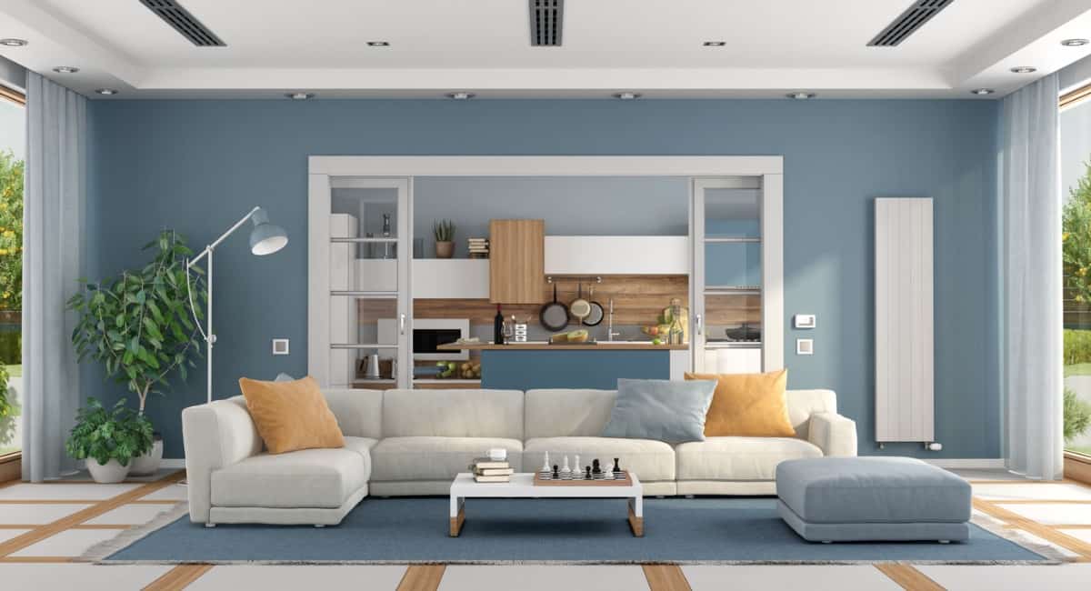
3. Kitchens
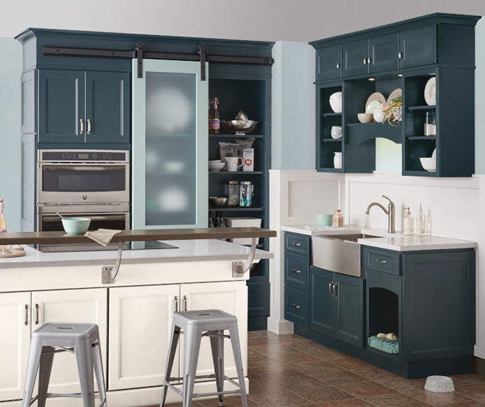
Blue-grays work well on kitchen cabinetry and accent walls, especially behind sinks and stoves. Their coolness is pleasant while cooking. Pair with marble for an earthy luxe contrast.
4. Offices
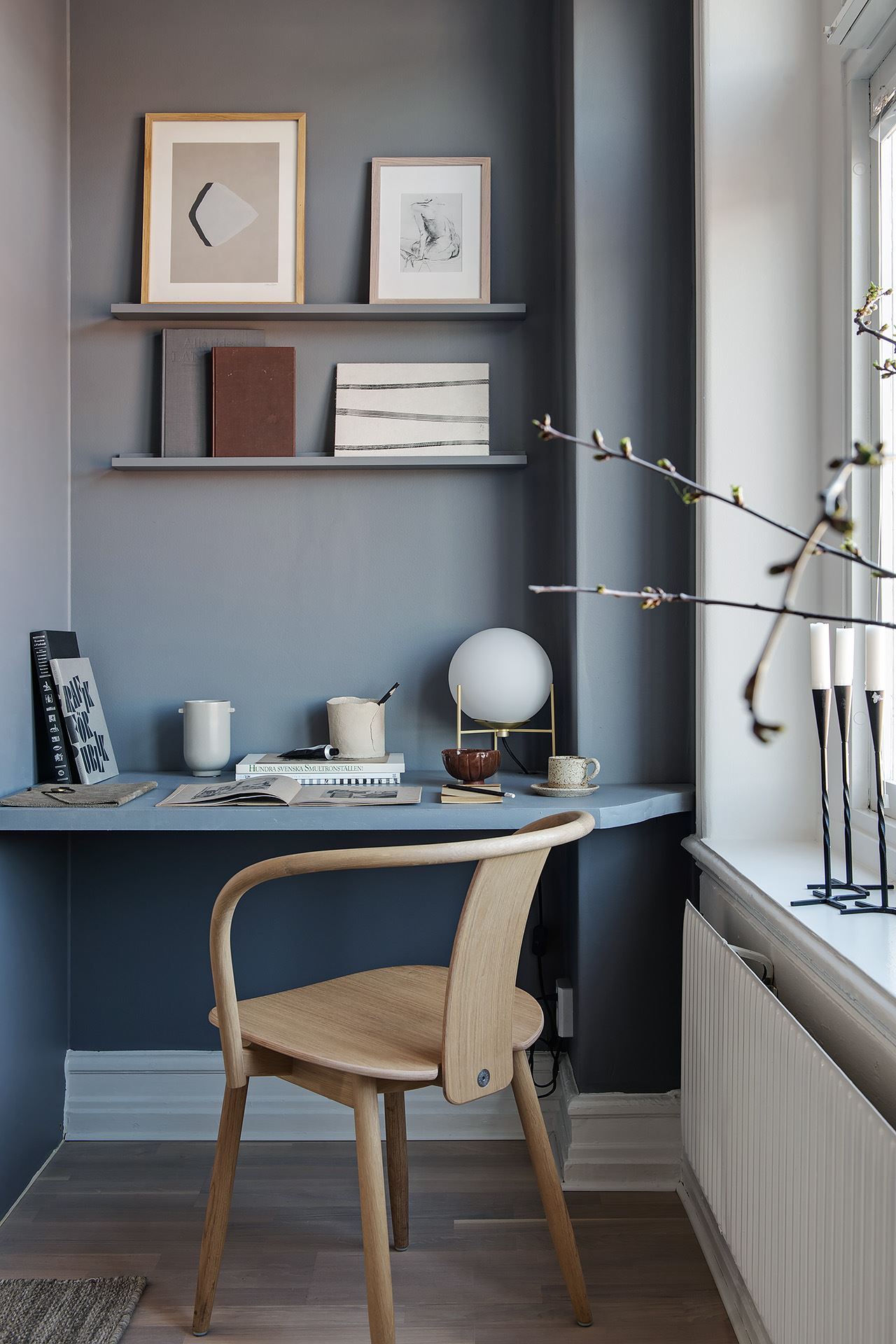
Neutral blues promote focus and efficiency in home offices. Blue-grays help concentration without energizing you too much. Sturdier satin sheens prevent glare while working.
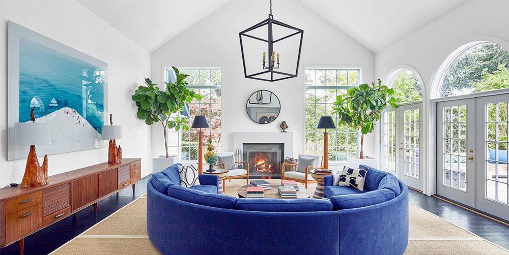
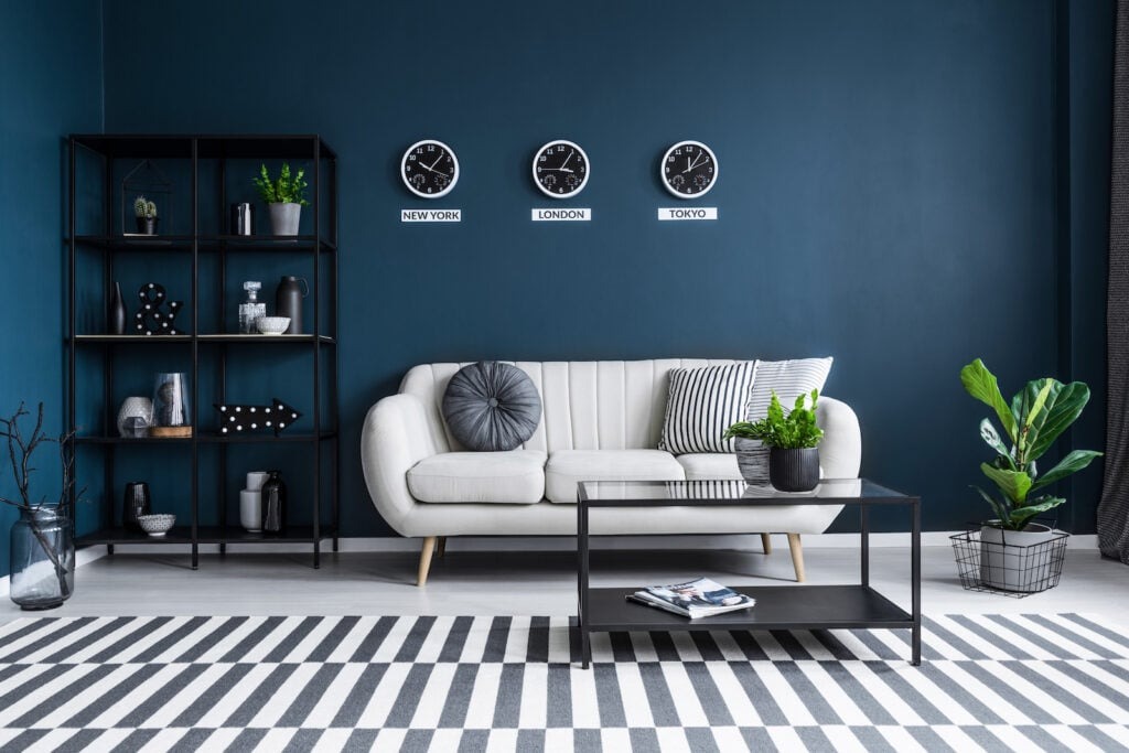
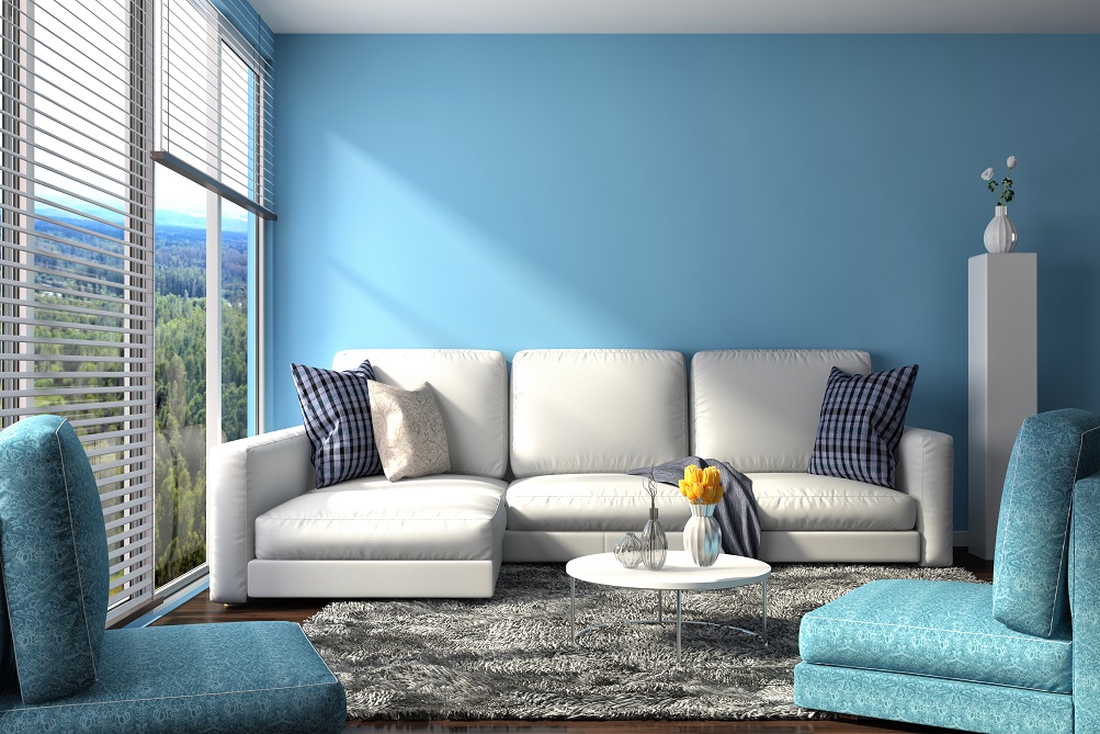
5. Living Rooms

In living rooms, try bolder neutral teal blues on accent walls to add intrigue without overwhelming. Soft muted blues relax without de-energizing completely.
6. Dining Rooms
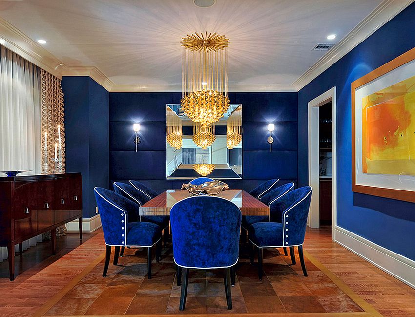
Sophisticated rich dense blue-grays create moody, intimate dining rooms. Their colors inspire lively conversation and family bonding. Ground with oak furnishings for cozy warmth.
7. Entryways
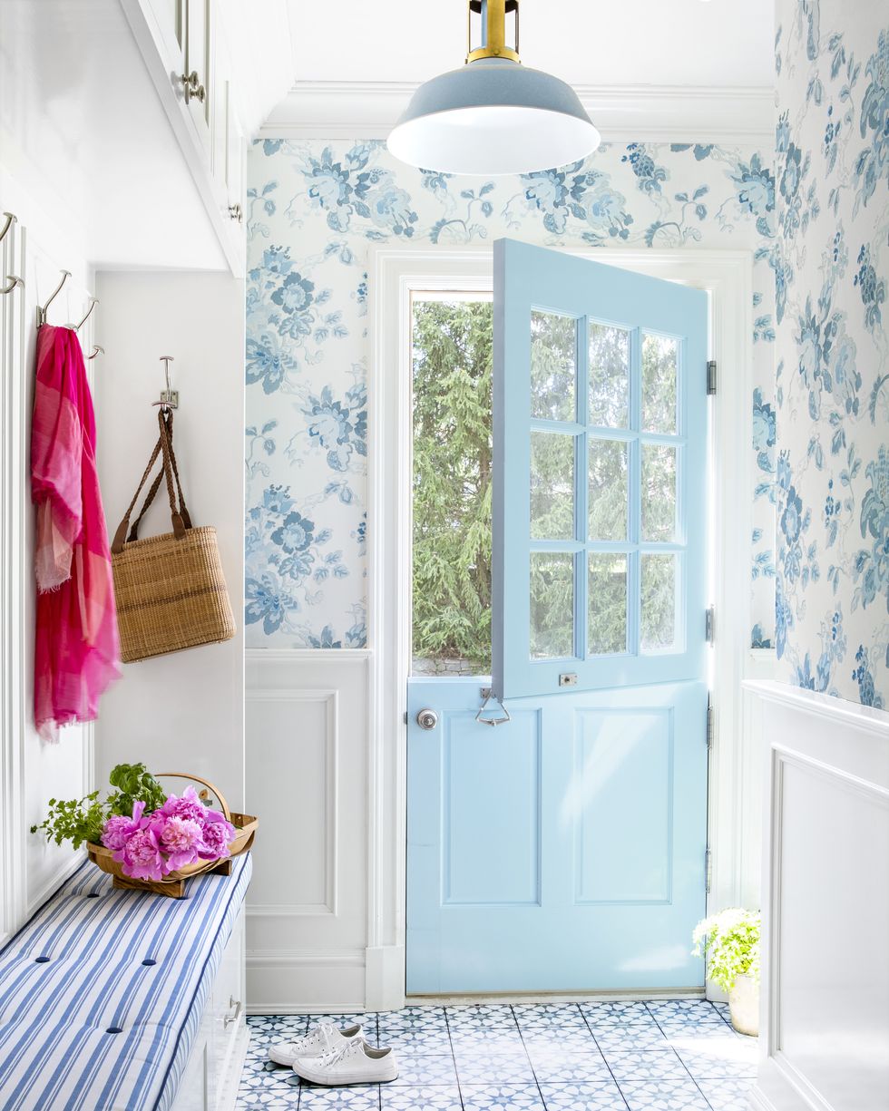
Use airy powder blue on entryway walls to give guests a soothing, tranquil welcome. Its calming effect makes transitioning from outside to inside more pleasant.
8. Laundry Rooms
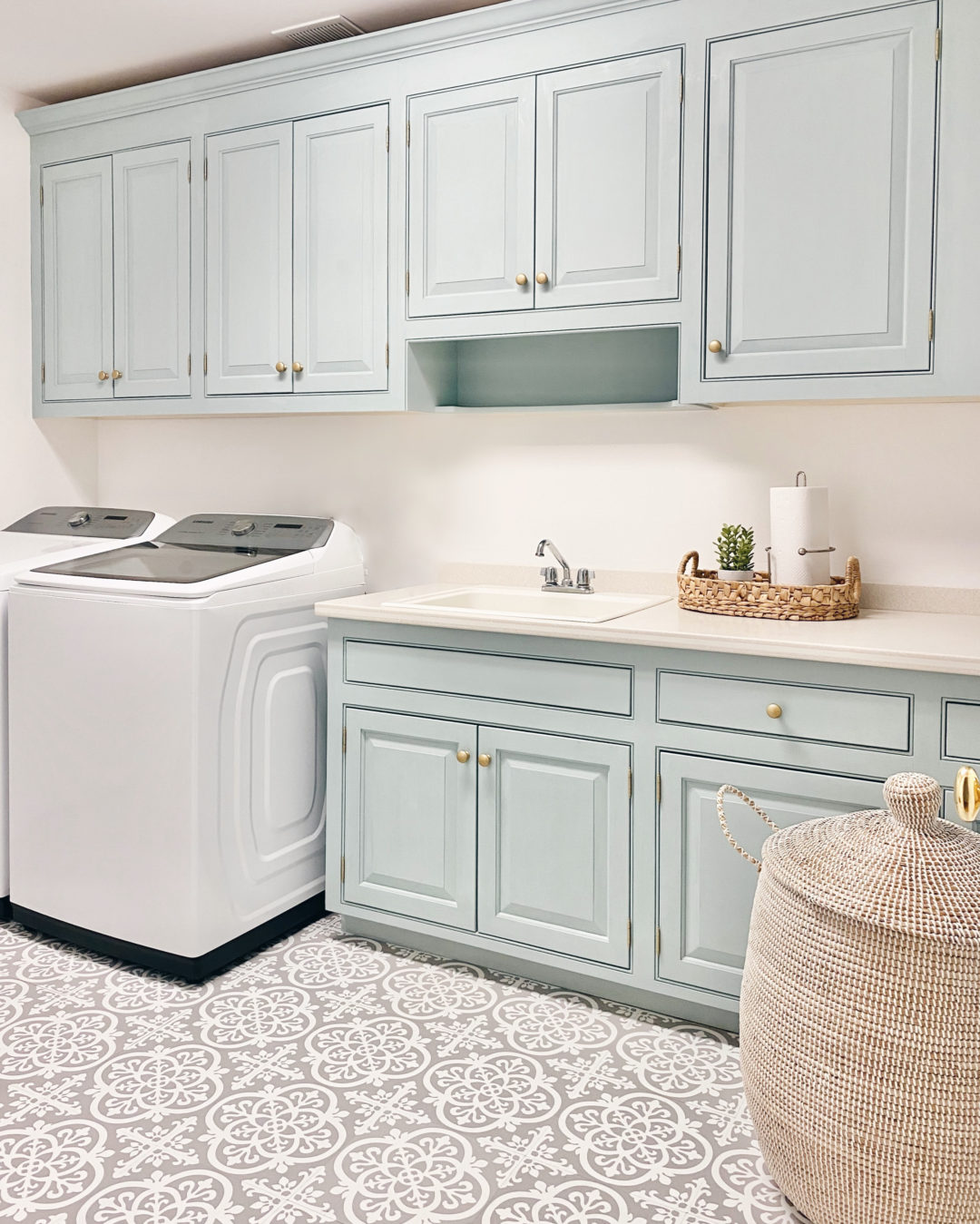
Infuse boring laundry rooms with subtle pops of blue on the backsplash or cabinets. Periwinkle blues make the space feel more cheerful and bright.
Decorating With Neutral Blue Paint
Decorating with neutral blue paint is all about balance. Try these tips:
Warm Wood Tones
- Incorporate oak, walnut or mahogany furnishings to add cozy, organic contrast against cool blue walls
Crisp White Trim
- For definition, use bright white trims, ceilings, tile and furnishings. This grounds the room and prevents soft blues from feeling too insubstantial.
Black Accents
- Metal black window frames, hardware and light fixtures feel bold and modern against blue-gray walls. Black and white photography also pops.
Highlight Blue Undertones
- Use blue, green or violet textiles and art to reflect and bring out undertones in the blue walls. Matching undertones creates harmony.
Natural Textures
- Add in jute, linen, wool and rattan furnishings for earthy contrast. Soft textiles prevent neutral blues from feeling too cool.
Using Neutral Blue on an Accent Wall
To add just a touch of blue without going overboard, use it on a single accent wall in a room:
Office – Behind the desk, paint a blue-gray to promote concentration. Keep other walls light for balance.
Living Room – On the TV feature wall, use a subtle teal to relax and unwind without appearing too bold.
Kitchen – For a backsplash, try an airy periwinkle blue tile. Feel transported while you cook.
Bedroom – Behind the bed, paint a soft powder blue to instill tranquility. Use a deeper hue here since it’s contained.
Bath – On the shower wall, cool rain-like blue-gray tiles evoke a spa. Crisp white tile elsewhere prevents overwhelm.
Neutral Blue Color Schemes
Mix and match paint colors to make neutral blues shine:
Neutral Blue + Crisp White
This beachy combo pairs airy powder blues with bright white trims and furniture. Lots of white keeps things ethereal. Uplifting and carefree.
Neutral Blue + Black
For modern edge, use black window frames, hardware and accents against blue-gray walls. The contrast feels bold but still refined.
Neutral Blue + Oak Wood

Warm oak floors and furniture provide an organic contrast against cool blue walls. It feels natural yet still updated and sophisticated.
Neutral Blue + Gray
Different blue-grays layered on walls, trims and furnishings create subtle depth without overwhelming the eyes.
Neutral Blue + Yellow
Energetic yellow accents in artwork, pillows and furnishings make soft blue walls pop without going overboard on color.
Neutral Blue + Green
Deep emerald greens against light powder blues feel vibrant yet relaxing. The blue-green tones play well off each other.
Tips for Choosing Neutral Blue Paint
With so many neutral blue paint options, how do you choose?
- Lighting: In dark rooms, use lighter sky blues to keep things bright. Deeper dense blues suit already bright spaces.
- Use: For high-traffic areas, select durable washable satin or semi-gloss paints. Use matte in low-traffic spaces.
- Size: Bold dense blues work best in large rooms with space to breath. Softer powdery blues keep small rooms feeling airy.
- Style: Green-grays complement modern minimalist palettes. Violet-grays match traditional warm decors.
- Furniture: Yellows make neutral blues pop. Whites feel beachy. Blacks add contrast. Oak adds warmth.
No matter the shade, always view real paint swatches at different times of day before deciding. Light changes everything.
Frequently Asked Questions
Here are more in-depth answers to common neutral blue paint questions:
How is neutral blue paint different than regular blue paint?
Neutral blues are muted, with less color saturation. They have undertones like gray, green, brown or purple that soften their look. Regular blues are much bolder, brighter and more primary-colored. Neutral blues have a weathered, sophisticated restraint.
What are some examples of neutral blue paint colors?
Some examples include gray-blues like Benjamin Moore Harbor Haze, green-blues like Behr Blue Danube, and periwinkle blues like Sherwin-Williams Nebulous Blue. Benjamin Moore Wythe Blue is a sea glass blue-green. Sherwin-Williams Rainwashed is blue-gray with a rainy feel.
What sheen should you use with neutral blue paint?
Sheen depends on the room function:
- Matte for bedrooms – soft, cozy
- Satin for durability in high-traffic areas
- Semi-gloss for wipeable bathrooms and kitchens
- Gloss on trims for definition
Typically a subdued eggshell or pearl sheen works well with neutral blues. Avoid anything too shiny.
What are some good neutral blue paint brands?
Some top-quality neutral blue paint brands include:
- Benjamin Moore – Wide selection of sophisticated neutral blues
- Sherwin-Williams – Variety of airy, watery neutral blues
- Behr – Dynamic muted blues for accent walls
- Valspar – Budget-friendly blue-grays
- Farrow & Ball – Upscale neutral blues for accent walls
- PPG Paints – Affordable pastel to mid-tone neutral blues
Always get in-home samples before deciding on a brand’s color.
What rooms work well with neutral blue paint?
Great rooms to use neutral blues include:
- Living rooms – Teal blues on accent walls
- Bedrooms – Periwinkle blues evoke tranquility
- Kitchens – Blue-grays on cabinetry
- Bathrooms – Powder blues feel like a spa
- Offices – Blue-grays increase focus
- Entryways – Soft blues offer soothing welcome
Neutral blues work well in nearly any room you want to feel relaxed yet cozy.
Final Thoughts
The 20 shades above showcase neutral blue’s remarkable adaptability. Ranging from the palest periwinkle to deep navy, neutral blues provide the perfect balance between vibrancy and tranquility. Consider the room size, lighting, furnishings, and personal style when selecting the ideal blue-gray, powder or slate blue paint color. With so many options, you’re sure to find the perfect neutral blue for your space and taste.